For our brief, we had to produce an alphabet with glyphs of a typeface, based on a existing typeface, that represents the personality/character of a random member of the year group, including a name tag. The member of our group that I got was Danielle Harrison.
The first thing I did was research into what her personality is like and also researched into fonts that I felt were possibly appropriate to use. (See Design Context blog)
From this, I then started doing initial manipulations of the chosen typeface, Abobe Caslon Pro, in order to come up with some suitable ideas that represent Danielle's personality within them (see pictures).
My 18 initial ideas/sketches for my typeface
From these initial drawings, I selected the 5 which I felt were most successful in communicating aspects of Danielle's personality (those highlighted in purple).
I then continued to experiment with possible typeface designs by developing these possibilities and exhausting all avenues (see pictures).
 |
| Developments of Initial Ideas to produce the overall font choice |
From these, I settled on the 5 most successful and then selected the one I felt was the most communicative in regards to Danielle's personality as well as the one that could be most successful in regards to a full alphabet rather than just the 1 letter that I have currently been developing from. I chose the Intricacy one.
From this I had a 'Power' Crit to determine where I would go from here (see PPP Blog)
After the 'Power' Crit, I researched into potential influences into the style of ornate type I was trying to reach for. (see Design Context Blog)
From the research, I set to work on producing a rough, experimental version of the alphabet in the style I had chosen.
 |
| Development of Column version of Alphabet |
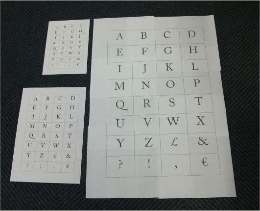
I decided to produce 4 different versions of the alphabet so that I had plenty of choice in regards to producing an alphabet that would work successfully. I produced 2 different alphabets (an intricate one and a detailed one), filled versions of these said alphabets and then an alphabet that focused on a thin line thickness and a thick line thickness. Visually, by looking down the columns, you can see which would be more successful within my alphabet. I want the alphabet to be consistant throughout so I need to take all these aspect into consideration whilst I am creating them.
From this, I can successfully discount the thin line thickness and the filled in options from my overall design as they seem quite disconnected and overbearing for the font, taking away from the personality of my partner. However, I have yet to settle on the overall typeface.
I decided to combat this by continuing this method of investigation when producing my 6 glyphs as part of the brief. I chose a comma, exclamation and question mark, pound and euro sign and an ampersand, specifically so I could compare the aesthetic with the legibility of the typefaces.
 |
| Development of Column version of Glyphs |
The experimentation allowed me to discount the intricate typeface as it appears very cutting and quite evil on the glyphs, particularly the ampersand as it looks like I have massacred the beautiful shape. I also discounted the filled alphabet as it took away from the shape of the type.
After producing the letters and glyphs, the last thing I had to take into account was the ability to produce Danielle's name with the letterforms for the name tag.
 |
| Development of Name |
This allowed the alphabet to come into its own as it would be make or break as to whether the letterforms would work altogether rather than separately. The most successful was the mixture of upper and lower case as it allowed for the letterforms to be easily read and were more pleasing on the eye. Words are a lot more legible when read like this and it was clear from my attempts that my work corresponded with this fact. The captials were too obnoxious and the all lowercase name was too small and unclear.
From this, I set about producing my alphabet poster and name tag. We had to produce an A1 sized tracing paper media poster so the only thing for me to consider was the pen size I should use to et the best result.
 |
| Testing what Pen media to use |
By testing permanent markers, pencils, ink pens and biro, I found the most successful was a slightly thick-nibbed black ink pen as it had a clear colouration, definition in the letter without overwhelming the letter and a consideration to the look I was going for.
Final Piece (Poster):
To produce the poster, I needed to create a grid of the alphabet and scale it up by photocopying the grid in order to produce a size that would be relevant to my poster.
 |
| Scaled up versions of the Alphabet Grid |
I wanted to be able to produce the layout as accurately and centrally as possible, enabling the letters to have an equal amount of spacing as well as have a border around the type for aesthetic purposes. From this method, I have managed to get it as close as possible to this.
 |
| Scaled Up Grid |
 |
| Bassline for Original Letterforms |
From this, I then took the measurement of the grid scaled up and then translated the size onto the tracing paper creating a layout and presentation to work from, working out a bassline for my letterforms to be placed on my poster from the grid.
 |
| Original Letter/ Point Size |
However, I found that the letterforms themselves were very small and completely out of proportion with the spacing as well as the poster itself.
 |
| Original Letters Against 300pt Letters |
I produced the letterforms in 300pt instead and found that it was a lot more in proportion and shared more of a relationship as an whole alphabet then when they were of a smaller point size. It gave more of a community, unity feeling to the overall poster.
From these several layers I had drawn, I produced the alphabet on the tracing paper in the black ink pen.
 |
| Finished poster of Alphabet Typeface on Tracing Paper |
I think it is a very successful attempt at the poster as it is clear and has a strong visual connection throughout, having a consistency which was important from the beginning of the project. It fulfils the brief and clearly communicates an aspect of Danielle's personality. To say that my style is mainly to do simple imagery, I think I have made quite a good interpretation of some detailled, ornate style typography, mixing the detail aspects with my approach to keeping things simple showing a good medium.
Final Piece (Name Tag):
We were allowed to produce some colour with our Name Tag so I wanted to incorporate the colour Navy Blue within my tag because that is Danielle's favourite colour.
 |
| Name Tag Variations Experimentation |
I experimented with different colours and media, like tracing paper and card, however, I wanted to keep the tag looking clean and simple due to the fact that the typeface is quite busy and detailed. I didn't want to over-power the appearance and make it difficult to read, particularly due to the small size specified in the brief for the tag.
 |
| Name Tag In Use |
I settled on this design out of all of them as the blue stands out on the white background, making a large impact in such a simple and subtle way. The white background allows for the name to take all the attention and makes the navy appear brighter than it actually is. Also, the white background works as a negative space allowing for a clean and slick aesthetic.
If I was to improve on anything from this brief, I think I would try and make the letterforms more ornate and detailed, perhaps trying some more traditional typography styles. Also, I think it would be more beneficial if I had spent more time developing the alphabet in the initial ideas stage in order to work on the previous possible improvement.
Giving Our Typeface A Context:
After producing a full alphabet and name tag, we were given a mini study task to do over the weekend based on the Typeface that we had created. We had to find a Context that we could put our Typeface into so that it would be relevant to use in everyday life.
 |
| Packaging for Mr Kipling French Fancies |
Due to the face that my letterforms are quite feminine and ornate, I thought about how it could be used, such as for perfume, toiletries or maybe even champagne. However, my inspiration came in the form of a discarded French Fancies box that had been left out. The type that already adorns the brand is quite formal but traditional in style, with a mixture of scales and fonts being chosen to give it the appearance of a upmarket brand. Based on the subject manner and presented aesthetic of the cakes, I felt that this would contextualize my type and make it relevant.
 |
| Tracing paper version of Typeface Contextualisation |
I traced round different scales of type and lined out the placement of the type so that it would be similar to the layout that was already in use. I wanted to keep it similar as it is already a formal style and I think my type is already fitting enough to the context. The packaging uses a mixture of types but by using just my own, I felt like it gave the brand identity a lot more unity and consistency and it didn't look out of place either. The tracing paper version I have created is successful as it provides a delicate yet fancy typeface which works well as a unit when producing full words and fits in with the subject matter perfectly.
 |
| Colour/ Black and White Pen Versions |
After producing a tracing paper version which was incredibly successful, I was disappointed by the outcome of a black and white version and a colour version. They didn't contextualize my type and instead appeared quite out of place and disconnected.
 |
| Tracing paper Version Submitted |
From that, I submitted my tracing paper version instead as it was the most successful. Even though it was a bit out of place on the wall as it was a tracing paper and pencil version unlike other submissions, it still managed to stand on its own I think as the type and context were so fitting of each other and you could tell that i had thought out the arrangement of the type and scale.
If I was to do it again, I would maybe have a try on illustrator and see how that would effect the appearance of the type and whether it would improve the problem I had with the colouration. I know that I have contextualised my typeface very well, it just wasn't very successful when I attempted to develop it which is a shame.