For this brief, we had to produce a piece of work that makes a statement/ comment/ observation or gives advice about the first year of this course. We can work individually or in a group, maximum of 4.
The first thing I did was think have a brainstorm of all the things that effected me and still do on the course as well as things that would maybe make my time on the first year easier:
- Map of Leeds?
- How to get around college?
- Things to Bring (To College or from Home when in Halls)
- Survival Guide to the Course?
- How to use Adobe Software?
- How to use Blogger?
- Bus Routes?
- How to Survive a Group Brief?
- Working when Commuting?
- Learning Everyone's Name?
- How to Budget my Money?
- Being Faster at Working?
- Balancing College/ Job/ Home?
- Amount of Work/ Workload?
From these, I came up with some concepts/ ideas that I could do for the brief:
- Student Planner
- Infographic Map of the area/ college
- Interactive Website/ Message Board for help
- Treasure Hunt around College
- Typographic poster slogans
- Student Life Board
- Ice-Breakers like Games
- Instruction Manual
- London Underground style map of Bus and Train Routes
- Homesickness Kit
- 'How To...' Book- Recipes, Wash Clothes, Cook, Budget, ect.
I went onto producing initial ideas in reaction to the brief.
 |
| Initial Ideas Design Sheet |
The idea I liked the most was a concept of making a game that would be based around the design process and the development of a brief. The idea is to complete the brief before the deadline (an hour), making the way around the board. Landing on a lightbulb means you have to answer a question on the subject of design principles. If correctly answered, they collect a piece of the final piece which has 6 pieces in total. A crossed out lightbulb means a punishment by going back spaces for discouraged practise. The winner is the person with the completed final piece on the last square before the 1hr time limit is up. The idea behind this is to teach them the design process, some design principles theory, meeting deadlines and time management.
From this, we had to produce a statement saying the concept of the work, whether it was individual or group work, the roles taken within the brief and what responsibilities we have.
 |
| Concept Statement/ Rationale |
I am working individually and have to play all the roles and responsibilities that would normally go with a group.
After coming up with the main idea/concept, we had to produce 3 boards for a Concept Crit. The 3 boards are based on the Concept of the idea, the Method of Delivery and the Production.
 |
| Concept Board |
The Concept is the idea of having a game that could be used as a non-embarrassing, informal ice breaker amongst the graphic designs student first years. The idea is to base it on the Design Process which would be relevant in the first few weeks as well as for the rest of their careers as designers. It will be informative in tone of voice and educational in purpose in the pretence of a fun and interactive board game.
 |
| Method of Delivery Board |
The Method of Delivery to me concerns the considerations behind how I am going to package this game concept. The packaging needs to hold all the components while also making the game easy to transport and make the game re-usable for years to come. In terms of delivery, I also need to consider the different types of games that are available and what format I could produce it in.
 |
| Production Board |
The Production regards how the product is going to be made so I need to consider the stock, the means that I will create the game and how I will produce the physical object.
 |
| Printed A3 Concept Boards |
After this, I had a Concept Crit (see PPP Blog) where I was encouraged to continue on and we were to keep going with our ideas.
 |
| Development Design Sheet |
To start with, I decided to come up with a name based on the concept. The name and the presentation of the name usually sets the scene for the rest of the design. I made a list of all possible names that I could think of:
- Design In Time
- The Design Process
- Creation Station
- Deadline By Design
- Deadline Design
- Deadline Dilemma
- Design Dilemma
- Design Time
- Deadline Disaster
- Down for Design
- Construction Production
- Deadline
- Design Line
- Brief Meet
- The Deadline Brief
The most successful I felt was 'Deadline' as most successful games have just one word as there title which keeps it to-the-point and blunt. It does give an ominous foreboding to the game and makes it seem a bit dark and final but I think it would also be a good precursive warning to the first years in regards to the amount of work and pressure they may feel when they start getting numerous briefs and deadlines.
From the name, I then went through typefaces that I felt could be possibilities. Initially I thought a typeface which gave the impression of being bold and eye-catching would be best due to the impression that the word Deadline leaves on you. This meant that I looked at some more decorative fonts to give this impression of being unavoidable.
 |
| Testing Typefaces |
As I was testing, I felt that I needed a typeface that was either 1 of 3 things; block font, capitalised or handwritten. Block so that it has a huge impact of panic that resembles the feeling of an upcoming deadline, capitalised to emphasise the importance of the word within the subject matter of the graphic design course and handwritten for the fact that most people will write and make note of the dates.
 |
| Chosen Verdana Game Typeface |
I felt that the most successful of these was the capitalised 'Verdana' typeface as it wasn't a block font which meant that it was more approachable and less panic-driven as a game. Plus, I felt that this font would give it more of a mature appearance then most other boardgames as it isn't overtly decorated and is more traditional.
 |
| Considered Colour Schemes |
I went onto looking at possible colour schemes with the main ones being CMYK or use of the primary colours as the are more to do with graphic design or with traditional board games. I felt that the use of the brighter colours however was too distracting which doesn't suit the traditional aesthetic.
 |
| Chosen Colour Scheme |
From this, I selected a muted colour palette which I felt worked a lot better whilst being in keeping with the theory behind colour. Naturally, it is also reminiscent of a board game without having to use an overpowering colour scheme, which is normally used for children.
Logo:
I went onto trying out some of the logo ideas I had by producing them digitally in order to see how they would come across. I was putting them alongside the chosen typeface as well so that I would be able to see if they would work together as a cohesive identity.
 |
| Digitised Logo Ideas |
I felt that the ones which were more type based were more business like and didn't fit in as well as a possible board game logo. I know I want it to appear more of a matured version of a board game aesthetic but I can't take away from the actual purpose of a board game which is to have fun. From the illustrations, I felt that the clock and the hourglass ideas were the most successful as they worked well with the intention behind the game name which hints at the lack of time.
 |
| Chosen Logo Design |
From the logo designs, I decided to go with the hourglass which is tilted to the side as it works with the use of the time scale in the game as well as look more like a logo rather than a stuck on illustration with no substance to it. I wanted it to be something which could be used for more than one aspect of the product and I feel like this could be used in all areas.
 |
| Coloured Logo Variations |
In regards to colour, I stuck to using the colour scheme but kept it quite simple. I just alternated the outside colour to give some variation but I was quite surprised as to how much it did actually change the appearance. I decided that the most successful was the green logo as I intentionally tilted the hourglass to a larger degree to see if it would look aesthetically appealing and it does. Plus, I knew that I could use the red and blue as strong aspects for other areas in the board game so it was important that using the colour green was significant to the game in some way.
 |
| Logo Finalisation |
I am particularly happy with my logo as it is simple and reflective of an aspect of the game and the connotations surrounding the name of the game- lack of time. It gives a clear distinction on the style of the game and the way that it is going to be presented throughout.
Board:
I started by designing some possible game layouts to see which would be the most fitting in regards to the requirements needed for my game.
 |
| Game Layout Development |
As you can see, there was a natural progression in regards to the board shape and the development of the narrow body shape. I wanted to have an incorporation of all aspects so I felt that this wasn't achieved well in the first 2 shapes and the last design was too cluttered with the inclusion of attached jigsaw placements so I went for a median with using the 3rd design produced.
 |
| Layout Production |
For my layout, I wanted to have space for the cards and the spaces needed to be big enough to accommodate at least one player counter per square. I liked the idea of having the board in the centre with a surrounding area and this accommodates well for the cards and the starting and finishing points.
I have used the 4 colour scheme to show the 4 areas of the design process so they are clearly defined. The lightbulbs are placed in a way which is to try and catch the players out so that they land on them more frequently, making it harder for them to play. In order to complete the board, I needed to be able to produce a starting point and a finish so that there is a clear path around the board. Without these, the game would not make any sense. I wasn't sure about how I could show this in an illustrative image but then I had a brainwave about using the logo.
 |
| Finishing Point |
For the finishing point, I took the logo hourglass and flip it so that the sand would be right at the bottom, mirroring the physical state the sand would be in nearer the end.
 |
| Starting Point |
I felt that to produce a beginning, I would be able to produce the hourglass from the logo so it was like it would be like when an hourglass has first tilted. It also acts as a reminder for the game users to do the action that is in front of them on the board.
 |
| Start and Finish |
 |
| Start and Finish Points |
I like that the logos work together and keep the game consistent as well as working as an imagery based solution in keeping with the rest of the board game design. It doesn't seem out of place or unconsidered.
 |
| Overall Board Design |
I added a bridge with extra squares from the start and finish points to the main board so that the players can get from one to the other. This would make a set path around the board and give some additional purpose to the start and finish points.
 |
| Back of Game |
Usually there is a pattern or just a plain back to the board itself but I liked the idea of having the logo on the back so that it wouldn't seem as plain as so it would keep to the overall aesthetic of the game board.
 |
| Front and Back Mount Board Print |
In regards to printing, I consulted James in Digital Print before producing my board game to see what he would suggest about the production and the stock which would facilitate my needs best. He recommended using Mount board as it was the thickest printing stock he could use and would be much more successful than using some think card. I needed to cut it down to A2 scale before it was printed. I was happy with the way it came out as it slightly muted the colours but this suited the aesthetic of the board game.
 |
| Cut Down Mount Board |
I went onto cutting the board game down after getting feedback from the Crit saying that it would look more professional. I found that using a scalpel and ruler made it very easy to cut as a material and it came out with a precise cut. The board cut out from the stock gives much more of a sophisticated impression and I am happy with the results. If I had the time and the option, I would see about using a thicker stock or even a thicker material yet I think it still illustrates the point of its use very well.
Cards:
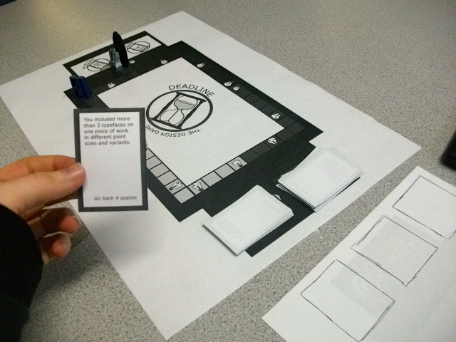
For the cards, the idea is to have 'Good Practice' cards and 'Malpractice' cards in order to promote the ideals of being a good design student and studying alongside the mistakes and bad habits that people get into.
 |
| Design Ideas for Cards |
I liked the idea of representing ideas and the thought process put into following the design process. One thing that everyone who does Graphic Design has in common is the production of ideas and this is commonly recognised in popular culture as a lightbulb. I looked into having the lightbulb being crossed out but it looked clumsy and poorly designed. I felt that using a broken, cracked lightbulb would be a nice visual image that could be interpreted in the same way.
 |
| Cards- Front and Back |
I feel as though the design is very simple and understated as it is more purposive. The colour choice is based on the colour scheme so that it is fluid throughout. The red colour choice is for bad decisions and the blue colour choice is to represent knowledge.
 |
| Replication of Card Production |
I replicated the cards on a large scale and reproduced them to be able to create the cards in the same format throughout. This allowed for the same sizes and imagery to be made without having any scaling issues.
 |
| Questions/ Malpractice Card Contents |
There are 20 cards for each of the 2 sets. For the blue lightbulb questions, there are a mixture in regards to the different areas, e.g. history questions representing research, printing questions representing production. I wanted to be able to educate the people who were using it with the questions so that, if they didn't know the answer, it would mean that they would be learning something that would come in handy for one of the modules in the future. In regards to the red broken instructions, I took scenarios that I had heard other people do or witnessed for myself and included them so as to warn first years of these mistakes so as not to do them themselves.
 |
| Printed Cards and Cut Out For Play |
I feel that the cards are simple and to- the- point as they are specifically for a purpose so in that sense they work. In regards to printing them, I selected a mid- thick card stock to work on as I know that they would be something that would be in constant use so would need to be durable when being used again and again. The backs of the cards had to be printed using a full bleed to make sure they came out as close to identical as possible in terms of back- to- back printing placement.
Tester/ Mock-up:
Before printing off the finished articles and as a physical, pro-active manner of testing whether my game would work, I printed out a black and white version of the board with the fronts of the cards in order to be able to re-create playing the game so the fundamentals of it worked. Emily, Anna and myself tested the game and I used their comments as feedback to work from- like a mini critique.
 |
| Photos of the game being played |
This gave me the opportunity to write up the rules and how to play section so that I knew it would be correct. I was able to talk through the rules and add to them if they needed it.
 |
| Feedback from the Crit |
I got some valuable comments from them in order to improve my game. Whilst we were playing, some of the cards were seen as improper grammar or difficult to understand so they could be changed. They suggested that instead of having all the cards be going back spacing, to include 'miss a go' or 'go back to the start' options. They felt that there needed to be some more difficult questions and they liked the idea of having an 'ultimate question' that needed to be answered when on the 'Deadline' finish square to determine the winner. There was a discussion about having more 'Good Practise' lightbulbs so that there was more chance to be able to collect the jigsaws without being stuck waiting for a particular number of the dice, particularly as Emily wanted more but Anna liked the waiting, but it was decided that it didn't let the game make any sense to add more to the game so that was left as it was.
I immediately reacted to the feedback that I was given by changing some of the options to include more of a variety and I started working on some 'ultimate questions'.
Instructions:
From the tester game that we had, I wrote up the instruction and the rules as we went along in order for them to be comprehensive and easy to understand.
 |
| Rough Mock Up of Written Instructions |
Also, this meant that if there were any problems that had arisen that they could be put in the rules so that it would be simple for the players. After the game, I read these out to Emily and Anna and they agreed that, based on what we had played and discussed that they were clear to understand from a players point of view.
 |
| Instructions on Illustrator |
On Illustrator, I produced an A5 sheet with a front and back that keeps it quite similar throughout. I wasn't sure whether it would be better on InDesign so I decided to attempt to produce a booklet style information pack.
 |
| Front Cover Designs |
I started experimenting with the front cover by mixing with the use of opacities and the way that the logo would look. In my naive overlapping, the opacity based logos did seem to overwhelm the stand out main logo. I was worried that the original design would be too plain but the other designs seem too over-the-top and cluttered so I have settled on this design. It also seems to keep with the main aesthetic of the board game and cards so it keeps it consistent.
 |
| Contents Layouts of the Instruction Manual |
In regards to the content, I wanted that to be the main focus of the middle of the manual. I thought that it would be interesting to have a synopsis of the game on one page which would be eye catching and have the detail to the other side. I experimented with different layouts and opacities for the logo, with 10% working at its best. I had to bring the typeface to the front so that it wasn't overwhelmed by the logo colours. I found that the logo was too overwhelming for the body copy 11pt font size so I kept it to just the header text even with the lessened opacity so that it would be readable for the audience.
 |
| Back Cover Designs |
I felt that the back cover would be too plain and boring if I had the front the same as the back so I took the patterned background of the middle and applied it to the back so that it has that extra little bits of detail that would make it seem more professional.
The PDF was a good way of being able to see whether it would work as a connected entity. It was from how impressed I was about the design that I went onto producing a physical copy by printing it on a good thin stock in digital print.
 |
| Printed Instruction Manual |
I am very happy with the outcome of my manual as it appears very professional in the aesthetic as well as working alongside the rest of the brand identity of the game. The 10% opacity worked very well and the typeface works perfectly as body copy and as header text. When printing, I chose to use a thin stock of paper in order to accommodate for the fact that I wanted to have the manual folded and I knew that with a thick stock, it wouldn't fold very neatly and would look clumsy and misjudged. This has worked very much in my favour.
From this point, I had the Final Crit which gave me some feedback into how my Board game was coming along and answering the questions that I wanted answered (see PPP Blog)
 |
| Products finished for the Final Crit |
In the Crit, I discussed that I knew what I needed to do which included adding some 'Final Crit' questions and the inclusion of components and possible having a packaging for it. I just felt the need to get on with what I was doing and keep going with it.
Final Crit Questions:
In a response to the mini critique I had with my peers, they suggested having more difficult questions and having them as the last thing to determine the winner. I didn't want them to be overly difficult because you have to remember the audience that my game is directed to yet I need to make it so that it challenges them. The questions produced have been done so that they have the chance of having an educated guess or an explanation they can give in regards to the answer.
 |
| Design of 10 'Final Crit' Cards |
The idea of the naming of the questions are to be 'Final Crit' questions is because, in a Final Crit which usually gives feedback on the piece you have produced, if you haven't completed it or if your work isn't very good then it usually seems that you have done a lot of work for nothing and I want to get this feeling out of the way for the first years. In regards to placement on the board, I didn't have a particular place for them to go so I decided to have them in the middle of the logo which would produce a design for them to have on the back as well.
 |
| Printed Matt Stock 'Final Crit' Cards |
In regards to stock, I kept them on matt so that it would be the same as the previous cards I produced for consistency. They printed out really nicely yet there was a problem with the lining up of the card front and backs due to the circular shape. This meant that they were a little bit off in placement and even when cutting around the cards would cause an imbalance so I had to re-print them without a edging on the back so that it would be a lot more successful.
 |
| Produced 'Final Crit' Question Cards |
I am very happy with the shape and scale of my cards as it makes them different to the others within the game, highlighting their importance. The backs do look a little plain yet this also combats the off-set that the edgings were originally having so if anything, this is successful as it appears more professional than if I had kept and used the original print outs.
Jigsaw:
The aspect of having a final piece for the 'Deadline' was so that the game had more of a purpose to it. The audience need to understand the idea of how it is produced, where it comes from and making it. This gives a physical, interactive interpretation of this happening.
 |
| Initial Drawing Developments |
The initial concept was to have pieces which were of a drawing of a trophy that you could collect. These designs kept getting more and more complicated as they were developed so I wasn't sure about how it would translate visually.
 |
| 4 piece Jigsaw |
Seen as I cut down the amount of players and sections, I also cut down the amount of pieces to 4 as well to keep it consistent. This made for a much more sleek and simpler effort.
 |
| Settled Design for Jigsaw |
By adjusting the sizing so that it would be on the scale for a 4 piece jigsaw, I used the finalised illustration yet it did still seem a bit over-complicated for something that is going to be split apart anyway.
 |
| Colour Experimentation |
From this, I went onto including colour where I was going to have the background in a colour scheme colour and the trophy coloured in as a full illustration, however, I found that I really liked the silhouette effect that producing just the outline in colour gave.
 |
| Player Gets Colour of Their Counter |
I went onto producing this for the full image rather than just one corner and it was even more effective. I felt that this would work as a jigsaw per player as they could collect the colours for their player counter.
 |
| Further Experimentation with Colour |
I started messing about with the idea of having a different colour for each piece so that it was multicoloured and found that this would also be relevant to the game as the players could select a corresponding colour for the section they have just been in.
 |
| Mixed Jigsaw Colours |
 |
| Same Jigsaw Colours |
In order to combat any confusion, I decided to try a mixed jigsaw piece colour set and same colour jigsaw piece colour set and found that it would make more sense to have them all the same pieces, otherwise the players might pick different ones that are not meant to go together which would mess the game up for them.
 |
| Stock Choice |
In regards to stock, I wanted a thick card which could be used over and over so I knew it had to have some backbone to it. Due to the success of using Mount board for my actual board which is a bit more heavy than normal card, I decided to print it in this way. Using this stick allowed for a lighter, less bright version of my colour to come out yet this compliments it very well.
 |
| Cut out Jigsaw Pieces |
Due to the nature of a jigsaw, I had to cut them out in the shape of pieces to get all 4 pieces that were needed to play the game. It was quite fiddly and because of this and the difficult shapes, it did mean that the crafting suffered a bit. It wasn't horrendous but I would have preferred it to be neater and more presented even though I did go over the cut to make them better.
 |
| Finished Jigsaw Pieces |
I am happy that the jigsaw pieces are successful in actually working and connecting together like a proper jigsaw. I'm not as happy with the crafting for the jigsaw as I should have been able to do better yet it was quite a difficult thickness and shape to get around. However, it will fulfil the purpose and need of the game and if this was to be professionally mass re-produced then it would have been done by a machine very precisely.
Components:
For my components, I needed to source dice, counter stands and an hourglass.
I managed to find a collection of dice looking through old board games that were around as well as looking in stores and asking for them from other people. I managed to produce quite a selection to choose from.
 |
| Dice Selection |
I felt that using the clear dice would make it difficult to read yet I also felt that the coloured dice, whilst being connected to the game through colour choice might overwhelm things so I decided to stick to using just white dice. In regards to the amount, I felt that using 2 dice would make the game go to fast as the board doesn't have lots and lots of squares so I decided to stick to 1.
 |
| 60 Minute Hourglass |
Part of my game is that it has a time limit of an hour long so that the players know how it feels to have the tie limit set by the deadline. I managed to find this one hour timer which will fit with the purpose of the game. I wish to add to it by making it more part of the brand and component package.
 |
| Shape Illustration |
For this to work, I measured the sides and the angles of the hexagon shaped top and bottom which I then applied to within Illustrator.
 |
| Application of Logo |
Then I applied the logo to the hexagon shape so that it replicates that of the hourglass top and bottom.
 |
| Finished Hourglass |
The matt paper stock keeps the card consistent with the rest of the game and the shape fits snuggly onto the top and bottom of the hourglass. The top and bottom are opposites in regards to placement as they are the opposite way around to each other, however, this means that they are the right way up when they have been turned by a player.
 |
| Player Counter Stands |
From the Final Crit, I was directed to a craft shop I didn't know of where they had player counter stands which I could attach the player counters onto so it allows for physical movement. I want to try with both types of counter, wooden and plastic to see which would be best.
 |
| Player Counter Stands Experimentation |
I found them very difficult to use as they were very rigid and would be enveloped by the size of the counter itself. In terms of attachment, it was difficult to connect the counter to the stand and it wasn't working. The coloured ones were better as they would go with the colour of the counter yet they were still difficult to handle. I would have to find a solution to this problem.
Player Counters:
I liked the idea of having the players represented by the different font types but I felt that that would be difficult to produce as a counter. Then I went into seeing whether reproducing the symbols for the software programmes would work, as I could use them as the media that the players would use to produce the work.
 |
| Initial Counter Development |
The problem with these is that they hold absolutely no relevance to the game so it didn't look very convincing. I knew I had to go back to the drawing board.
 |
| Logo using Different Colours |
Looking back on my initial development of the game logo and the fact that I adapted it for the start and finish points, I decided that I would use the colour scheme colours to interchange the surrounding coloured border so that there could be 4 different players to differentiate between based on the colour. This would be simple, united with the rest of the components and easy to understand.
 |
| Square Player Counters |
In order for the pieces to be easy to use and grip, I knew that having the counters in the shape of hourglasses would have been difficult. I decided to have them in the shape of squares to reflect the squares that are on the board. I knew that this would ease the rate of play and would mean that they would be easier to produce stands for.
 |
| Printed Front and Back Player Counters |
They were printed in the same way as the jigsaw as, again they were going to be a piece that would be constantly in use. The colour was also affected yet again this gives a nice tone to the overall counter designs.
 |
| Cut Out Counters |
After producing the final counters, I still had the issue of producing stands for my counters. I didn't know how I was going to produce them and I knew that the counters would not be able to stand by themselves which would mean that the game could not be played. I had a brainwave when cutting out the counters that I could stick a rectangular piece of Mount board on the bottom of the counters to be able to make a flat edge with a surface area for them to stand on- This was a complete success as it worked well with the aesthetic and fulfilled the need of the counter.
 |
| Finished Player Counters |
After the problems that I was having with my counters in regards to producing them and the stands that were a constant source of problem, I am very pleased with the outcome of my counters as they are very simple yet practical and show that a simple solution is sometimes the best one. If I could improve them, I would perhaps have them slightly smaller and I would make the top of the counters smoother in regards to presentation.
Box Design:
Even though i had produced the contents, I had nothing to keep it all together safe. I felt that I had to produce some type of packaging in order for my work to stay together in one place.
 |
| Top Box Net |
 |
| Bottom Box Net |
I created a net of a box using the measurements for the height and width of my board game with the depth of the hourglass as it is quite big and need to be able to fit in. I made the bottom half 2mm smaller in all aspects so that the top lid would be able to fit over the top in a snug way.
 |
| Initial Design |
I thought of having black on the sides all the way around resembling the board game itself yet, as you can see, it completely drowned the whole layout and didn't suit the rest of the design.
 |
| Development of Design |
As an experiment, I thought I would try what the 4 main colours would look like on the box and it didn't look too bad. It is bright and colourful yet this would be to the sides so that would mean that the colours wouldn't be too over-powering as you wouldn't be able to see all of them at once when put into its form.
For the bottom, traditionally board games have a short synopsis on the back in regards to what the game is and the subject matter. I tried this in the same style as my manual with an opacity-based logo and capital letter paragraph. I felt that this was quite overwhelming to read so I did a version in just normal body copy and this was a lot more appealing to the eye as well as being easier to read.
 |
| Insides/ Inner Pattern in Box Packaging |
I wanted to include the pattern design I had within my manual for the inside of the box as I knew it was going to be quite plain without. I felt that this would give a bit of added decoration to the design without taking anything away from the contents of the box.
When printing, I found that I was very restricted by what I could do. Due to the size of my board game, I had to print at an A1 size which meant that I couldn't print double sided for the inner pattern and I had a very limited range of stock so I couldn't use anything of a stronger thinker card which could bend. I found this quite disappointing as it meant that when I made my box, it was quite flimsy on its own.
 |
| Putting together of the Box |
I put together my box quite easily yet it was the flimsy nature of the card which was the only problem. I found that when the board game was put inside the box that it wasn't as bad as the board game itself acted as a stronger base.
 |
| Reinforcing the Base |
In an attempt to strengthen the base, I put in some stronger card in the top and bottom of the box to be able to make the box stronger and less flimsy. If I had the time, I would have added some to the sides as well.
 |
| Finished Top and Bottom of Box |
Despite the stock issues, it is a small price to pay to be able to have all of my pieces in one place safe. There are a few scaling issues and print issues that I can see but timing has meant that I don't have the time to re-do it. The box is purposive and the colours used are not over-whelming due to them being at the sides which isn't too distracting.
Final Piece:
I produced a game that could be used as a non-embarrassing, informal ice breaker amongst the Graphic Design student first years. It is an informative and educational game whilst being fun and interactive. It is usable for up to 4 players and comes in a box so that it could be played over and over for years to come as a way of introducing concepts to the first years as a heads-up in regards to the workload, topics and how we approach Graphic Design as a studio, not just as a classroom.
 |
| Final Piece |
Overall, I think I have produced a successful answer to the brief that is obviously targeted at first years, not just next years first years but all first years. I wanted to produce something which would have longevity and be appreciated by more than just one set of people. I have always been interested in making games so I felt that this was a way in which I could explore that interest and see if I was any good at it. Originally, my game was going to be for 6 people and have 6 areas but I felt that this over-complicated the game so this was a dramatic change within the game as it meant that I started scaling it all down for a maximum of 4. I felt this design decision was a good one as this meant that it was more intimate and gave a better flow to the game. I felt that the colour scheme went together and the use of just white and black to give it a bit of a break allowed for a clean aesthetic. If I could change anything, I would try and reproduce a stronger box and see if there was any way where I could use a string stock or perhaps even reinforce the box with some stronger material. Out of all the parts, I am most proud of the manual as I have never managed to make a layout for a book that I am so proud of. Even though I enjoy layouts, they never look any good so I am very happy with this one so in that sense it has boosted my confidence a little. I look forward to seeing the first years try it out and I hope that they enjoy playing it as much i as enjoyed making it.