For this brief, we had the choice of between 15 dead ISTD Competition Briefs and we had to select one of them to do. I selected the Mutton Quad Brief from 2011.
 |
| Mutton Quad Brief |
The brief is to make a typographically-themed restaurant brand identity that has a print and web response with proposals. The brief needs to be focused on one of the disciplines and proposed for the other disciplines. Things that can't be made can also be presented as a proposal.
 |
| Mind Map |
To start with, in order to dissect the brief, I did a spider diagram. This got me into the right mindset in relation to how I would approach the brief, possible target audiences and products I may produce or propose for restaurants in general.
 |
| List |
In relation to producing a typographical theme, I looked at different typographic terms which I could use as a starting point to my restaurant. I made a list of possible terms I could work with and decided to use these in order to come up with some ideas. I wanted to use word play or physical typographical elements to produce the brand identity for the restaurant.
 |
| Initial Ideas Design Sheet |
I did a design sheet so that I would be able to put my ideas down visually. When thinking of possible brand identities, I put down possible collateral I could produce in relation to the idea as well as proposals I could produce for the idea. I felt this would give me more of a focus and a clarity when producing my identity if I had already outlined what I was doing. Out of all my ideas, I felt the one which was most imaginative and had longevity to it was the idea of a seafood restaurant based on the typographic term 'Swash' as the term reminds me of the saying 'swash-buckling' used in sailing and piracy.
 |
| 'Swash' Idea Spider Diagrams |
Based on the simple outline of the idea that I had produced for the design sheet, I had another brainstorm except this time it was solely on the concept of 'Swash' itself. I began to think about possible seafood concepts for the restaurant, the topic of pirates and the possible target audience which I then brainstormed more specifically into possible food and drink menu content, proposals and products I could produce for the brief. I also thought about considerations that I needed to think about when producing the brand identity, such as colour schemes, typefaces and logo design as I knew I needed to keep to the specifics of the brief whilst being individual in the production of the brand. I decided on having a middle class target audience of 25-55 year olds and that it would have an open and approachable, friendly tone of voice.
As part for the brief and as a study task, I had to re-write the brief to make it more specific to me and my idea.
 |
| Re-Written Brief |
At this point, I had a crit where I discussed my initial ideas and chosen idea as well as displaying my re-written brief (See PPP Blog).
From the crit, I decided to focus on the printed aspect of the brief and, going with my 'Swash' idea, I went onto developing it.
 |
| Idea Development |
Using the spider diagrams as a template, I went onto producing a design sheet for Swash with my intention of developing a logo design and considerations for the printed collateral I needed to produce as well as the website proposal I would need to provide. I wanted to produce everything in a way that was consistent and unified for a comprehensive brand identity.
To start with, I tested what fonts I could use for 'Swash' to give me the appropriate tone of voice and characteristics for the restaurant.
 |
| Testing Fonts |
I wanted to try out Fonts that were elaborate and went with the actual term. A Swash is a flourish which is added onto letters to begin a sentence so it is usually associated with decorative, scriptive fonts. Despite this, when I was trying them out, they didn't give personality or tone of voice which I felt was appropriate for a seafood restaurant.
 |
| Blanch Caps Font Choice |
 |
| Futura Font Choice |
 |
| Blanch Caps and Futura Together |
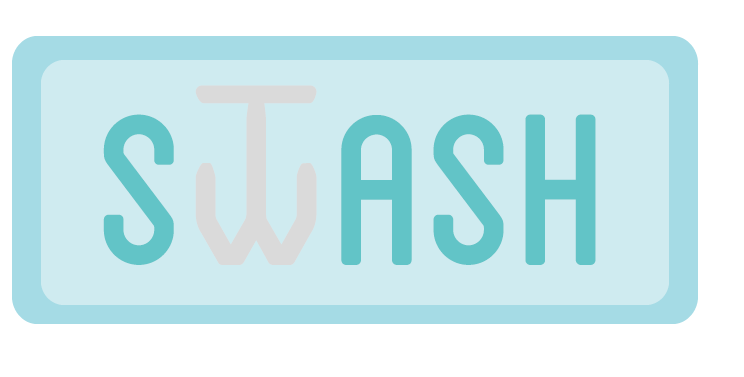
One font I did use, however, was the font 'Blanch Caps' which I felt was appropriate for the tone of voice I wanted as the sans serif font was rounded and soft whilst still having a commanding presence which would catch the attention of possible diners. Due to the fact that 'Blanch Caps' does not come with a lowercase version of the font, I felt that this would be difficult for diners to read in the menu if all the body copy was written in uppercase. I decided that I would need to include a sans serif body copy font so I selected Futura as its rounded nature linked well with the aesthetic of the logo. The only problem was that, with them being modern sans serif fonts, it didn't go with the actual typographic term for 'Swash' which would make their use redundant. I decided to attempt to rectify this by manipulating the typeface as I developed the identity of the brand.
 |
| Type Manipulation |
In order for the brand to have an identity, I came up with the idea of having the 'w' in the word 'swash' to be manipulated into looking like an anchor. This would be the icon used for the brand. By using the 'Create Outlines' tool, I changed the font into becoming vector images and manipulated the letterforms to produce the anchor itself. I felt that this was quite a breakthrough for me as I have never manipulated a typeface before to make it my own and I felt that by marrying the idea of image and text together, I would be able to play on my strength of imagery and improve my limited experience of type.
After producing a simple logo, I wanted to produce a colour scheme to apply to the logo.
 |
Colour Scheme
For the colour scheme, with it being a seafood restaurant, I knew that I wanted to have a blue theme running throughout but, based on the target audience of middle class, middle aged people, I knew that I wanted the colour scheme to be based on light blues and pastel shades for modern, sophisticated aesthetic. Despite this, I felt that my choices of colour needed to be condensed as there were some colours which were still quite demanding and overpowering.
|
 |
| Selected Specific Colours |
I stook to having just 3 specific colours as a scheme to work from with, blue and grey, with a variation in tonal hue alongside them to create a little contrast. I felt that this would work alongside the choice of typeface as it allows for a softness and approachability as well as being relevant to the restaurant theme of seafood.
 |
| Colour Variation |
I went onto experimenting with different colour variations of the logo to see which would be the most fitting for the logo identity. Darker colours came across as abrupt whereas very pale pastel colours were not very legible. I felt that a deep pastel blue and light grey that was outlined made for an easily legible and appropriate colour choice. Despite this, I felt that as an overall logo, it was lacking in substance so I decided to develop it by having a border.
 |
| Rectangle Border |
I decided to have the text enclosed into a border which is supplied by the rounded rectangle. A normal rectangle appeared too harsh on the rounded typeface and soft pastel shades so the rounded border gave more of a corresponding tone of voice. This also creates a bit of negative spacing around the wording which makes for more of a professional appearance. I decided to also include the term 'Seafood Restaurant' underneath the name of the restaurant to provide some orientation to the audience so that they know the purpose of the restaurant and what type of restaurant it is.
 |
| Manipulating Swash Flourishes onto Logo |
As I said earlier, by having a sans serif typeface, it made the typographic term used for the brand redundant. By using the 'Create Outlines' tool, I changed the font into becoming vector images and manipulated the letterforms to produce flourishes for the first and last letters of the logo brand name. Usually they are on the first letter of a sentence but I decided to have one on the end of the last letter as well to balance the logo out. I felt that this gave the brand and the typeface more credibility by having the physical swash's in the logo as well as a aesthetic uniqueness in the presentation of the brand.
 |
| Changed Anchor |
 |
| Logo Design |
In order to finish off the logo design, I developed the anchor further by smoothing out the lifework for the stem so that it wasn't bumpy and indented. I also developed the straight lines used for the restaurant orientation by trying out wavy lines so that it would reflect the sea but it looked too disjointed and unprofessional. Due to the fact that the straight lines looked better, I had the idea of having the lines become oars of a boat so as to continue the sea imagery within the logo. This was a greta idea as they link very well with the anchor and makes the brand identity much more incorporated. Then I got rid of the outlines of the logo to make for a softer and more integrated logo design.
After settling on the logo design, I then needed to start producing a typographic identity. As I had incorporated imagery and type within my logo design, I wanted to continue doing this but on a bigger scale for the branding.
 |
| Text and Image |
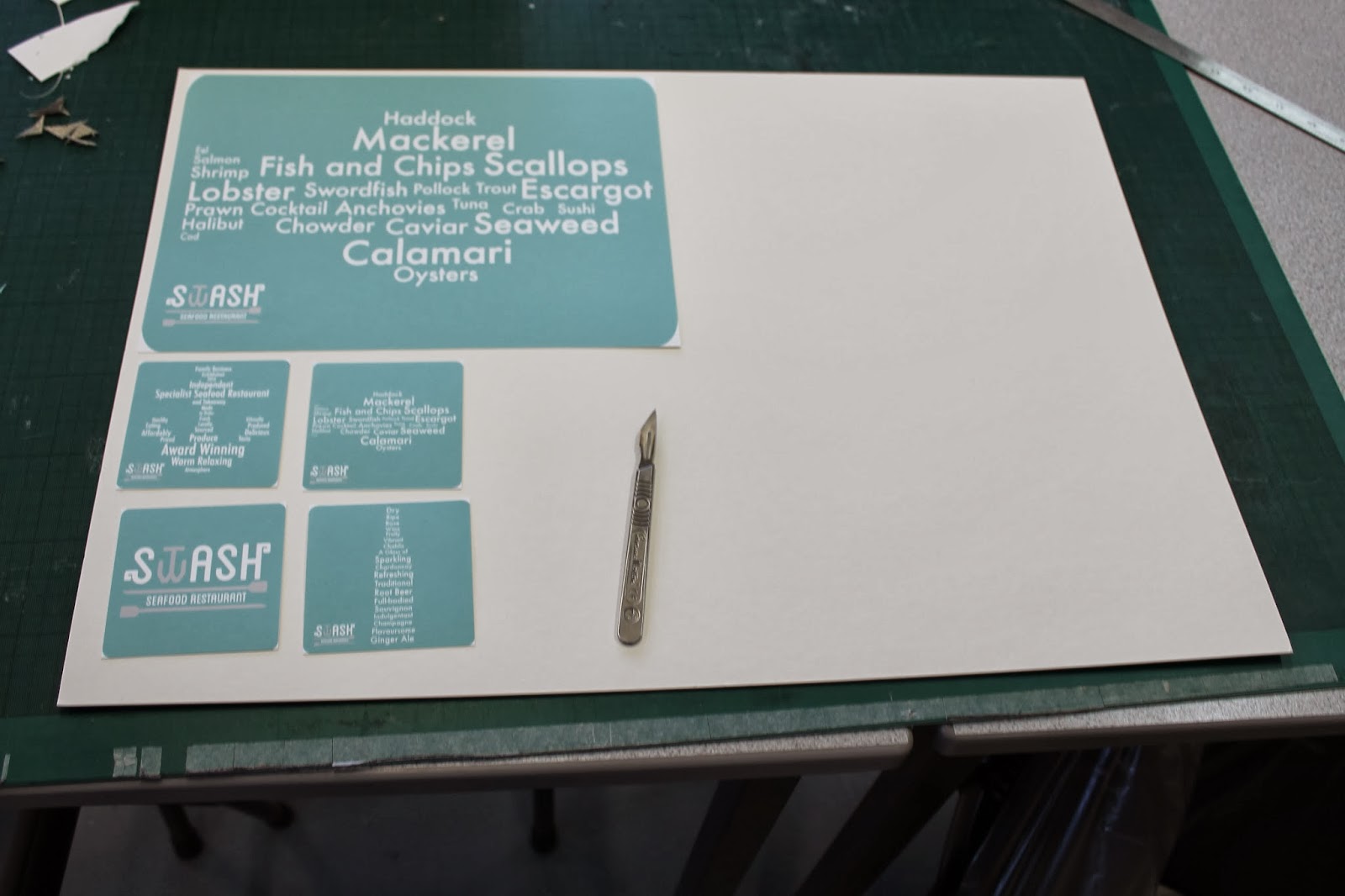
Using an illustration of a fish and an anchor, I started to fill the shapes in with different font sizes to create a sort of type collage.
 |
| Addition of Wording |
Getting rid of the outlines left the outline of the shape itself and from that, I added words to describe the restaurant as well as different fish that it would be selling. This would allow for the restaurant to develop an identity of its own.
 |
| Inclusion of Colour |
In order for the type images to work with the overall brand, I used the colour scheme I had devised to highlight different words and phrases so it was clear which were different and which were together.
Print Collateral
After producing some elements of an identity, I felt it would be a good idea to move onto printed collateral. I felt that a good place to start for the identity would be a business card as it would establish the brand and that the overall look that would continue on throughout the rest of the collateral.
 |
| Business/ Loyalty Card Development |
I found it difficult at first to produce a design for the card as I wasn't sure what I was going to include on it. Usually I would include the logo at the front of the design ad information on the back yet I get this was quite generic and I wanted to be able to have more of a natural design. I felt that this would be a card which you would get inside the restaurant rather than outside so I decided not to include any location information/ contact information. From this, I decided to use the typographic illustration I had produced of a fish to be able to have the logo and some anchors as loyalty points on the card. After playing with layout, I found a design which was casual yet sophisticated.
 |
| Actual Size |
 |
| Back and Fronts for Print |
I put it into a new illustration file which is of the correct size and then prepared it for double sided print by laying them out in 2 separate illustrator files.
The next area I wanted to work with was the menu as the content of the menu was an important aspect for the restaurant. If the menu isn't very good then it can make or break the longevity of the restaurant.
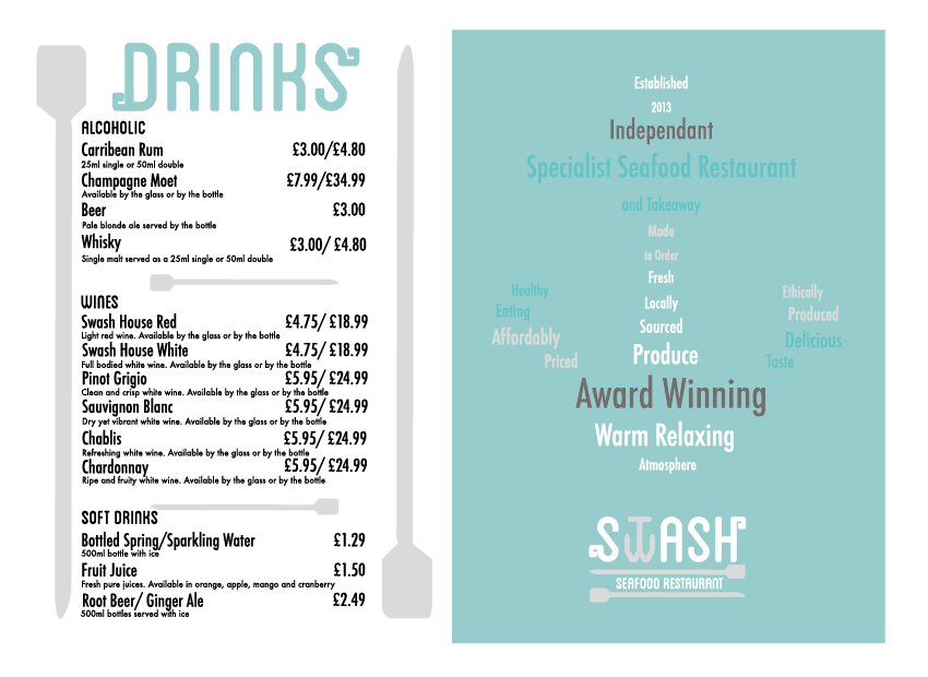
I started by inputting the content of the menu using Futura for body copy and Blanch Caps for the Sub-Headings onto the file and added the oars from the logo design as an information break point so that the separate areas of the menu were separated simply with the oars. The menu just looked very plain like this so I added oars in a vertical format onto the menu as borders which gave a simplicity to the aesthetic design of the menu without taking assay from the information. Initially I had the logo in the top middle of the menu but I couldn't find a way to incorporate it without it looking like an afterthought which had just been put there with no thought.
 |
| Inclusion of the Header |
I had the idea of, instead of having the logo at the top of the menu, just to have the word 'Menu' at the top in the same style as on the logo. Instantly, this gave a much cleaner and considered aesthetic whilst still orientating the customer.
 |
| Other Menu Pages |
After producing the initial menu page, I felt like I hadn't include a lot of other types of foods, like specials, sides and beverages which needed to be included. From this, I produced 2 more menus in the same style which allows for a wider range of food whilst still being quite specific in the menu choice given to the customer.
 |
| Final Menu Design |
Due to the fact that I had produced 3 separate menus at this point, I decided it would be a better idea to have all the menus together in one large menu as I felt it would be easier for the audience to use rather than having to handle 3 different menus at once. I used the typographic illustrations I had designed to have a front cover for the menu which would be in keeping with the rest of the brand identity.
The next thing I went onto producing were the physical products that would be used in the restaurant, starting with the own-brand House bottles of red and white wine.
 |
| White and Red Wine Bottles |
I chose the bottles for the fact that they were the same shape and didn't have anything written on the bottle tops themselves, which turns out to be a harder task then I initially thought it would be!
 |
| Typographic Illustration of Wine Bottle |
To go with the brand identity, I produced a typographic illustration for the wine bottle which I would be putting onto the label.
 |
| Label Development of Wine Bottles |
Using the illustration, I developed the label by working with different layouts and format types so as to try and find the most appropriate way of presenting the information.
 |
| Sticker Fronts |
I decide to go for a vertical sticker which would be sleek and go with the physicality of the bottle rather than a wrap around label which would take up a lot more room. There isn't a lot of information to put on so I felt that it was more suitable to have a vertical sticker so that there wouldn't be a lot of empty space.
 |
| Sticker Backs |
From the front sticker, I decided to produce a sticker for the back as well in order to add a description of the wine onto the bottle so that the customer would know the characteristics of the wine itself.
Next thing I decided to produce was the placemats and coasters as I wanted to apply the typographic illustrations I had already produced to them.
 |
| Placemats and Coasters |
By using the typographic illustrations, I knew that I would be able to produce a range of different coasters and a placemat that all worked as a series and individually for when they are being used. By having the logo in the corner, it sticks with the inclusion of the branding and makes it part of the restaurant itself.
I had a Crit based on the work I had done so far and was given some considerations and ideas that were very good. I responded to my Crit feedback by developing what I had done so to improve further.
 |
| Developed Logo |
In regards to my logo, in the Crit it was commented on that the crossbar of the anchor should be made shorter and the arms raised higher so that it is much more clearer that it is a 'w'. Having done this, it does come across as much clearer to read and the fact it is a 'w' is more defined.
 |
| Changed Typographic Images |
Also in my Crit feedback, it was stated that the colours used for the typographic images made it difficult to determine the actual image the words made. They suggested that it would be easier to see by using just the one colour from the colour scheme so it was more unified and worked together as an image. Despite the fact that I prefer the images with the mixed colours, I can understand where they have come from in regards to the unified colour and it is a bit clearer in just one colour. From this, I am going to change it to be just white so it is easier to see and I will change this on all of the work I have produced so far.
I managed to source some condiments from a supermarket which had plain black tops so that I would be able to attach my own brand identity onto them.
 |
| Measuring Condiments |
In order to get the correct sizing for my condiments, I measured the labels on the bottles to make it a precise size and recorded them for my files.
 |
| Typographic Illustrations for Salt/ Pepper Grinders and Sauce Bottles |
To be in keeping with the rest of the Swash identity, I created a typographic illustration to go onto the labels of the bottles. This will be consistent with the rest of the identity.
 |
| Salt and Pepper Grinder Labels |
 |
| Sauce Bottles Labels |
The labels are long in width so as to wrap around the condiments and will allow for the restaurant attendee to be able to know which sauce is which.
Next to produce was an idea from my crit which was having the receipt as a message in a bottle. Instead of having the bottle plain, however, I wanted it to have a label on it as well.
 |
| Receipt Bottle Label |
By having this label on the bottle, it gives it an instant identity and more personality to the concept rather than having a random bottle which isn't contextualised as to its purpose within the dining experience.
Instead of just having a plain piece of paper inside the bottle, I felt that it would be great to make the receipt go with the idea given to me in the Crit in regards to having the receipt as a message in a bottle. This way it would be much more authentic and creditable.
 |
| Receipt Design |
The receipt has been designed to reflect the design of the menu to continue the consistency of the brand, except have a separate section for the total of the receipt. I felt that it was important to have a section thanking the customer for their custom as I want to give the impression of being a well-rounded, accessible restaurant.
I went onto digitally printing my collateral for Swash using a thicker, watercolour off-white paper stock to give the softer tone of voice which goes with the choice of a rounded rectangular border and soft pastel shades. On top of that, the stickers were just produced on a sticker back paper which was bright white but this didn't take away from the colour consistence in the print outs.
 |
| Printed Collateral |
 |
| Business Cards |
 |
| Stickers |
 |
| Placemat, Coaster and Receipt |
 |
| Double- Sided Menu |
From this, I had to cut out and craft all of the elements of the printed collateral, particularly as the intention is for the sides to be rounded off.
 |
| Cut out Business Cards |
 |
| Cropped Menu |
The menu and business cards just needed cropping and rounding off/folding to produce the necessary aesthetic.
 |
| Coasters and Placemat |
For the coasters and placemat, for them to be a bit more authentic in their purpose, I backed the print out onto off-white mount board using double-sided tape and cut them out with a scalpel so that it had a much thicker stock weight. This made them appear more like a placemat and coaster set rather than just a printed image.
 |
| Condiments |
For the condiments, sauces and bottles, I attempted to peel off the stickers that were originally on them and stick them over the top. I found that this was quite a messy and futile effort as it created an uneven surface to stick onto. After this poor effect, I just started to stick them over the top and cut excess off with a scalpel as shown by the salt and pepper grinder examples.
 |
| Receipt Message in a Bottle |
In regards to the message in a bottle idea, I had to roll up the receipt into the bottle which was quite difficult due to the thick stock choice so this took a few attempts but it gave a great visual and a great unique selling point for the restaurant itself.
 |
| Finished Collateral |
I went onto photographing and recording the different pieces of collateral in some photographs on a off-white background.
Final Pieces:
A range of printed collateral for a typographically-themed restaurant in response to the ISTD Mutton Quad Brief.
 |
| Finished Collateral Images |
I am extremely happy with the way that my printed collateral has come out as it looks professional, consistent and unified. In particular I am happy with the use for the 3-D objects as they managed to create more of a range of products rather than just working with flat print alone. I am also happy with the stock choice as it gives a much more authentic and higher quality appearance, adding to the friendliness of the brand.
Website Proposal
To go alongside my printed collateral, I needed to produce a design for a potential website which could be used to promote the restaurant.
 |
| Homepage |
I decided that it would be ideal to have 4 pages on the website; About, Menu, Reservation and Reviews. Originally, I contemplated having a Contacts page yet I felt that the reservations page would cover this aspect so I felt it would be nice to have a reviews page so as to encourage new diners into the restaurant.
 |
| Roll Over Effect |
 |
| Application of Roll Over Effect |
The Homepage would act as a landing page which would be linked to all of the other pages. The links would be roll over buttons which go towards the page which they are intended. This navigation will aid the user so that they can quickly find what they are looking for. The navigation bar uses the words in-between the oars so that it links with the visual identity of the brand.
 |
| 4 Chosen Webpages |
To highlight the orientation of the user, I have put the logo at the top centre of the page and modified it so that it says what page the reader is on. This means that it is consistent throughout and the navigation is integrated within the branding as well.
 |
| Navigation Bar |
The navigation bar used on the Homepage is then used throughout the pages so that all of the pages are linked to each other which makes for easy use.
 |
| Roll Over Button Orientation for Pages |
 |
| Application of Orientation |
To add to the orientation of the navigation, I decided to highlight the page that the user is on in a different colour in the same style as the roll over button would work.
 |
| Roll Over Button Effect |
In order to get back to the Homepage, I decided to make the anchor logo in the restaurant name a roll over button so by selecting the logo, the user can go back to the Homepage. This adds to the integrated nature of the site whilst sticking firmly to the consistence of the brand throughout. I was originally going to go with the darker grey shade for the effect but it would then be inconsistent so I decided to make the anchor white to go with the navigation bar roll over effect.
From this, I went onto adding content onto the pages so as to make the website.
 |
| About Page |
I added some believes and core values of the brand as well as a back story as to the opening of the shop. I want the brand to come across as new and exciting but also one of knowledge, expertise and a brand that the customers can trust in regards to the handling and sourcing of the food. Adding the typographic illustration of the anchor emphasises this connection to the audience as this language is reinforced by the text in the anchor.
 |
| Menu Page |
The Menu page was just taken from the physical menu but I felt that it was very disconnected from the rest of the pages. I got rid of the headings and changed the text to a white font colour so that it works with the rest of the website aesthetic. I still felt that this was more translated to a layout for print rather than web so I decided to space out the information and get rid of the oars that separated the information so that there was more space for the page to breathe.
 |
| Reviews Page |
I wrote the content for the reviews page but felt it was quite stale, plain and boring so I decided to include one of the typographic illustrations I produced. The layout was changed to appear more gridded and translated better to screen.
 |
| Reservation Page |
The initial design for the Reservation page I felt was very sparse so I made the decision to work with the vertical gridded nature of the other pages. I found it difficult to place the 'Book Now' button as it felt that it was quite a separate entity on the page so by re-sizing it smaller, it has made it fit in better with the rest of the page aesthetic and layout.
 |
| Swash Website Pages |
What I like about the web page design is that it is fluid and works as a series so you can tell that this is the same for the whole website. I like how there is a clear layout and presentation of information and the way that I have shown orientation and navigation which makes for an integrated design. What I would probably could do with having is some images of food or of the place but I think this could be quite disjointed. I like how the website does't give away any of the secrets of the restaurant by showing the food so it encourages the audience into going and trying it for themselves which is emphasised several times in the content of the website.
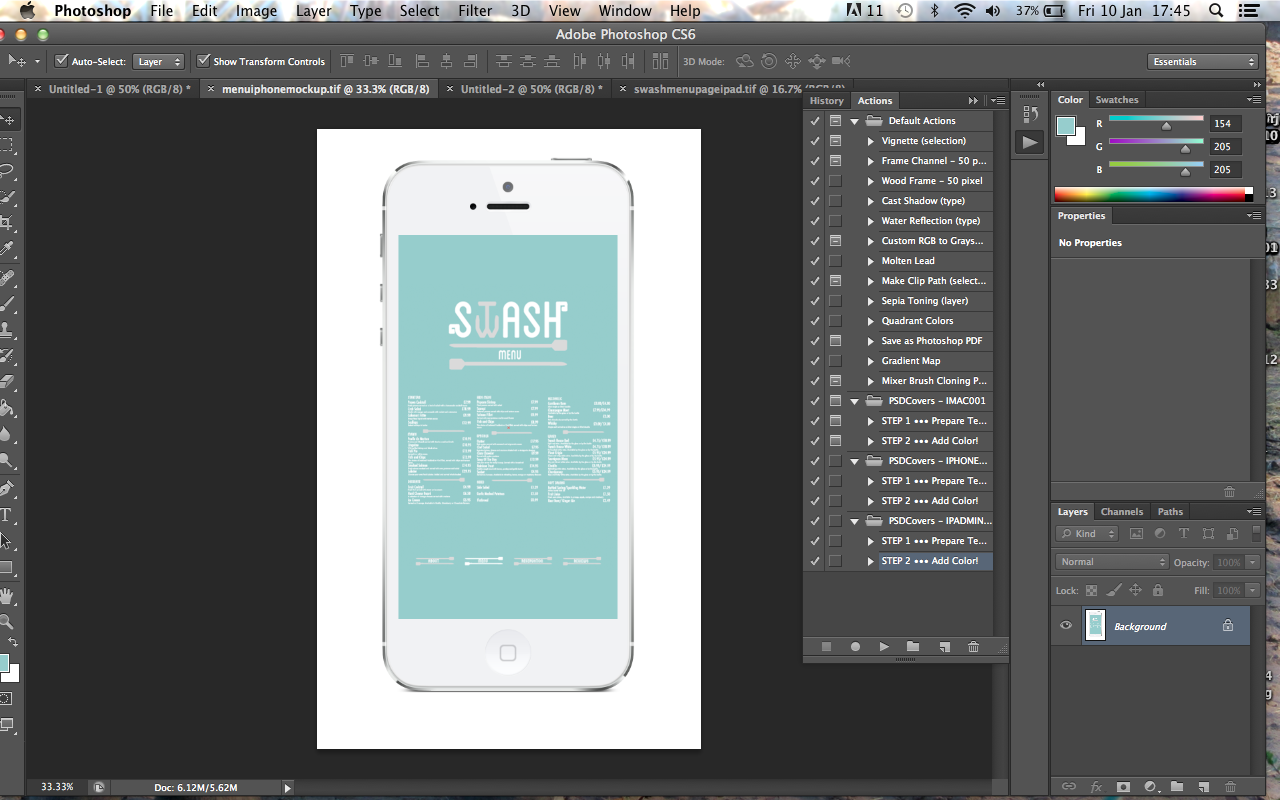
I then applied this layout to an App for an iPad and iPhone vertical presentation to see if this would work on a different layout and for various platforms.
 |
| iPad and iPhone App Vertical Layout |
I was quite happy with the way that it managed to translate from one layout to another. I had to slightly change the format of some of the pages to fit into this layout yet it does show how it can be easily transposed from one format to another and still have a connection.
Superimposing and Proposals
As part of the brief, we need to be able to propose things that we haven't included which are relevant to our idea.
I have never superimposed anything in my life so this is a whole other new skill for me. I documented very well last year about my lack of skill in Photoshop so this is the time to learn something which will be relevant as it will probably something that I need to constantly use to present my work.
 |
| Notes on Photoshop Superimposing |
I was taught a simple method of being able to do this which I could apply to most objects to impose with. I made notes in a step by step guide to follow so that I could try an learn for myself how to do it. It took me a while but I started to get the hang of it.
 |
| Content Aware |
Putting the image you want to change into a Photoshop file, using the Marquee tool, select the area you would like to get rid of and press the backspace button. This comes up with a selection box called Fill. From the drop down menu, select the option 'Content Aware'. Content Aware lets Photoshop make the selected area become the same background as the surrounding area, making it plain and getting rid of any unwanted information. This is more successful when it is done in small amounts and continue until the image has gone.
 |
| Distorting the Image |
Once you have cleared the image of any unwanted information, you can add the image you want to put on it into the same file and place it. To get the effect of the logo being on the wood itself, I selected the filter of multiply so as to make it see-through. Once placed, go into Edit- Transform- Distort to be able to move the image in the corners to the place you would lie it to occupy. If the image you have added is a smart object then you need to rasterise the image beforehand in order to distort it. This makes the image appear like it is suppose to be there.
 |
| Contrast, Brightness and Highlights |
Due to the darkness of the original image, using Image- Adjustments, you can find a range of manipulations which you can alter the image with, making it brighter and clearer. For the sign, I used Contrast, Brightness and Highlights.
 |
| Proposals for Print |
Based on the way that I have produced the Signage, I made a range of printed collateral that could be produced for the restaurant including Interiors, Napkins, Window Signs, Takeaway Packaging and Baskets and Uniforms.
From my website and app proposals that I had previously made, I went onto superimposing them in Photoshop onto an image of a iMac, iPhone and iPad so as to show the various layouts and formats that it could be produced in. I was recommended a website online which has free templates you can use on Photoshop of ways of displaying your work so I decided to use this so that I could get as much of a professional finish as I could.
 |
| Open Action |
You have to open the file as an Action and select both files before opening the action. From here, It will open a file with a blank box and a file with an image of a iMac inside.
 |
| Sizing of Image |
Using the file with the black box, put the image you want to use into this file and resize it in proportion. It may be necessary to add another layer and create a full box with the background colour in to have behind the original image so that the image stretches the full width of the screen. Afterwards, it is important to remember to flatten all the layers so that the file size is compressed.
 |
| Imposing Image onto iMac |
Copy and paste the image from the black file to the iMac image file and it should be exactly the right size. All you need to do is place it into where the screen would be and get ri dog any excess information. Flatten the layers and save as a TIFF file.
 |
| Superimposing Other Pages onto iMac |
From the Homepage, I did exactly the same for all of the other pages in order to get them onto the image and saving them as a TIFF File.
 |
| Website Proposals |
This is the finished imposing for the website and it looks as though it is a live site that is on the internet. This highlights how presenting the images in this way looks much more professional and puts the images into a context.
Then I did the same with the iPhone and the iPad proposals so that they had the same professional effect as the iMac images.
 |
| Homepage for iPad and iPhone |
 |
| About Page for iPad and iPhone |
 |
| Menu Page for iPad and iPhone |
 |
| Reviews Page for iPad and iPhone |
 |
| Reservations Page for iPad and iPhone |
From the iMac website, I did exactly the same for all of the iPhone and iPad proposal pages in order to get them onto the images and saving them as a TIFF File.
 |
| iPhone Proposal |
 |
| iPad Proposal |
This is the finished imposing for the iPhone and iPad formats and it looks as though like it could be a live site or app that can be used when on the go which is what I would like for my customers. This highlights how presenting the images in this way looks much more professional and puts the images into a context.
Design Boards
From producing the Printed Collateral and Web and Print Proposals for the brief, I went onto putting this information and displaying it on some Design Boards so that I could show my work in a more professional context. I used a minimal amount of writing keeping it brief and concise, using lots of images to allow the work to visually stand up by itself.
 |
| Printed A3 Design Boards |
I'm happy with the way that my design boards have come out and think that they are the best ones I have produced throughout the module as there is less writing and have more of a professional layout due to the fact that they are so simple, with the larger sized images spaced out so they are not all squashed onto one sheet.
Overall, I feel as though this brief has gone very well for me as I have put web and print together in design so that they work in coexistence. I think I managed to answer the brief quite well, even though I used type as image for the typographic elements. I am happy that for this brief I have learnt some basic Photoshoppping skills as I had never done it before and the fact that I have learnt to do something on Photoshop makes me feel as though I am an actual proper designer! An improvement could be made on my ability to Photoshop as it isn't the best imposing in the world but it is a start. I am very happy with the outcome of the brief and enjoyed making and producing the brand itself. I think it would be something that I would defiantly like to do again.