We have been put into Groups of 6 and given the topic of our brief which is '5 A Day'.
When we got the topic, we decided to go away and do some research before we came up with any ideas as the initial thing we could think of was Fruit and Vegetables which we felt was an obvious choice (See Design Context Blog)
I decided to come up with some initial ideas that we could work with in regards to the topics that we had thought of looking into
 |
| My Initial Ideas |
Then we had a group brainstorm in order to come up with some possible concepts and contexts to work from as well as possible initial ideas we could use.
 |
| Group Brainstorming Notes |
From this, we came up with the shell of a concept/ idea that mixed 2 areas of interest we had looked into. The idea of having 5 websites you use daily and the idea of encouraging people to use their blog regularly.
 |
| Supplement/ Blog Idea Initial Designs |
The concept of the idea is to have a design website/ blog that can be used by a target audience of foundation/degree students in order to aid them find new inspirations. We thought that we could have it as a blog/ website but also maybe have an email or printed version that could be used as a supplement. The idea of a supplement was run with by Caitlin who came up with the link to having vitamin supplements and the fact that the blog was to aid supplement contextual practise thereby running with the idea of having the information available daily in a pill box. In regards to the content of the blog, it would keep to the 5 a day by having 5 categories with a new inspiration for each category daily thus making 5 a day. Each category would be represented by a pill that would open up to show the contents for that category for the day. In order to advertise and distribute the contents, we could use online adverts, like pop ups, and have posters in relevant areas to encourage users. We would get feedback and see how successful the idea is based on the amount of views we can get.
What I liked about this idea is not just how fulfilled it is as an idea at this early stage as we have a clear vision but the fact that it stemmed naturally and came from a full group collaboration in regards to producing elements of the idea. The way we were discussing and creating amongst each other was very collaborative in regards to the approach to the concepts and ideas.
We presented our ideas in a Progress Crit in order to see the reaction we would gauge and any things we should consider in regards to our idea (See PPP Blog)
After the Crit, we were given the opportunity to write our own briefs and I wrote our brief for our group.
 |
| Group Brief |
As stated in my PPP Blog, it is direct for us to relate to but it isn't very restrictive in regards to content needs so we can be as open as we want and add to it if need be.
We came together to go through potential names that could be used for the Blog. It needed to be something that would go with the medical theme but would link with the idea of the blog. We came up with:
- Design Prescription
- Design Capsule
- Design Supplement
- Doctors Orders
- 5 A Day
- Design Addiction
- Design Remedy
- Injection of Inspiration
- Design Drug
- Design Cure
- The Placebo Effect
- Design Dose
As a group, it was unanimous that Design Dose was a great name that had a ring to it and wasn't necessarily linked to drugs as you could take anything in a dosage.
Individual Development
From this and the feedback we were given, we decided to go away and come up with some design of our own individual being in regards to colour schemes, font choices, imagery and brand promotion. This way, everyone would get their chance to have some input and then we would decide the designs from what we had created. One thing we had agreed on is that the colour scheme should have the colour Orange in it and that the name should be included in the branding.
I started with a design sheet to sketch out ideas for logos and posters.
 |
| Individual Ideas Design Sheet |
I went onto digitising the most successful of these ideas to see if they would be successful.
 |
| Testing Typefaces |
I wanted to try 2 different types of typefaces- typewriter style and sans serif style as they are usually the 2 typefaces that are used on prescriptions and medical packaging. This is due to the need to have legible and readable type when producing medication for people to take so they don't misuse them. The typewriter style ones seemed very outdated and some chosen serif fonts seemed too traditional for the brand we are creating therefore Helvetica seemed the most successful option.
 |
| Development of My Logo Designs |
I developed my logos by digitising them in order to see which would be the best in regards to communicating the brand in a professional yet creative way. I used the idea of having 2 back-to-back D's as the shape of a pill for a logo whilst having the written name of the brand in various positions. This made the brand seem professional and sleek whilst having a simple visual that could be easily identifiable amongst other blog brands.
 |
| Potential Colour Schemes |
I went onto producing some possible colour schemes that may be used for the designs. A consensus amongst the group was that we wanted to include the colour orange based on the fact that vitamins and supplements are usually in a deep shade of ochre. The main colour choices I settled with was a pale shades of orange and blue, normally not to be partnered with due to the fact they are complimentary, however, the shades come across as muted and not too overpowering.
 |
| Vitamin Mock Ups |
Based on the colour scheme, I had to come up with tints and shades that would be available to produce 5 different looking vitamin supplements that would each represent a category. I think I have managed this well and, based on the orange colour, have produce natural looking vitamins due to the colouration. Each supplement is different and has its own characteristics so it can easily be differentiated yet have a consistency that allows them to be similar.
Due to the fact that I had produced my own colour scheme and logos, I went onto thinking about promotional materials. This is something we have considered as a group but not gone into yet so I thought I would produce some designs that could maybe worked from.
 |
| Development of My Poster Ideas |
I used my logos I had come up with as aspects of my poster designs. I included a tag line that would pull designers into reading the poster therefore drawing in the intended audience. I felt it necessary to include the website at the bottom along with the brand identity so that it would encourage people to visit the site.
 |
| My Promotional Posters |
Using just the colour scheme that I had on Illustrator based on the Orange and Purple and the stock colour of white, I managed to produce some promotional posters that could be used based on the identity I have come up with. I think they are simple and bright which will catch the eye of people to see what it is. The tag line is used throughout so that it gives the viewer an entry into the meaning of the poster and the brand is at the bottom so it doesn't interfere with the poster message. Not only this but, due to the fact that people read in this way, it would allow for them to make sense of the communication behind the posters.
 |
| My Mock Up of Possible Physical Presentation |
Other areas of promotional materials include the prospect of having physical objects that people could take away with them as usually people respond better to something that is physical. The idea of having a stand with pots that have the brand name on that people could take away with them would be quite quaint and interactive. They could include sweets inside that could be like physical supplements with leaflets of the posters either to take away with them or rolled up inside the pots.
 |
| Physical Packaging, Leaflets and Packs Mock Up |
I further developed this concept with the idea of maybe producing take away paper bags, in the shape of pharmacy prescription take away bags, that were coloured with the identity and logo so that it was in keeping with the theme. Plus, it would seem a bit more authentic perhaps, like they had actually been given a physical supplement to take away with them.
 |
| Possible Physical Display Mock Up |
I decided to produce a mock up of a promotional stand we could create using the collateral, using perhaps using large A2/A3 poster on walls to promote the brand and having a display for people to interact with to encourage them to visit our blog site.
 |
| Potential Banner Mock Ups |
I felt that we would need a banner to go on display for our blog at the top. I wanted to keep it simple and sleek in its presentation in order for the work to give the blog a professional edge. I think that they have been most successful in this endeavour, however, they would have to be tried on the blog itself to see whether they would be successful.
 |
| Possible Blog Layout Mock Ups |
From that, I went onto making some mock ups of the blog layout to see what we could possible come up with. I feel that the orange background is more effective than the purple yet again this would be best applied to the blog to see whether it would be possible. The only problem is that the media is restrictive in a sense as there are set standard layouts and fonts to choose from which may effect the outcome.
Blog Set Up and Daily Posts
In order to make it so we could have 5 equal posts a day, 5 of the group members, including myself, would be posting on the blog once a day, tagging ourselves in the posts so you could easily select a name and see who had posted what. This would be relevant to the brief as there would be 5 posts a day. As there are 6 group members, we designated that the last member would work on the twitter site to generate a readership.
We made a Wordpress account as we had been told that it would be the best blog that would give us a professional aesthetic that we would be able to customise in a relatively easy way.
 |
| Set Up of Wordpress Blog Account |
In order to visit our blog, you can go to this link:
http://thedesignersdose.wordpress.com and you can find any post I make by clicking on the tag 'Charlie'
From the initial set up, Ellen created a tester post to make sure that the account worked before we started to blog post daily. From that, we were to post once a day each to meet the needs of the brief as well as the blog.
From this, we also had Rinesh set up a website (Available from this link:
http://designersdose.wix.com/thedesignersdose) and a twitter feed to drum up traffic of people to look at our website and blog posts.
 |
| First Post- Product and Packaging |
 |
| Second Post- Editorial and Publishing |
 |
| Third Post- Branding and Identity |
 |
| Fourth Post- Retail and Promotion |
 |
| Fifth Post- Information and Wayfinding |
 |
| Sixth Post- Product and Packaging |
 |
| Seventh Post- Information and Way Finding |
 |
| Eighth Post- Retail and Promotion |
 |
| Ninth Post- Editorial and Publication |
From this point onwards with the blog, we decided to focus on one specialism each to make the amount for each section fair. We took names out of a hat and from now on, my blog posts will solely be on Product and Packaging.
 |
| Tenth Post- Boxed Water is Better |
 |
| Eleventh Post- Drip With Song |
Some of us have decided that we are going to continue posting to the blog after the end of the 3 week brief as we feel as though it is something that we have started that can continue to grow and will help us contextually.
 |
| Twelfth Post- The Barber's First Gentleman's Care |
 |
| Thirteenth Post- DayTrader Board Game |
 |
| Fourteenth Post- Chocolate's With Attitude |
 |
| Fifteenth Post- Fairminds Paper Craft Kit |
 |
| Sixteenth Post- Essential Patch Packaging |
The group had a meeting where we had to present what we had done individually so we could make some informed choices based on the designs of the blog so we could move forward. For the colour scheme, it was decided that its to be teal and deep red.
 |
| Chosen Colour Scheme |
It was also decided to select Amy's logo and Caitlin's vitamins for the overall brand and identity.
 |
| Caitlin's Vitamins |
 |
| Amy's Logo |
I was to be the person to write the 'About Me' section of the blog/website in order to introduce ourselves to the readership.
 |
Original
The original draft was good as it gave a brief introduction to the reasons behind the blog but had no reference to any of our own influences that will go into the blog.
|
 |
| Additional |
Then I had it reviewed as I added an extra paragraph to the original describing what we are influenced by and the blogs purpose. It was decided that it was a bit too wordy and it would be best just to simplify it a bit.
 |
| Developed Final |
The final section had a combination of both paragraphs into one with a much more simplified ending to it. This was unanimous in its success as it kept it easy to read with a hint of formality in its introduction to us.
Next, we had a Progress Crit where we demonstrated where we had got up to with the brief and were given feedback to consider (See PPP Blog)
From the Crit, we decided to hold a website launch event to promote the brand in a physical manner. The group decided that we needed to delegate each other jobs in order to be able to producer promotional materials, which are posters for the event, posters to include submissions for the blog, water bottle packaging, business cards and flyers/leaflets. To make it fair, we put our names into a hat and chose them at random. I was designated with the packaging band for water bottles to give out to potential audiences as well as sourcing the cheapest option. The idea stems from the fact that to take a vitamin or pill, you need to take it with water so giving bottles of water will emphasis the medical theme. Not just this but people will tend to carry bottles of water with them so this would give our brand a much more far reaching exposure of an audience as the packaging will promote the brand.
I started with a design sheet of considerables and possible layout designs.
 |
| Design Sheet for Water Bottle Labels |
From the design sheet, I went onto to digitising the layouts to see which would work best.
 |
| Water Bottle Labels |
I like the patterns and layouts that I have created as they would probably all work as a successful water bottle design. I wasn't sure whether or not they would carry enough information that was needed so I may have to revise these ideas.
 |
| Bottle Top Packaging |
Another way of labelling it could be based on having a label covering the bottle top instead and going around the neck of the water. The circular shape, however, is difficult to use and work around.
 |
| Bottle Top Tag Labels |
The idea of using a tag label is quite quaint and classy yet I wasn't sure whether or not this would fit in with the aesthetic of the water bottle and the plastic material used.
I went onto sourcing the water bottles in order to be able to get them for the event. If I was to continue my progress then I would need to have some to use so that I could test my ideas out on them. We decided to look into bulk buying just plastic bottles and fill them up ourselves but you could only buy them in thousands which was too many and not cost effective.
I went onto using a price comparison site so compare them to see which would be the best fitted for our brief as well as what would be the most cost effective. I found that I could get 10 packs of 6 for £7.90 in a 330ml bottle which I felt was suitable due to the size and the cost.
 |
| Bulk Bought Bottles |
 |
| Individual Bottle Used for Testing |
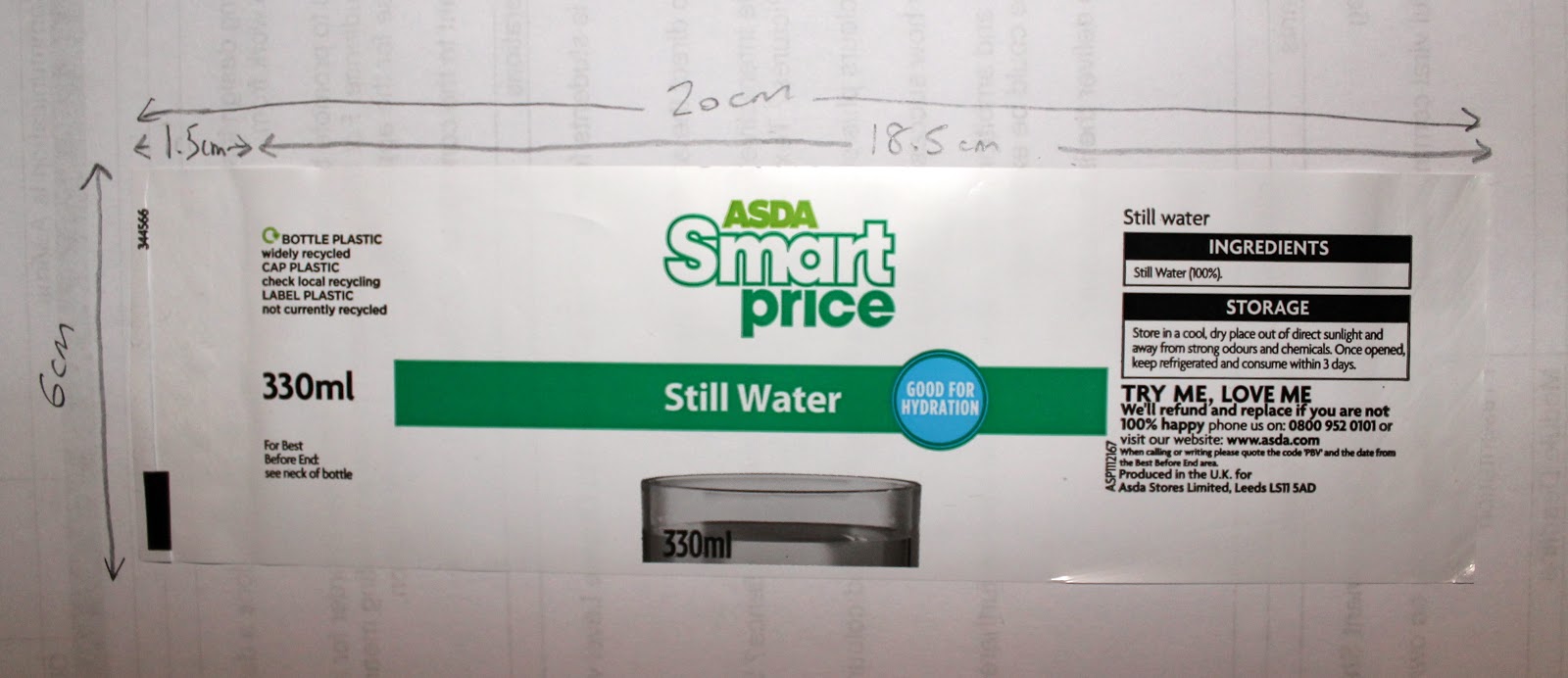
Using one of the bottles as a tester, I took measurements to determine the necessary sizing for the possible label to fit.
 |
| Measurements of Label |
Then I went onto printing off some mock ups that had been measured to a scale of the label and seeing which would be the most successful label type.
 |
| Mock Up Designs |
 |
| Mock Up Designs Printed |
I started with the traditional wrap around bottle label.
 |
| Bottle Labels |
I felt these were very successful but the burgundy colour was a bit weaker than the teal thereby not adding to the identity of the brand, which defiantly cemented the colour scheme that I would use if I was to produce it on a mass scale.
 |
| Bottle Top Packaging |
The bottle top packaging is quite an odd shape and doesn't fit as securely as the previous labels so they wouldn't be successful if we were using them as a chosen ones as they would easily come off which help the promotion of the blog.
 |
| Bottle Top Tag Labels |
The label tags were a nice idea and a little different but they don't really suit the aesthetic of the bottle itself as the labels seem quite dainty whereas the bottles seem quite harsh and plastic.
From the designs that I printed off, I felt that the most successful bottle label were the first ones as they seemed to fit in better with the general visual identity of the brand.
I selected what would be my final design choice as I like the pattern style which makes it seem young and refreshing, therefore being relevant to the target audience.
 |
| Final Design Choice 1 |
Despite this, after looking at the rest of the groups posters and leaflets, I realised that my busy design, even though it uses a quirky and interesting pattern approach, wouldn't look in keeping to the rest of the groups designs as they are more simplistic and use negative space. I decided to re-design my label so that it would fit more in keeping with the uniform of the designs so that they resembeled each other.
 |
| Final Design Choice |
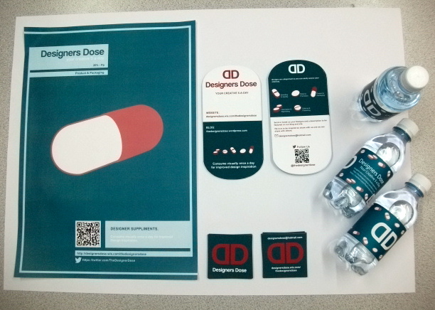
I felt that this design would be more successful as a bottle label as it includes the necessary details on it and colour scheme. It has the inclusion of the pills which is necessary to the branding of the blog with the name, tag line and logo being the most predominant. The fact that it also has the use of negative space means that it links in well with the rest of the designs so it has more of a consistency. My group were happy with the design itself, however, suggested that I would have to make the Twitter QR Code larger otherwise it wouldn't be able to be read by a mobile device, therefore I made it larger and was then tested by a group member who found that it worked.
In order to print out my labels, I had to import my design into Photoshop so that the colour would come out successfully.
 |
| Finished Label in Photoshop for Print |
 |
| A3 Print Out for Labels |
I went onto producing 64 versions of the label on A3 sized sheets of paper to print off. I printed more than 60 just in case anything went wrong in production. I have printed them on a Laser-jet printer rather than a professional print and stock choice due to the fact that it will keep the costs down based on the volume and lack of a profit from it.
 |
| Printed Labels |
 |
| Cutting Down to Individual |
By cutting them down and assembling the bottle labels ourselves, we were able to attach them using double sided tape.
 |
| Individual Bottle with Label |
 |
| All Bottles with Labels |
I am extremely happy with how my bottles have turned out in regards to being promotional material. They look extremely professional and fit in with the rest of the promotional material that the group has done. I feel like I have made a valuable contribution to my group from this. If I was to suggest a negative then I would perhaps have made the labels a little larger so they wrapped around fully, however, I had measured them properly so I don't think it was my calculations that were the problem.
Not only myself but the rest of the group managed to produce the promotional material that was necessary. As a group, we have created a uniformed identity for the brand which is clearly the same yet has the visual styles of us all as different people which provides nice different presentations of the brand.
 |
| Caitlin's Promotional Poster |
 |
| Sam's Leaflets/ Flyers to give out with the Water Bottles |
 |
| My Water Bottles |
 |
| Ellen's Business Cards |
 |
| Promotional Material |
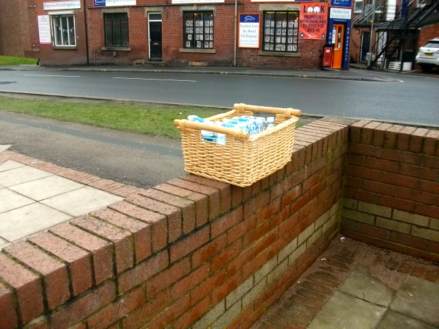
After creating these, we went onto doing our promotional event where we went up to people and gave out the bottles of water alongside a leaflet or a business card in order to promote our website. We took some photographs of the event to record this.
 |
| Bottled Water in Basket ready to Hand Out |
 |
| Members of The Group who took part |
 |
| Photographs of us handing them out |
All of the bottles of water ere gone when we had finished, we had ran out of leaflets as well. We think it went really well as we managed to target quite a few groups of people yet the successfulness of it will soon be seen as to whether people will actually look at the blog and website. Despite that, I think we did well promoting it.
To show that our brief was successful, we need to be able to prove that our communication worked.
 |
| Print Screens from Blog showing Statistics |
As you can see from the print screens, we have managed to get quite a lot of people to view our blog. We have a lot of twitter followers who can link to our blog and see the posts. From this, we have very slowly started to gain blog followers as well. I think if we continued this on then we would be able to amass a bigger following via the blog readers and it would be successful.
As part of the brief, we needed to produce 3x A2 boards showing the Concept, Content and Method of Delivery for the brief. The group decided to make them digitally. Ellen and Caitlin made the Concept board, I made the Content board and Sam made the Method of Delivery board.
 |
| Ellen and Caitlin's Concept Board |
 |
| My Content Board |
 |
| Sam's Method of Delivery Board |
We decided to do them digitally so that we could put them into our presentation. The last part of the brief is to present what we have done in a presentation to show what we have achieved and whether it has been successful.
 |
| Powerpoint Presentation |
We kept the presentation very simple without a lot of detail. This was because we wanted to have a lot to talk about whilst we were giving the presentation and didn't want it to do all the work for us. We are going to be showing physical promotional materials as well as perhaps show the website and blog itself so the presentation is going to be based more on the physical using the Powerpoint as an illustrative tool.
Caitlin: Blog Promotional Posters, Blog Posts
Sam: Leaflets, Blog Posts
Amy: Other Work Submission Posters, Blog Posts
Ellen: Business Cards, Blog Posts
Rinesh: Set-Up, Design and Running of the Website and Twitter
Me: Water Bottles, Blog Posts
Update:
Up to submission point, I have been continuing on Designers Dose single-handedly and is currently celebrating having over 100+ posts
 |
| Current Designers Dose |