As part of the Responsive Module, we needed to enter a competition which had quite a large brief so it would be our main independent brief. Having looked at all of the D&AD and YCN briefs, I decided to do the National Trust brief for D&AD New Blood.
 |
| D&AD New Blood National Trust 2014 Brief |
I started by highlighting areas and information of interest so that I can focus down onto what the brief was asking me to do.
 |
| Brainstorming |
Through the studio sessions, we went onto coming up with initial ideas and research (See Design Context Blog) before moving onto breaking down the brief to make it more focused and easier to manage. (See Responsive- Design Process 2 Studio Session Blog Posts).
 |
| Initial Ideas |
Out of all the ideas I came up with, the most successful was an idea of producing print collateral for a kit that young families could use during their time at a National Trust site so as to make the most of the time that they have their. Using the memories that they make as a family, the positive emotions they get from the experience will make them what to come back and enjoy the outdoors as they will associated the brand and nature with positive memories. The kit will include things they can use to have a successful time out site like a treasure hunt game, some seeds for flowers to plant, a disposable camera to record the day and some picnic utensils alongside membership cards and free parking stickers. This will be packaged in a picnic basket which will have a tag on it.
 |
| Re-written Brief |
Through this, I rewrote the brief to become more bespoke to me and the audience I identified alongside the idea I had come up with.
 |
| Idea Development |
I went onto making another Design Sheet developing the idea further, thinking about the design of the kit and what I could include inside. I wanted to expand on my initial sketch to make it more detailed and considered.
From the development, I went on to mocking it up digitally.
 |
| Identifying the Typeface |
 |
| Difference between Bold and Regular |
The first thing I needed to do was to work out the typeface that was being used for the National trust brand. It took a while but, using the Identifont website, I was able to work out that it was Optima. I looked at other typefaces that I could maybe use to coincide with a more friendly, younger audience but I wasn't able to find any that I felt was suitable. Realising that the Optima font in the brand is bold, I tried it in just a regular style at it came across as more friendly and approachable. I have decided that this is the typeface that I am going to use.
 |
| Illustrations |
Knowing that I would need to produce a brand for my campaign, I wanted it to link with the already existing National Trust logo of a tree. The idea of natures growth and family growth made me think of seeds and saplings so I produced an illustration of an acorn seed (which is within the original National Trust logo) and an illustration of a sapling to show the youthful target audience that the campaign is appealing to. The logo needed to be approachable for young families so it had to be something which was recognisable and to do with nature.
 |
| Logo Designs |
I played around with the possible logo designs as I wasn't sure which would be the most inviting and reflective of the campaign intentions. I liked the idea of having the National Trust logo encompassed into the logo of my campaign to show a connection and unity between the two.
 |
| Chosen Logo Design |
This is the overall design that I chose as I felt it was the most inclusive and came across as a more up-to-date version of the already existing current logo. This allows for a unity amongst the brand identities and will allow for my campaign to highlight the connection between the new and the old.
 |
| Logo Icon |
What is great about this logo is that the image of the tree in the acorn can act like a icon so that the full logo doesn't have to be in use to communicate that something is part of the campaign. This individual imagery adds to the modernity of the campaign and how younger people will connect with the campaign as we are in a world where things are recognisable based on just a single image.
From this, I went onto looking at possible colour schemes that I could use to go along with the campaign identity.
 |
| Colours for Colour Scheme |
The colours that I focused on were colours that were based on giving the impression of nature and woodland which is paramount to the brief. I looked at the lighter colours to go along with darker tones but I didn't want them to be too cliched so thats why I felt that the lighter shades were necessary.
 |
| Colour Experimentation |
I went onto experimenting with these colours to see what combinations I could come up with. I felt that a lot of the combinations I came up with were very dark and disconnected the type and image. I thought that with the impending crit coming up that I would be able to get feedback on this from the members of my crit group.
I had an Interim Crit based on the work (
See PPP Blog) and research I had done so far which I had to show by producing 3-5 Design Boards and was given some considerations and ideas that were very good. I responded to my Crit feedback by developing what I had done so to improve further.
From the crit, I felt that I needed to consider a digital response to the brief as I hadn't considered this yet. This would be something that I consider the further on I get into the brief as I would need to sort out the definite visual identity of the campaign.
 |
| Final Logo Design for Campaign |
From the logos that I had produced and showed during the Crit, my group stated that this was the one that they preferred because it was more cohesive and less disjointed and dark than the rest of the designs. I went onto making the text a darker brown like it is for the tree so that there is some distinction and makes it easier to read.
 |
| Colours for Different Sites Visited |
I played with this by putting different colours into the acorn and felt that this was quite fun and could be used to represent different National Trust sites. This could be stamps that are put onto the picnic basket label which record which different sites the family have been to, as tokens of their time there.
 |
| Colour Schemes for Products |
I knew that to produce my collateral for the kit, I would need to have a colour which would work alongside the logo design. I went for pastel shades which I felt were quite informal and youthful but found that this wasn't working out in regards to the darker colours, with the logo being more successful when put alongside complimenting colours like oranges and yellows.
 |
| Colour Scheme |
From the success of the lighter colours, I decided to go with a very light shade of yellow as any slightly darker shade seemed to overwhelm the logo design and make it very difficult to see. I felt that the light yellow was quite innocent and easy on the eye, seeming quite welcoming and warm to new members.
Print Collateral:
From this decision, I went onto developing the collateral starting with a membership card.
 |
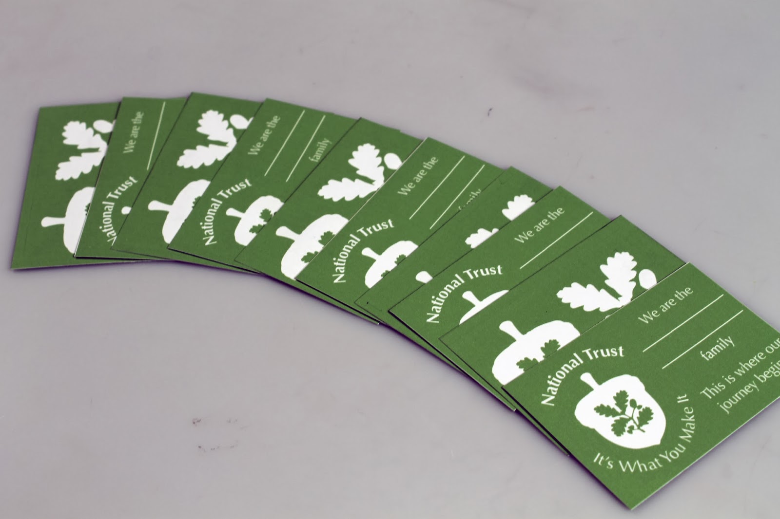
| Membership Card Development |
The main thing I did for the Membership card was develop different layout variations as well as different fronts and backs of cards. This would give me a wider scale to choose from. I liked the use of the illustrations on the front rather than having the logo because the logo seemed to make it appear more formalised. I liked the idea of having a family photograph onto the card because I felt that it would make it more personalised to said family, however, if the young family had any other children then this would mean that they wouldn't be able to update the card. With this reason, I felt that it was necessary that I just have the family name that they could include singularly.
 |
| Membership Card Final Design |
From the variations in layouts that I produced, I felt that these were the layouts which were more appropriate from the previous reasoning. I used the terms 'We are the' and 'This is where our journey begins' to show an inclusivity within the family unit, highlighting how no one is left out and they do it together.
 |
| Parking Sticker Designs |
Based on the visual aesthetic of the card, I mirrored it in the design for the parking sticker. Usually, with parking stickers, they would be peeled off and need to be a whole design which is cohesive and unified rather than having bits of type or image sticking off the end which makes it difficult to use and fiddly. The logo of the campaign itself doesn't really lend itself to this so I produced a simplified version using the illustration of the logo icon, which would allow for the sticker to be in the shape of an acorn. I felt that this left hand side design was much more viable for this purpose as it would be a single whole image and therefore, appropriate to the needs of the product whilst still being obvious as to the reason for it.
I then started to look into the picnic basket label and how I could present that in an appropriate way.
 |
| Picnic Basket Label Final Design |
Traditionally, a picnic basket label is usually a rectangle so I produced the label originally in that format but felt that it was very bland and plain. I changed it slightly so that it was more of an arrow shape which gave it more of a rustic, organic feel yet this also seemed quite plain. I felt that I could do more with the layout so felt it would be more different and reflective of the campaign brand if the label was an acorn shape. I had to change the layout of the content but I felt that it instantly gave the individuality that the basket label needed.
 |
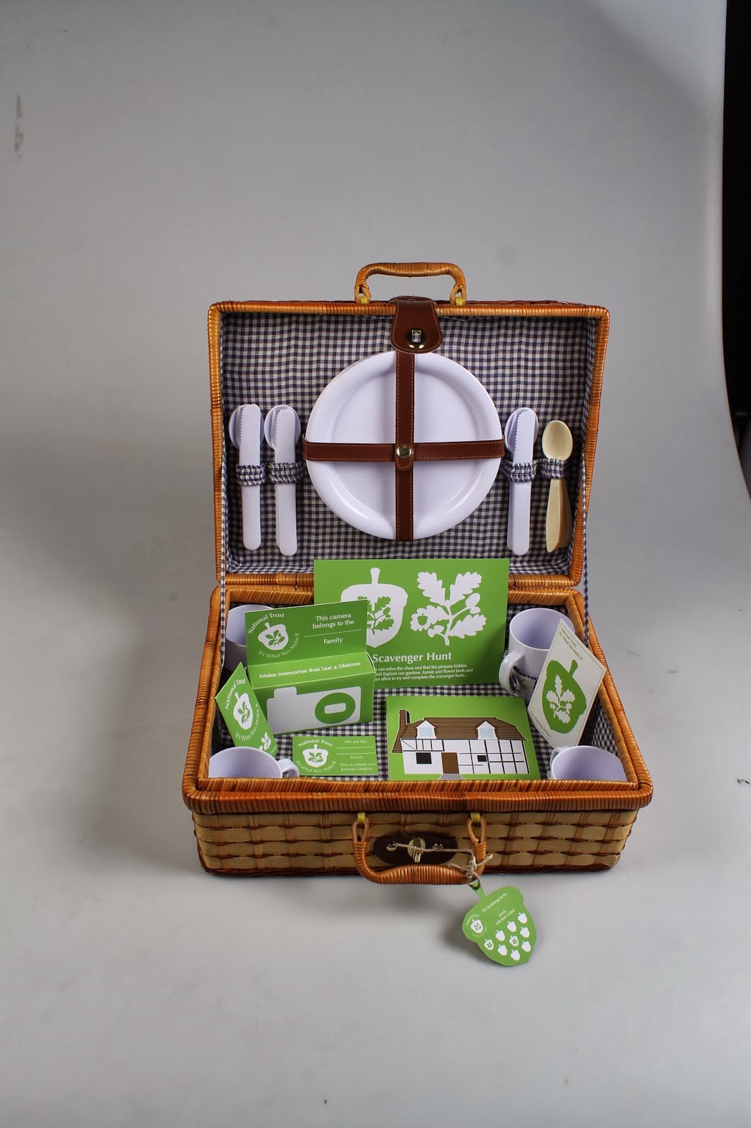
| Picnic Basket |
From the label, I needed to be able to acquire a picnic basket for the actual kit otherwise designing this would be redundant. I managed to find myself a picnic basket in Oxfam which was very appropriate as it still had a range of picnic utensils within. I thought that it would be good as I would be able to impose the label onto them and make it as part of the overall kit.
 |
| Label Tester |
I printed a mock up version of the label as a tester to see whether it would work as a shape as well as be able to see the size of the label when in conjunction alongside the basket. I felt that it was very fitting in regards to the size and shape of the basket as it was readable yet it was also not too distracting and didn't get in the way of the handle when it was being held. I attached the label with some string as I felt that it went alongside the natural ethos that National Trust have.
In regards to mock ups, I knew that if I was going to include some packaging for a Disposable Camera and some seeds that I would have to get the measurements and nets correct.
 |
| Measuring the Net of the Camera |
To do this, I dismantled the packaging so that it was just down to being a net and then I measured out each individual side to get the right sizes.
 |
| Illustrator Development |
Then on illustrator, I used the line tool to be able to get the right sizes for each of the lines which meant that the design I produced on the software would be the exact measurements to reproduce the box. Then I had to work the design to the dimensions and shape of the net which was quite confining and difficult as I had to work, thinking of the placement and how the image would be the right side up on the net.
 |
| Mini Mock Up of Camera Packaging |
I printed out a small scale version of the net in order to try it out for myself and see if it would work. It pretty much did apart from the sides of the camera which didn't reach the close properly so that the sides couldn't shut. I know for when I print out the proper one that I will have to slightly adjust this.
 |
| Mock Ups of Current Collateral |
I felt that the mock up for the camera packaging was great because it showed me if I had any faults or problems with the making of it. I decided to print and produce mock ups of the other collateral I had made up to this point so I could see what they would be like.
 |
| Seed Packaging |
I did the same process for the seed packaging as I did with the camera packaging by breaking it down, measuring it out and producing a exact measurements version on Illustrator.
 |
| Mock Up Version of Seed Packaging |
Again, I printed out a copy and made a mock up version so that I could see if there was any problems with it. I found that it was pretty much perfect except that I could do with making the top flap slightly smaller so it wouldn't cover the writing when it would be closed, making for a more professional aesthetic.
In order to get my point across within my next crit coming up, I photographed the kit s far just to visually show what I was going to produce.
 |
| Kit Proposal |
In the proposals, I included my mini mock ups as well as the cutlery and a flask so that it looks more of a well-rounded kit. To give the impression of being a finished product, I showed how the label would look attached to the closed picnic basket and it gives the impression of being a closed kit.
Using some of the photos I took, I put them into Photoshop and imposed the campaign logo onto the plates and cups to give the impression of a more cohesive kit as well as showing how, if I had the know-how, I would produce the kit with this detail on them.
iPhone and iPad Proposal:
To make sure that I fulfil the brief, I needed to have a digital element to my work so that there was an integration within the campaign.
I had a really good idea come of the crit that I had where it was suggested that I produce an website proposal based on the concept of the picnic. I felt that it would be much more relevant to the target audience if an app proposal was produced instead as it would appeal to the younger generation and, these days, younger children use apps as well.
For pages, we came up with the idea of having a page for a walk around the area of the site, a checklist of things to bring with them and a list of picnic games which could be updated on a weekly basis or that people could submit suggestions.
 |
| Icon |
The icon just depicts the campaign logo which highlights that it is different to any other standard National Trust app, specialising in just the campaign itself.
 |
| Loading Screen |
The loading screen would show the illustrations to symbolise growth, highlighting how the page is developing with the loading. The images will become darker as the app loads to show a visual development of the app.
 |
| Homepage |
The homepage is very basic but structured as the user is instantly orientated as to the sections of the app and they know what it is for as the logo of the campaign takes up most of the room of the app.
 |
| Roll Over Effect |
 |
| When a Page Is Selected |
So that the user experience is heightened, I would have a roll-over effect so that the user would know what image they had selected. The colouration would change on the image so that it was saturated with the outline visible so that they can see where the image would be.
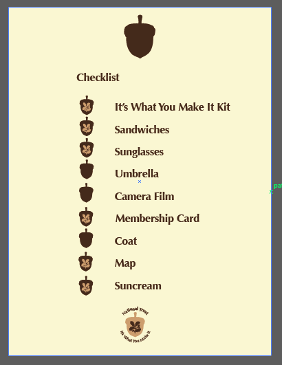
For the app, I have suggested 3 different pages it could have but to show what it would be like, I decided to only show one of them in the proposal. For the checklist of things they could remember to bring, it would be weather dependant but a lot of the time when you have a family to plan around it can be easy to forget essentials. I felt that this could even be extended to maybe having families personalise it to a list which would be appropriate to them.
 |
| Checklist Page |
The main thing that orientates the user was the fact that the image has the button it has been paired with at the top of the age so that they know what button they pressed to get there. At the bottom of the page is the campaign logo which they can press to go back to the homepage. I felt that the original layout was too cluttered and sporadic, with the content being too big in type size and scale.
 |
| Finished Checklist Page |
In order to improve the general layout of the page, I scaled down the imagery and type sizes so that it would work in a focused, single linear line. This made the information so much more easier to focus on and made it much more readable. The only problem is that the page seems a bit plain so this would be something that I think will be picked up on in my Final Crit.
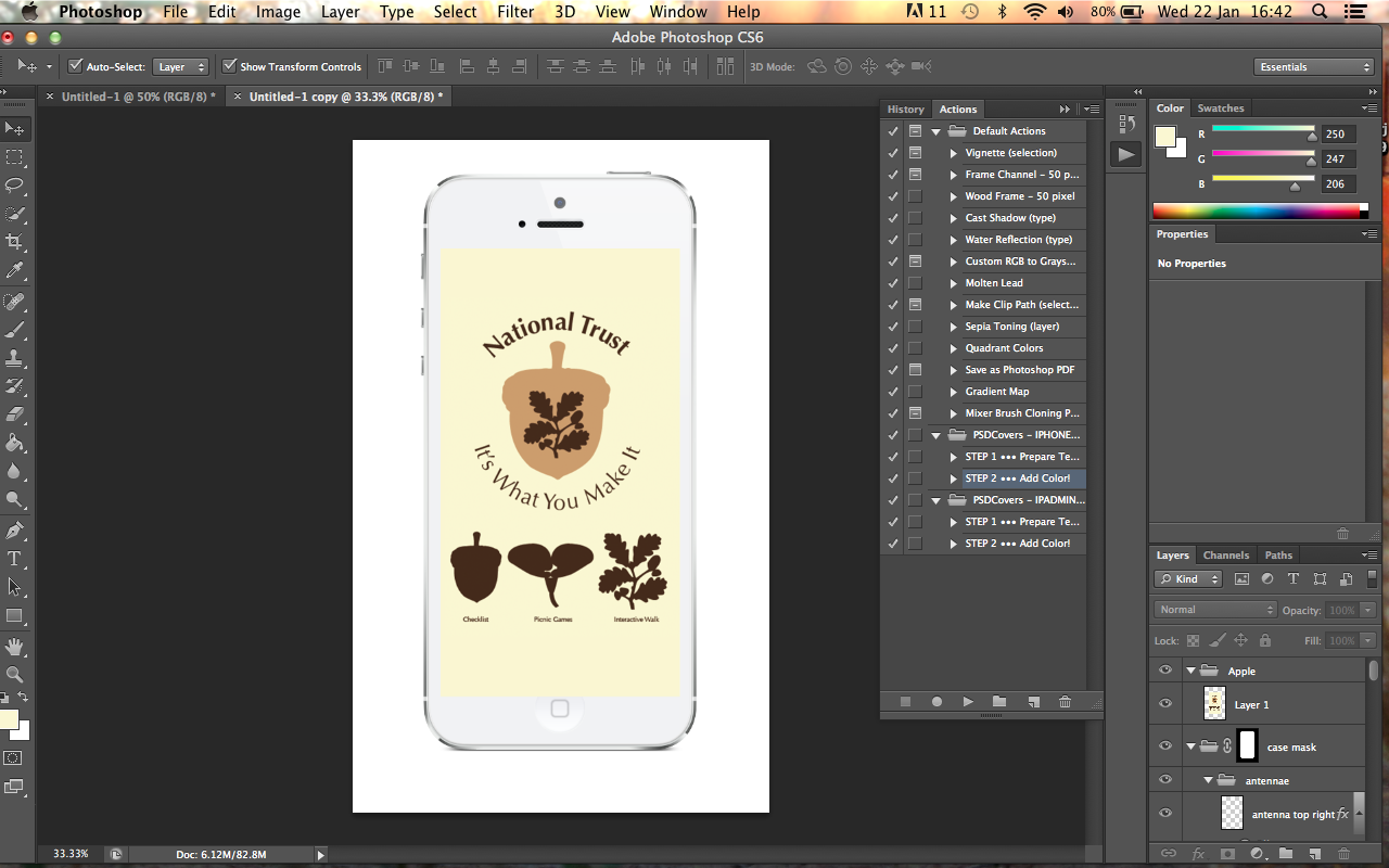
For the proposals to look professional, I put the images in Photoshop, re-sized them, flattened them and imposed them onto a stock image of an iPhone so that it looks realistic and would look like how it would be if it was being used.
 |
| iPhone White Proposal |
I produced the mock up onto a white iPhone mock up which is what I have been doing for my other briefs but, due to the delicate light beige background, this came across as very faint on the white iPhone so it was very difficult to see.
 |
| iPhone Black Proposal |
In response to this, I produced it again but downloaded a new Photoshop action which I set up for a black iPhone mock up. This comes across much more clearly and can be visibly seen.
I had a Final Crit based on the work I had done so far and had to produce 5 Design Boards for it. I was given some considerations and ideas that were very good (
See PPP Blog). I responded to my Crit feedback by developing what I had done so to improve further.
The main thing that was picked up on in my Crit was the need for a brighter colour scheme that could improve the whole demeanour of the campaign so that it comes across more youthful. I can understand where these comments have come from and decided that, in order to move forward, I would need to rectify this straight away.
 |
| Initial Colour Development |
I started by using very bright colours with contrasting colours for the letterforms, which I found was actually quite tacky and too overwhelming. What I did like though were the logos which had just one colour throughout as it made for a clean visual whilst still being bright and colourful.
 |
| Pastel Colour Development |
From the initial colours, I focused on having just one colour throughout the logo and it looked much more youthful. This left a white silhouette in the middle of the logo which was white due to the empty spacing. I decided that I really liked the effect of having the white alongside the colour as it made it seem bolder and, also, it would be cheaper to produce print collateral for as it would be one colour. I decided to go with pastel colours to see what effect this would have on the design but I felt that this was still a little bit plain.
 |
| Bright Colour Development |
From this, I went onto producing much brighter versions of the colours which instantly added an energy and a spark to the overall identity that my previous colours had been missing. Straight away, it didn't seem plain or boring at all. I applied the colours to the Basket Tag, Membership Card and Logo so that I could see what it would look like on a range of the collateral. From the three colours I had gone with, I decided to go with the green colour as it was most in keeping with the ethos and purpose of National Trust whilst still keeping the fun and boldness of the campaign.
 |
| Colour Scheme Change Throughout |
Due to the colour scheme change that I have just decided on, I had to go through each of my collateral that I had already designed and change it throughout, making it fluid and strong so that it works as a collective. I m very happy with the way that my work looks now, like it has been given a new lease of life through working on the comments that was given to me by the Crit.
The next thing I needed to get done was produce the treasure hunt game that I was going to include within the kit.
I felt that it would be a good idea for the children to be able to walk around the grounds of the National Trust place and be able to find objects that would be hidden but are easy to find so that it is easily spotted by younger children. I thought it would be an idea for them to bring the cards with them when they find them but then this wouldn't be feasible because only one family at a a time could do the game. I thought about a photograph but felt that this would mean they would need the kit and I felt that the Kit could be the reward they get at the end and the hunt being the initiation into the campaign. Eventually, I thought about the family carrying a card that they can fill in when they find an object, writing where a bouts they found it as well which they can give to a member of staff and therefore fulfil the hunt to get the kit. This means that the treasure hunt would become a scavenger hunt instead.
I felt that it would be a good idea to use images associated with National Trust whilst at the same time, things that were easily recognisable such as buildings (Cottage, Castles and Windmills) and nature (Oak Tree, Bee and Sunflower).
From this, I went onto producing the necessary illustrations for the scavenger hunt on Illustrator.
 |
| Illustrations |
The illustrations I made were not too detailed and quite bold and colourful so that they would be easily noticeable when they are hidden. I wanted the illustrations to not be too difficult to realise what the illustration is of so that younger children would be able to recognise the object straight away. The lifework of the illustrations is in white so that it goes with the current colour scheme of white and green.
 |
| Illustrations on Background |
I put the illustrations onto a square background which will be printed off as a board which can be put into the gardens. The fact that they are on a background will allow for the images to be stuck or placed into positions without damaging the actual illustration which is the most important.
 |
| Logo as a Background |
To highlight what the images are for for people who are members of the National Trust but not for this campaign, I am going to have the logo campaign at the back of the square background so that it gives a context as to the purpose of the images.
 |
| Possible Front of Card |
For the scavenger hunt to be successful, there needs to be a card for them to have clues to what they are looking for and be able to write their answers down on. In regards to the front of the card, I made a range of layouts so that I had something to look back to because I knew that the front of the card would be determined by the layout of the back.
 |
| Possible Back of Cards |
The way that the clues are listed is reminiscent of the App that I am producing so I have done it in the same style for consistency between the printed and digital collateral. I felt that the design which had some text at the top of the card and smaller spacing for the answers looked more professional.
Out of the Front and Back designs, I liked the bottom designs however, the text is the same for the back and the front.
 |
| Different Variants |
In order to make the front and back of the designs different, I changed the text so that they weren't the same. I felt that by using the logo on the front when I had already used it on the back, it came across as being quite stagnant and not as fun. I tried it with the illustrations instead and it did look more family friendly and fun.
 |
| Final Design |
Based on that, I decided that I would go with the illustration version rather than the logo version for the front. In order to print, I made the colour for the front expanded so that there would be no white bits left.
From this, I had designed all of the printed collateral components for the actual kit so I needed to get them printed out so that I could produce them.
 |
| Printed Collateral |
I was really happy with the way that the designs had been printed due to the fact that when you use different thicknesses of paper, it can sometimes print out in different shades of your colour but this has come out the same throughout. The only problem with the printing is that the membership cards and label page didn't print out well in regards to being perfectly double sided which meant that they were uneven compared to everything else which was perfect. In order to counter-act this for the images that we have to present, I am going to cut out the fronts and backs individually so that this mistake is hidden.
 |
| Scavenger Hunt Illustrations |
The illustrations had been printed on a thick white mount board so that they would be stronger to withstand being knocked about or handled by visitors better than if it was a lesser thick stock.
 |
| Plant Seed Net |
 |
| Camera Net |
 |
| Scavenger Hunt Card |
 |
| Membership Card and Basket Tag |
I printed these components out on a white Cartridge paper which would match the white mount board for the illustrations whilst also working with the colour scheme as it would make the white of the colour scheme pop. The cartridge paper gives the components some thickness without being too difficult to bend, in regards to the nets.
 |
| Printed Car Stickers |
I printed off the stickers for the car using the cutter so that it produces an exact cut out shape of the acorn.
I went onto crafting my elements of the kit.
 |
| Crafting |
Some of the elements, like the membership cards, I was able to cut out using a guillotine yet, in order to get many of them, I had to cut them out using a craft knife and a ruler so that I was able to produce the correct shapes. I have been having trouble with my crafting as of late so I saw this as a great opportunity to put it into practise.
 |
| All Elements of the Kit |
Once I had cut out and crafted all of the printed elements of the Kit, I was really happy with it as it looked like it was actually coming to life. All of the elements worked really well with each other and I was very pleased with the outcome.
The next thing I had to do was craft and produce the nets of the Seeds and Camera Packaging so that they work and fit perfectly.
 |
| Seed Packaging |
I managed to produce the packaging so that the seeds fitted perfectly inside the packaging, highlighting how measuring them earlier when making them paid off. What I had learnt from the mock ups I had produced earlier is that the size of the flap at the top needed to be shorter so that it didn't cover the writing so that is what I did for the actual packaging.
 |
| Camera Packaging |
I was pleasantly surprised with how well my camera packaging fitted the camera but that would have been from measuring the original net. I had learnt from the mock ups that I had done previously and I had made the slots for the closing folds longer and wider so that they worked and the packaging closed so this time it worked properly.
 |
| Picnic Label |
The final thing I needed to do was attach the label to the picnic basket itself. Again with the previous printing problem, I made both an individual front and back. To make the hole, I put a pin through the centre of the label and then put a pencil through to make it wider before threading the string through the centre.
 |
| Overall Kit Collateral |
I am really happy with the way that my Kit looks when it is all together as it actually looks fluid, cohesive and, above all, fun and inviting. I think it captures the essence of the campaign as well as the message behind it.
What I needed to do thought was be able to display this in a professional manner so I decided to book some time out in a photography studio and photograph them properly. I haven't done this before with any of my other briefs but it was some feedback that was given to me from a different module so I felt this was a great brief to try it out.
 |
| Setting Up for Photo Shoot |
I had to take out some lighting equipment and a tripod and set it up as well as prepare and position my kit before photographing. The background itself was quite difficult to work with due to the size of it but it did mean that it would give an even background to the photographs.
 |
| Selection of Images from Photo shoot |
Overall, I took just over 200 images and as you can tell, a lot of my imagery was trial and error as I tried to get to grips with positioning the camera and using the tripod as well as photographing in camera rather than using the screen. I actually found it quite fun to spend some time photographing my work and made me rather proud of the outcome.
Out of the images I took, I felt that these images were the best ones.
 |
| Most Successful Photographs |
I was really happy with how these images came out but I felt that they needed improvement so I went onto manipulating them in Photoshop. I took the opportunity to superimpose the logo of the campaign onto the plates and cup of the set so that it looked part of the overall design.
 |
| Manipulated Imagery |
The images of the design look so much better now in regards to the images themselves and the imposing of logos onto the design. I like how I have managed to make the logo look like part of the design rather than just being put on at random.
Following this, I felt it would be a good idea to contextualise the kit itself for its own use so I took it to my local park and took some photographs of the kit there as well. The National Trust is primarily for getting people inside so it was important to have the kit outside.
 |
| Photographs for the Local Park |
The trouble with my local park and the tim elf the year was the fact that it is sparse and has no leaves or flowers surrounding. Saying that, I felt that some of my images were actually alright and illustrated the point I wanted to make.
 |
| Photoshopped Image |
I took the image I felt was the most successful and photoshopped the logo into the kit and straightened it up so that it looks more like it should. I feel that this shows the use of the kit and gives it a purpose and a point.
 |
| Developed Photoshop Image |
I went onto developing this further by producing a poster style page from adding a filter and the logo onto the photograph. I was thinking about how this could maybe be used within the campaign or maybe have it as a front impact image for the boards I need to make.
The final thing I needed to produce before I do any design boards was to re-design my App Proposal in conjunction with the rest of my visual identity for the campaign. I want to change the visual appearance of the pages as well as I felt that they were unprofessional and a bit of an afterthought.
 |
| Home Page |
I didn't have any problems with the Homepage I had previously so all I have done is re-design it using the current visual identity and applying it.
 |
| Checklist Page |
Whilst I was producing the App pages last time around, I had found it difficult to come up with designs for the actual pages or layouts. This time around, I took the initial design that I had come up with and played around with the layout of the information to make a slicker, more cohesive design that looks much more professional. I added a simple grid which I could use to adhere to all the pages and decided to illustrate the page with a photograph. I played with the colour scheme of green and white and found that the layout looked much more professional in white. In the end, I added a scroll bar and moved the home button to the corner so that it is much more condensed. The logos act like check off boxes so they can be touched when that item has been remembered so that there is a visual reminder of what to pack.
 |
| Picnic Games Page |
The Picnic Games page follows the same aesthetic as the Checklist page yet the information is i small paragraphs as it wouldn't make sense to have it all bullet-pointed. The different games are bulletpointed however so they can be checked off when they have been done.
 |
| Simple Map with Landmarks |
I didn't know how I was going to be able to portray a map setting as I didn't have any photos for it so I felt that it would be easier for people to follow if it was a little bit similar to a sat nag but for walking. I decided to have different landmarks which the family could look out for and visit on their walk highlighted by pictograms. The start and finish of the walk would be shown by the campaign logos, the campaign acorn being the start and the National Trust logo being the end.
 |
Landmark Pictograms
The landmarks and pictograms would be shown as a key at the bottom of the page so that the family knows what they mean. The green and white colour scheme works with the rest of the app whilst I have had to make the images themselves quite big so that they are clear to see.
|
 |
| Interactive Walk Page |
I applied the layout for the other pages towards this one in order to get the final page image. Even though the others are photos whereas this one was a vector, it still works as a series. It is very simple yet it is easy to follow and I think this is the most important aspect of it all.
 |
| Finished App Pages Designs |
 |
| App Proposals |
I put the pages into Photoshop and superimposed them into a black iPhone so that they could be seen in context. from that, I then manipulated the background to be the same colour as the studio images so that they could be consistent. I am very happy with the way that they look and have been laid out. This is the best that I have ever managed to present mocks ups in this way so I am happy with the improvement that has gone into my mock up skills.
The last thing to do was produce Design Boards that I would be able to submit for the competition. They need to be submitted as JPEG images and have a maximum of 8 per entry.
 |
| Initial Development of Design Boards |
It was important for me to get these design boards right as it is for something which is quite important. I started off with a border surrounding the image and some text at the bottom in Optima discussing information of the brief and my response. I have put the design boards in a vertical format due to the fact that the photographs themselves are vertical so it fits together well. I tried with a white and a green background for the border but felt that this cheapened the photographs that I had put a;lot of effort to do to look professional.
 |
| Format and Layout Development of Design Board |
Following this, I went onto having the photograph itself as a full bleed image taking up the whole of the room of the board which was successful due to the smooth, plain grey background of the images. I felt that the darkness of black text didn't to with the overall brand identity. I tried it with green but it was illegible whereas with white, it was clean and contrasted with the grey background. I had the text in columns at the bottom so the eye is drawn to the images and along the top row is my name, page number and the campaign logo so that it is a constant. I also went through what I had written on each page and condensed it so that there was minimal but the most important information on each page. I applied this to all of my other pages.
These design boards are fluid throughout with a strong identity and aesthetic that gives the impression of professionalism based on the consistency. The last page is slightly out of this loop but it is important to include due to the contextualisation of the kit but otherwise submits to the general aesthetic. The fact that each image is large and full bleed means that each page has instant impact which is what I need my boards to have so that they will be taken seriously.
 |
| Changing Images to RGB JPEGS |
The submission guidelines state that they need to be in RGB and can only be submitted as 8 JPEG images maximum. Also, all mentions of my name must be deleted. I put the pages into photoshop as png files and re-saved them as JPEGs. I had to save them stating what the image was for, in my case that it was for the National Trust brief and that it was a main deliverable image and it was the first one. I did this for all of the images.
 |
| Uploading Problems |
I entered my details to place my submission, however, when it came to uploading my images for the submission, this window came up saying I had problems with the scale of my images. This confused me because the sizes shown would indicate a horizontal format and there is nothing in the guidelines saying this.
 |
| Landscape Tester Upload |
I applied this size as a tester to one of my images to see if this would work and it did which confused me further because I didn't know if this meant I would have to re-do all of my boards to this scale.
 |
| Email Correspondance with D&AD |
I emailed D&AD to find out what could be the cause of the issue with uploading to the website. I got an email back with possible problems to check for and an offer to send my files if there was an issue.
 |
| Changed dpi |
After checking the details of each of my images, it was the dpi that was the problem. With it being an RGB file, it must have been on 72dpi automatically. I changed all of the images dpi's and saved them before trying them out again on the uploader. This time, they worked.
 |
| Uploading, Payment and Submission of Entry |
Following from this, I re-uploaded and found that they worked. I uploaded all 8 images, paid the entry fee and submitted my work before the deadline.
Overall I am very happy with the outcome of my design boards and the work itself. I think I have taken a brief and answered it whilst giving an unexpected answer to what was asked. If anything, it is probably not what the brief was after but this means that my response will be very different to everyone else's and memorable. What this brief has allowed me to do is improve on my presentation of work and my design boards which are probably the best ones I have done so far this year in regards to presentation, layout and professionalism. If I was to change anything, I would probably try and thing of a different response or idea and do that because this brief has resulted in me doing a lot of work and taken up a lot of my time but, based on the end result, it has been worth it.