The next process we had an induction on was the program 'Photoshop'. I confess that I've had 2 previous induction on Photoshop and it wasn't very successful as I cannot use it so I decided to view this induction as a clean slate.
Induction 1:
Photoshop is solely for manipulating photos and not to make things in (Illustrator) or to use text and image together in (InDesign). It uses Bitmap Pixels which should never be scaled up or increased as it will effect the quality of the image. The pixel size needs to be bigger the larger the size of the image and Colour Mode RGB is used for both print and digital modes.
It is ideal that when we make work inside Photoshop that we use
'Non-Destructive Transformations', which are methods of working that don't damage or harm the original image.
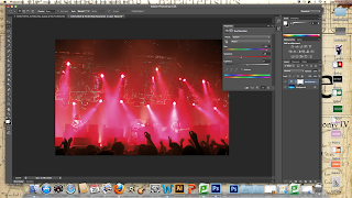
Firstly, we were shown the difference between printing in RGB and printing in CMYK by manually making the image turn from RGB to CMYK.
 |
| Original RGB Photograph |
 |
| CMYK Print Version of Photograph |
By going on View and the Proof Colour, it allows you to manually see what the image you have would look like printed as a proof is a mock-up of the work you are trying to create. From the images, you can tell that the quality of the CMYK would be lessened as the colouration has dramatically dulled.
 |
| Gamut Warning |
In order to be able to determine the specific colours that are out of range of the printer, you can go to View then Gamut Warning. Gamut is when your images are out of specific colour range, usually blues or greens. The grey area highlights the colours that are out of range.
 |
| Hue/Saturation Manipulation |
To manipulate this, you can create an adjustment layer that can work on top of the photograph in order to experiment with its appearance in a Non-Destructive Manner. Using the Hue/Saturation layer, we effected the colouration of the image so that the image was out of the Gamut warning, meaning that it would be printed off successfully.
Next, we were shown about how you an use Levels to your advantage to subtly manipulate an image to be able to get more detail in specific areas without having to effect the whole entire image.
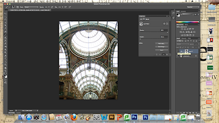 |
| Original Image |
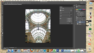 |
| Image with Mask Layer on Top |
Using the adjustment layers again and selecting the Levels option, it allows you to manually adjust the tones in the image. By adjusting the tones by adding highlights, it made the detail become a lot brighter and clearer yet it caused the already light windows to loose clarity. By using the brush tool at 0% hardness and going over the windows in black paint, it created a mask so that the highlights didn't effect the windows and allowing for the finished image to have the best of both images.
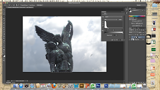
Then, we were given an image that has a very dark figure in the way of a sky background that causes it to appear a lot darker in the photograph.
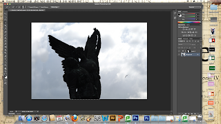 |
| Original Shadow Image |
 |
| Highlighting Shadow Figures |
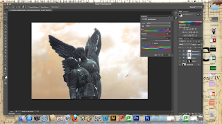
Using the Adjustment Layers on the Levels selection, we used the Quick Selection Tool to click the entire statuette and moved the white arrow to completely highlight the statue to bring out the detail in the figures.
 |
| Using Magic Wand Tool to get rid of Saturation |
Noticing that the gaps in between the statue that's filled with sky had been saturated out as well, we selected these areas with the Magic Wand Tool and filled it with black to create a mask like we had done previously, thereby successfully creating an even sky.
 |
| Changing the Background Hues |
Creating another Adjustment Layer (this time, a Hues/Saturation Layer), we selected the entire background with the Magic Wand Tool and dramatically heightened the hues and saturation levels to create a different coloured sky.
From this, we went onto seeing how you can take a selection of photos and merge them together to create a cinematic view. Going into Automate and Photomerge, it allows the choice to have a Seamless Cinematic Panorama.
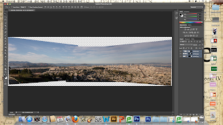 |
| Original Photogram |
In order to get rid of the jagged edging and shoddy connections, we used the Crop Tool to make a smooth rectangle so that it has a clean aesthetic.
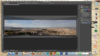 |
| Cropped Photogram |
Study Task:
For the next session, we had to collect a minimum of 10 photographs that were representative of a theme. The constrictions we have is that the photographs must be taken in and around college. We were each given a shape to base our photographs on and I had to take photographs of Circles.
 |
| Circle Photographs |
This will give me a starting point to see what I am going to have to do with these photographs.
Induction 2:
To start with, we started looking at how photographers manage to take photographs of monuments or popular tourist attractions without getting any people in the photograph. To do this, they take lots of photographs of the same thing in the same place with intervals of 30 seconds at a time.
 |
| Scripts |
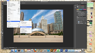
In order to rid of the people in the photographs, you have to put all of the photographs in one Photoshop document which you can do by going into Scripts and selecting all of the images in the folder.
 |
| Smart Object |
This presents the images as one Smart Object. A Smart Object is a file that is displayed in a specific way in Photoshop which can be manipulated and used outside of Photoshop.
 |
| Getting rid of Moving Objects |
In order to then get rid of the people within the photograph, I needed to stack the photographs using Stack Mode and by selecting the 'Median' tool it goes through every single photo, identifying the moving objects and getting rid of them.
 |
| No People In Image |
From this, the moving objects within the photograph are all removed so it gives the impression that the photograph was taken at a time of day when no one else was around.
In order to get a better image of the sky, we selected one of the photographs with the skyline that was wanted and put it into a different Layer.
Then, we selected the sky using the paint brush tool, coating the necessary area in black paint and then selecting the Inverse option.
 |
| Final Manipulated Image |
From this, it allows the 2 images to come together so that the designer has the best of both images in one.
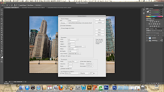
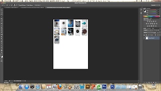
The next thing we went onto was the usefulness of producing a Contact Sheet. A Contact Sheet allows you to be able to present photographs you have taken in a quick and simple way.
 |
| Automate Contact Sheet |
To create them, you need to automate them by selecting the Contact Sheet Option.
 |
| Selecting Images |
To include the photos you need, you need to select the folder they are in and decided how many photographs you want on a page based on your choice of Columns and Rows.
 |
| Complete Contact Sheet |
The completed contact sheet allows for the photographs to be seen quickly and clearly so you can get an opinion from other people.
Photoshop Brief:
On the back of this, we have been given a brief for Photoshop which is to produce a set of 5 Postcards that explores a given shape. The given shape is that of the photographs we had to take, which in my case is the Circle. The postcards must work as a series or set and have a back and a front to them.
Firstly, because the images need to work as a series, I want to take some more photos around college and focus on specific things so that I can decide on what I want to focus my Postcards on. I will use my DSLR Camera as well rather than my compact that I normally use so that it has a better quality of image.
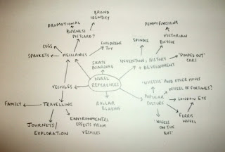
I made a spider diagram of ideas for things to photograph that are circular so that I had a bit more focus.
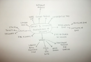 |
| Photography Spider Diagram Plan |
I started by taking just general photographs of circles around college:
 |
| Second Set of Photographs |
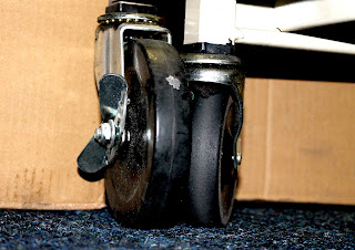
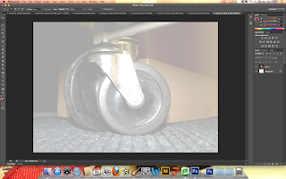
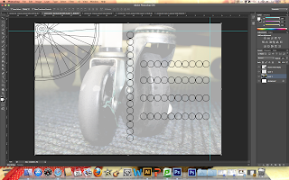
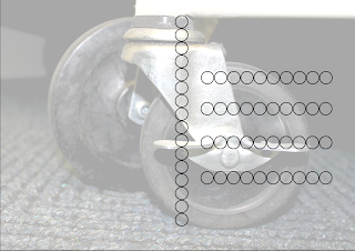
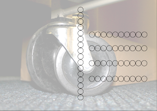
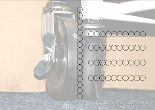
From the photographs that I was taking, I found that the most successful were the photographs I took of different wheels:
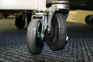 |
| Wheels Around College |
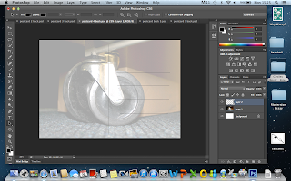
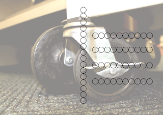
The ones that I liked the most were the final set which I took photos of inside the library of the books trolley, particularly those with the double wheels as it gave more of a subject matter and point of interest to focus on within the photos. I decided to take some more photos of this so that I could have a full set to work with.
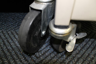 |
| Additional Photos of Library Trolley Wheels |
Overall, I selected these 5 photographs as the most successful and therefore decided to use them as my Photoshop Postcard covers:
 |
| Chosen 5 Photographs |
I felt these were the most successful as the wheels seemed as though they had more of a relationship that works together. The double wheels have a certain balance within the photos and the different angles mean that the images are not repetitive yet have a consistency.
After deciding what Photographs to use, I had to come up with some ideas or concepts for designs that I could do.
 |
| Designs Spider Diagram Plan |
Next, I then went onto designing possible front and back cover ideas for my Postcards
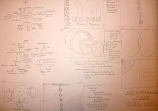 |
| Postcards Design Sheet |
I haven't settled on a set design yet even though I have come up with some possible visuals to use so I thought it would be ideal to manipulate and edit the photographs I have already settled on so I can add any design ideas to it at a later date.
 |
| Chosen 5 Photoshop Postcard Fronts |
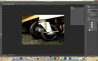
I created 5 new documents which were of A5 size and then changed the picture orientation by going into Image and selecting 90%C Image Rotation. I used the same technique we were taught in the Photoshop Inductions to place the individual images into the document.
 |
| Manipulating the First Postcard Front |
Firstly, I played around with the brightness and contrast of my photograph swiftly followed by manipulating the exposure and off-set of the photograph. This gives my image a defined and solid presence, which accentuates the characteristics of my image. Next I had a go at putting a colour filter onto my image, selecting cyan and sepia as a trial run yet I didn't think it was relevant or suited to my actual photograph therefore I decided to refrain from using one. Then I manipulated the sizing of my photograph by using the Move Tool to select my image and, holding down the shift key, move it so it fits the A5 scale perfectly. This also meant that I could zoom in and out as well as crop my image at the same time.
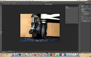 |
| Manipulating the Other Postcard Fronts |
I did the same with the rest of my Postcard Photographs in order to edit and adjust them so they all looked similar in order to stick with the convention of them being a series.
 |
| Final Manipulations to Front of Photoshop Postcards |
|
|
|
So far, I have settled on these as the designs for my Front cover as they are subtle and not overwhelming in regards to the manipulation. I don't want it to seem blatantly obvious that they have been edited digitally, especially as the initial photographs were pretty good in the first place but you can still see that they have been enhanced.
At this point, I still hadn't settled on any designs for my postcards as I didn't think that any that I had come up with would do my postcards justice. I decided that I would let my photograph on the front be my main focus and settled on having a simple background for them. In my design ideas, I drew a simple background using circles and an illustration to create a plain yet structured background so I decided to do that.
 |
| Using Saturation and Opacity at 34% |
I didn't want my background to look plain so I thought it would be a nice touch to put the corresponding image onto the back of the postcard yet, instead, I saturated the image by manipulating the opacity of the photograph so that it was faded into the background. I changed the opacity to 34% so that it would be faint enough for the details to be visible yet it wouldn't be so pale as to not be transparent.
 |
| Marking out Placement |
Usually, a postcard would be used for someone to correspond with someone else so I wanted to include marked out areas for the address and a separate area for correspondence. I marked this out using the 'Pen' tool whilst holding down the Shift key so that I would have completely straight lines.
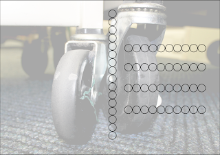
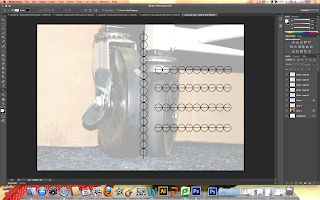 |
| Circles Layout |
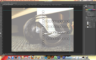
Using the lines as a template, I produced a circle with the Shapes- Circle tool to get the size I wanted. From this, I copied the circle by duplicating the layer and pasted it so that they would be the same size for consistency. I continued this until I had done the full vertical line. Having rasterized the layer to group the circles together, I took some of the circles by duplicating them and rotated them in order to produce the horizontal lines.
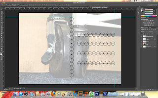 |
| Use of Rulers |
After merging the layers creates by duplicating the circles so that they were all together, I used the Rulers tool to mark out the exact placement of my circle layout therefore making sure that the placement was exact and equal on each background.
 |
| Circles Layout on All Back Postcards |
Personally, I like the aesthetic of the Postcards due to the fact that they look classy and simple without being too overly done. The circles look polished and have a purpose to them being there, rather than just being seen as decoration. Plus, they fit in with the theme of Circles.
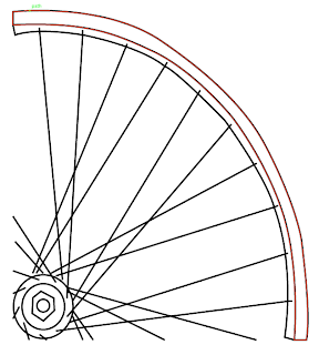 |
| Wheel Drawing |
Using the 'Pen' Tool, I drew the image of a wheel as I wanted to see whether it would look good as added detail onto the back of my postcards.
 |
| Wheel on Postcards |
From far away, the wheel looks 3-Dimentional and unobtrusive of the space available on the postcard back, however, when close up, the wheel doesn't look clean and seems slightly clumsy in its inception therefore I decided to go against including it in my final designs.
Final Designs:
 |
| Postcard 1 Front & Back |
 |
| Postcard 2 Front & Back |
 |
| Postcard 3 Front & Back |
 |
| Postcard 4 Front & Back |
 |
| Postcard 5 Front & Back |
Final Pieces:
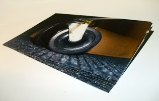 |
| Photoshop Postcards |
As a set, I think my postcards have come out really well. They fulfil the needs of the brief as they are a cohesive set of postcards that hold a running theme which is based on my shape of circles, printed in an A5 size that work together as a series. I think they look better as a unit then they do when individually together but it still communicates the theme of circles. The stock I have used could have been better as the paper is quite thin yet it has a good print quality to it. Also, I think the postcards look better on screen then they do in their printed format, particularly the back but it does manage to keep a cohesiveness and consistency throughout. I found the program Photoshop very difficult to use and it took me a long time to do the simplest thing so what I have achieved may seem minimal to other people but to me, is a learning curve and gives me something to build on in the future.