In preparation for the first session, we have to research into 5 Possible Briefs that we are interested in possibly working on so we could get an insight into the type of briefs that are available:
1 & 2: The Penguin Design Award
 |
| "Penguin Children's Prize" (2014) by The Penguin Design Award Penguin Design Award (2013) "Penguin Children's Prize" [Internet] Available from http://www.penguin.co.uk/static/cs/uk/0/minisites/penguindesignaward/puffin_brief.php (Accessed 30th October 2013) |
 |
"Penguin Adult Prize" (2014) by The Penguin Design Award
Penguin Design Award (2013) "Penguin Adult Prize" [Internet] Available from http://www.penguin.co.uk/static/cs/uk/0/minisites/penguindesignaward/penguin_brief.php (Accessed 30th October 2013)
|
3: TigerPrint Competition
 |
"TigerPrint Competition- Christmas Icons" (2013) by TigerPrint
TigerPrint(2013) "TigerPrint Competition- Christmas Icons"[Internet] Available from http://designcompetition.tigerprint.uk.com/page/CONTESTS/contest/ChristmasIcons (Accessed 30th October 2013)
|
4: Student Design Awards
 |
"Innovation Is Giving" (2013) by Student Design Awards
Student Design Awards (2013) "Innovation Is Giving"[Internet] Available from http://sda.thersa.org/en/challenge/rsa-student-design-awards/phase/ideation-phase/track/innovation-in-giving (Accessed 30th October 2013)
|
5: Typoday 2014 Poster Design Competition
 |
"Typoday 2014 Poster Design Competition" (2013) by Typography Day
Graphic Competitions (2013) "Typoday 2014 Poster Design Competition" [Internet] Available from http://www.graphiccompetitions.com/graphic-design/typoday-2014-poster-design-competition (Accessed 30th October 2013)
|
Studio Session:
For the module, we need to do a minimum of 5 briefs which are to be substantial as well as 1 brief which can be done over a longer time period (a few weeks)
We had to identify as many points as we could about we wanted to get out of this Module:
- Trying something new every time
- Finding an area of design I want to focus on
- Being quicker at producing work for briefs
- Gain confidence at making work for a larger, wider Audience (Clients and Competitions) who are going to see my work
- Being successful at something because of my Design Ability
- Be able to present my work in a Professional way to people in the Industry
We then came up with a list as a class of conclusive things that we would get out of this Module:
- Sense of Time Management and Discipline
- Understanding "Realistic" Time Scales
- Effective Professional Communication
- An Award/ Prize/ Fame
- How Not To Get Exploited (Including Getting Paid)
- Work on a Range of Briefs
- Identify Individual Practises
- Brief Analysis
- Creative Compromise
- Exposure
- Portfolio Development
- Building Contacts and Opportunities
- Show us what it is really like in a Real World Situation
- Get to see what its like to be a Freelance Designer making work for yourself
- Get to see/mix with other designers/ students who are in the same boat as you, learning from each other
We then came up with a list as a class of conclusive things we would find useful out of taking part in live and competition briefs:
- Improving Professional Design Skills
- The 'Challenge' of a Professional Brief
- Commitment to being more than 'just a Student'
- Developing Clearer/ More Effective Working Practises
- Real World Benchmarking (Judging Your Own Against Others)
- Professional Responsibilities
- Gain Confidence
- Gain Contacts
- Professional Feedback
- Professional Experience
We then had to list the reasons for why we had chosen the 5 briefs we had brought with us to the session:
Tiger Print:
- Producing Work For A Potential Commercial Client
- Allows for Experimentation due to the Content and Fun Nature of the Brief
- Never worked with Type outside of College Briefs before
- Event instead of a Competition
- Puts work in a Real Life Situation
- My personal Area of Interest- Books and Reading
- Can be quite Imaginative and Concept Driven
- Never done a Book Cover before
- Potential help someone with my Ideas (Ethical)
- Serious Tone of the Brief
- Quite Expansive in regards to Research and necessary work to present
- Brief seemed Straight-Forward
- Short and Simple
- Try new things out of your Comfort Zone
- They're Free To Enter
- An Interest/ Familiarity with the Content
- Ethically Motivated Design
- The Prize
- The best Brief that was available
- Creative Scope/ Freedom
- Range of Problems
- Client Basis could be Big Brands/ Popular Names
THE MAIN CRITERIA FROM THE BRIEFS ARE WHAT YOU CAN GET OUT OF THEM!
From these questions, we were then given a Dead YCN Brief from last year and put into Groups where we broke down one of the briefs. I was in the group given he task of breaking down the Fedrigoni Task:


 |
| Fedrigoni YCN Brief 2012 |
Following this assumption, we had to analyse the given brief using a series of 8 questions:
What is the Problem?
Fedrigoni feel like they are perceived as being unaffordable and there is a misconception about not being accessible to Print companies
What is the Brief asking you to do about it?
Create a Tongue-in-Cheek campaign that will break these misconceptions and raise the profile of the Brand
What is the Brief trying to Achieve?
Trying to transform the brand of Fedrigoni
Who will Benefit?
The company as well as potential clients/ customers
What Is The Message?
That Fedrigoni is an affordable brand which provides good quality products
Who is the Audience?
Designers and Printers across the UK
How Will the Message be Delivered?
Fun, Tongue-in-Cheek approach using Humour in the form of a campaign
Can you Foresee any Problems with this?
- The campaign in unspecified- unfocused brief
- Do we have to produce something or do they want a concept for a campaign?
- How do they want the work delivered?
- Tone of voice is inappropriate for the target audience
- Contradiction towards use of paper- allowed to ask for samples or not?
Study Task:
For the next session, we have to find or select a brief that is going to take us a few weeks to do and has scope for development. It also needs to be something we are interested in.
I decided to select the National Trust Brief set by D&AD for the D&AD New Blood Awards 2014.
 |
| D&AD Brief for National Trust |
Upon selecting this brief, we have to answer these questions from it:
- Why have you chosen this Brief?- I have chosen this brief because I am familiar with the brand and the work that they do so I already have some interest in it.
- What do you want to get out of this Brief?- I like the fact that I will be trying to help a campaign which is keeping the History and Culture of Britain alive for years to come. In a way, it makes me feel like I am giving back to the community by trying to help making it more appealing to a new generation.
- What do you want to do/ make/ produce for the Brief?- I'd like to do a new Logo, Brochure and Membership Cards.
- What do you need to do/ make/ produce in response for the Brief?- An Integrated Campaign to a UK nationwide audience of 25-40 year olds using relevant communication channels such as Print, Digital or Experimental.
Then go through the Brief and answer the 8 Brief Analysis Questions:
What is the Problem?
The National Trust feel like they are perceived as being for old people and would like to be made relevant to the modern visitor.
What is the Brief asking you to do about it?
Reposition the National Trust away from it's current perceived image and re-establish the importance of place in our lives.
What is the Brief trying to Achieve?
Trying to transform the brand of The National Trust
Who will Benefit?
The Trust as well as the Visitors
What Is The Message?
That The National Trust is the driving force behind rebuilding modern societies connection with the outdoors
Who is the Audience?
25-40 year olds nationwide across the UK
How Will the Message be Delivered?
Create an Integrated Campaign which stands for a positive impact on People's Relationship with Nature and Beauty
Can you Foresee any Problems with this?
- The campaign in unspecified- unfocused brief
- Do we have to produce something or do they want a concept for a campaign?
- How do they want the work delivered?
For Primary Research, I looked at my Membership Pack which is the latest design as I am only a new member. Inside it has a Handbook, Map, Magazine and Leaflets which is packaged in a folded card box with a handle.

 |
| Packaging |
 |
| Leaflets for Individual Locations |
 |
| Map |


 |
| Magazine |


 |
| Handbook |
 |
| Membership Pack Contents |
BWA Design are a brand consultancy who deal with a lot of National Trust reports and information who have tried to develop it over the years:


 |
"National Trust Annual Reports 07/08" (2008) by BWA Design
BWA Design (2008) "National Trust Annual Reports 07/08" [Internet] Available from http://www.bwa-design.co.uk/en/NationalTrust_annualreports_08_09.php (Accessed 13th November 2013)
|


"National Trust Visitor Engagement Materials for Cotehele Property" (2013) by BWA Designs
BWA Designs (2013) "National Trust Visitor Engagement Materials for Cotehele Property" [Internet] Available from http://www.bwa-design.co.uk/en/NationalTrust_cotehele_print.php (Accessed 13th November 2013)
When they first started developing work for them, it was very brown and dark in colour with a layout that came across as quite uninspiring as it is quite fixed and lots of text which seemed to either take up a whole page or was non existent. Clearly the brand is catering for a specific audience with the magazine showing either young children or families within its pages.


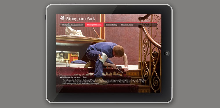 |
"Attingham Pack Visitor iPad Kiosk"(2012) by BWA Design
BWA Design (2012) "Attingham Pack Visitor iPad Kiosk" [Internet] Available from http://www.bwa-design.co.uk/en/page_1452.php (Accessed 13th November 2013)
|


 |
National Trust Annual Report 2012/13 Print"(2013) by BWA Design
BWA Design (2013) "National Trust Annual Report 2012/13 Print" [Internet] Available from http://www.bwa-design.co.uk/en/page_1461.php (Accessed 13th November 2013)
|
I decided to make some Spider Diagrams to brainstorm the brief that had been provided:
 |
| National Trust Brainstorm |
 |
| What The Brief Wants |
 |
| Initial Design Sheet |