We have been given the task of producing an Website which is to be based on my topic of Research for the Sumer Brief, which I did on Chocolate (See Summer Brief Blog).
From this, we had some Studio Sessions based on what our Website could be and initial ideas in regards to what could be included, concepts and approaches to it (See Design Practise Studio Session Blog Posts). I also started doing some research into my topic of Web based on things which would be useful to consider (See Design Context Blog).
 |
| Initial Website Proposal |
My initial Website Concept was based on the idea of having the history of chocolate being shown as a story, scrolling downwards in a linear narrative, with the child following a cocoa bean through the website as it goes through the story, making it fun and engaging. I felt this was a very good idea, however, the website we are making is suppose to be 5 pages rather than just 1 long page therefore I would not be answering the brief.
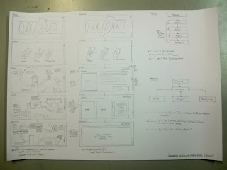 |
| Second Website Proposals |
Based on the Concept for the 1st Idea, I went onto producing a simplified version of the linear site, narrowing it down to 5 pages which can run off each other in a sequence. This would be presented in the form of a map which the audience would follow along, finding little illustrations along the way and clicking them to get the information. Even though this manages to narrow down the amount of pages, this may be quite complicated to follow and difficult to grasp as a website as it would be quite cluttered and difficult to follow. After that, I decided to produce an even more simplified version of this Concept where the website would have separate pages for each section and the pages would scroll down, making all the information in one place, easier to navigate and digest.
From this, I had my Interim Crit which gave me some Feedback on what I was doing and my idea/ concept for the website (See PPP Blog).
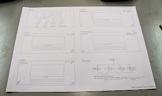 |
| Layout Scamps, Development and Final Website Scamp Proposal |
Based on this simplified version of the Concept, I drew out some layout scamps for both the Homepage and the Content pages which allowed me to come up with some potential visuals of the website so I could determine what would be the best for my audience and intention. I put the best ones into Illustrator to see how they would translate on screen and from that, I settled on a Homepage and Content layout I was happy with and drew them up together, showing how they would look like. I accompanied them with a Flow Diagram of how the website would work so that it was easy to show how the pages would link together and how the Site would work as a whole.
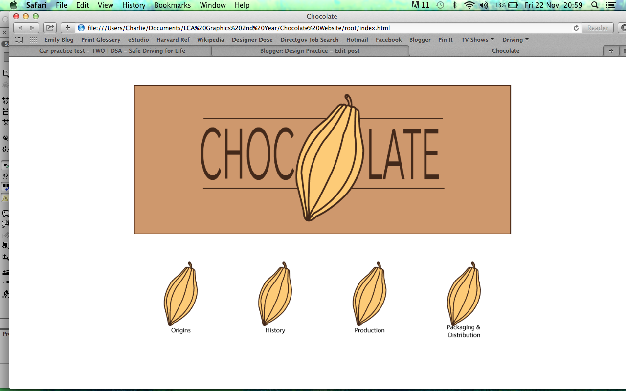
From this, I went onto trying to produce my Logo that I had come up with when drawing the initial ideas.
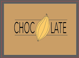 |
| Logo Development |
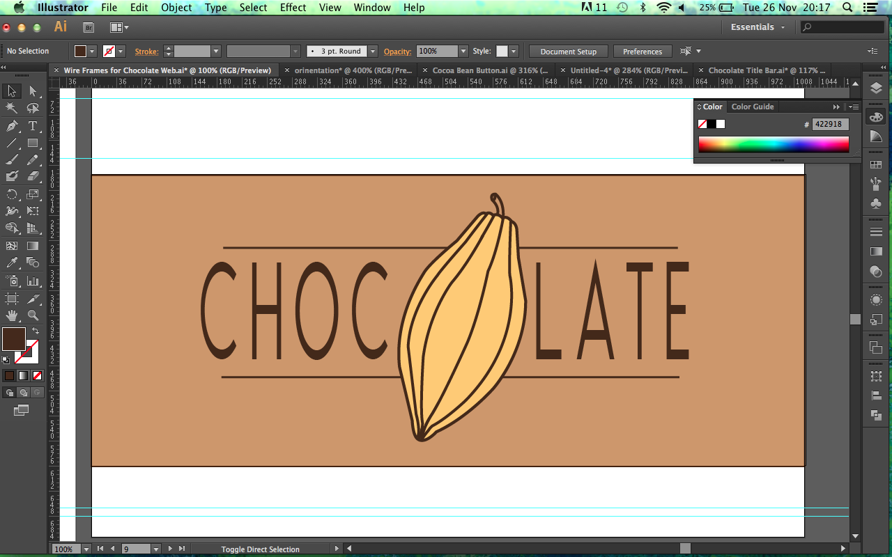
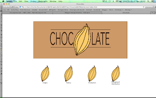
The idea behind the logo is the idea of using a Cocoa Bean instead of using a 'O' within the word 'Chocolate'. The background colour is not too dark which is appropriate and the actual illustration of the Cocoa Bean is realistic and distinctive yet the line thickness comes across as too thin and seem as bit plain to be a logo for a children's website so I decided to develop it a little bit further.
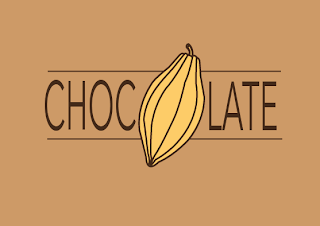 |
| Logo Development |
The change in the colour of the font from a Black to a Brown gives the logo more personality and softens the font, making it warmer and more approachable. The thicker line strokes give it more of a cartoon aesthetic as well which makes it more appealing to the target audience without being too childish so as not to be patronising.
 |
| Roll Over Button Design |
I felt that the illustration for the Cocoa Bean itself was so successful that I decided to use that same one for the Roll Over buttons, making it appear more fun as well as keeping the website consistent. When the Buttons are Rolled-Over, they will loose their opacity so it is a clear visual difference between the button being selected or not.
Based on producing the main components of the Homepage, I went onto producing the layout in Illustrator.
 |
| Home Page Development |
Using the layouts I had made earlier on Illustrator in order to get the sizing and proportions correct, I imputed the components to produce the desired layout. My intention was to have the Cocoa Bean buttons in boxes to make it obvious that they were buttons but I tried them without and felt that it made the layout look a bit more polished and less systematic.
 |
| Roll Over Effect |
Using the presentation of the beans, I produced a Roll-Over effect with the Buttons by simply making the opacity of the buttons 50%. I felt that this would produce a simple yet sophisticated solution to the need of the audience.
 |
| Roll Over Type Possibilities |
I tried a varied amount of Roll Over Buttons to see which would be the most appropriate effect to coincide with the visual style of the Homepage and I felt that the underlined text would fulfil this as it wasn't overwhelming and didn't take away from the actual effect itself.
 |
| Roll Over Effect Applied |
The underlined writing visually shows in a clear manner the button that has been selected. What makes it successful is the subtlety of the underline as it didn't take away from the actual effect and instead lends itself to the overall visual.
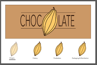 |
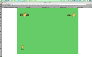
| Homepage |
I am very happy with how my Homepage has turned out as, visually and in theory, it works as a solid web page as well as a visual identity. I am slightly worried that the layout of the Homepage and the way it is presented seems to be quite more structured and mature for a website for a young target audience. This will be something that I will consider to ask when I am next in a Crit so that I can get some Feedback.
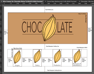 |
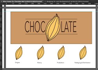
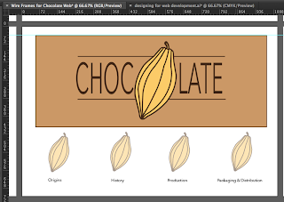
| Wire Frames and Grid Layout for Homepage |
Even though I had produced the layout for the Homepage, I hadn't worked out the sizing I would need for the actual Website so that everything fits on. To make sure that it would work, I produced a Wire Frame Scamp to work out what the dimensions of all the components of my page would have to be, especially as we were given a size to work with of 1024px Width x 768px Height. This would make it a lot easier to do the mathematics now rather than later when trying to do the coding as this means that you just had to input the numbers rather than trying to guess.
 |
| Wire Frames and Grid Layout of Main Pages |
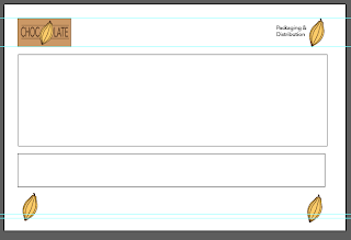 |
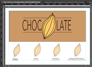
| Wire Frames for Content Pages |
In keeping with the need to produce a Wire Frame for the Homepage, I produced a Wire Frame for the Content pages as well. With the fact that I am keeping the layout of the pages all the same so as to help the target audience as well as the website consistency, I need to only produce one Wire Frame for the 4 pages. After working out the dimensions, I put the layouts into Illustrator to make sure that they worked as an on-screen format and I felt that it produced a spacious layout. The beans in the corner will act as links meaning that the user can go back and forth from the previous sections in order. The logo in the top corner will act as a link back to the Homepage and the bean on the top acts as a point of orientation for the audience so that they know where they are and what page on the website they are on. This will provide an easy of navigation so it creates a better user experience.
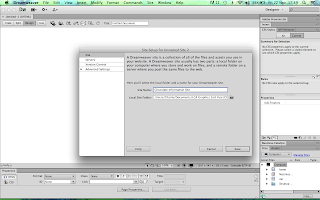 |
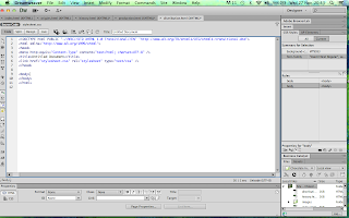
| Setting Up The Root Folder |
After producing the Wire Frame for both types of pages, it was ideal to start producing the pages within Dreamweaver. To start the website, I needed to open a new Dreamweaver file and create a root folder within my Documents. I created an images folder in the root folder itself so as to keep all the images being used in one place. Then I linked the root folder to the file so it would correspond with each other.
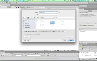 |
| Setting up Index (Homepage) Page |
By saving the linked root folder and new file together, you name it 'index.html' which means that the software will know that this is the Homepage.
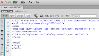 |
| Setting up and Linking CSS Style Sheet |
In order to start putting some of the aesthetic components onto the Website, I have to create a CSS file which is known as a 'Style Sheet' as it is used to input some simple code to create aspects of the Website. I made a new CSS file and then I linked it to the HTML file so that they would correspond with each other.
 |
| Setting Up My Own Font Family |
To start with, I just included general things which will be for the whole site that can be put into the <body> section. I have used the typeface Avenir Next for the logo therefore I decided to make a new font family which would mean that the website would use this font as a default and if not, it would use a sans-serif font.
 |
| Producing Container |
In order to put all of the components onto the website, I needed to put it all into a Container. The Container is made to the specifications of the website size of 1028px Width x 768px Height.
 |
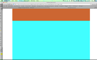
| Title Image Box |
Into the Container, I produced the area where the Image for the Title of the Website would be held. This takes up a large amount of the space but this is necessary to be able to get it in the right proportions.
 |
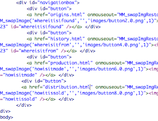
| Navigation Box for Buttons |
For the bottom half of the Container. I produced a Navigation Bar for the Roll-Over Buttons to go into.
 |
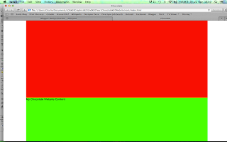
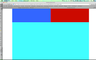
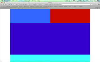
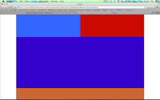
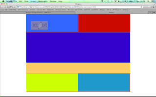
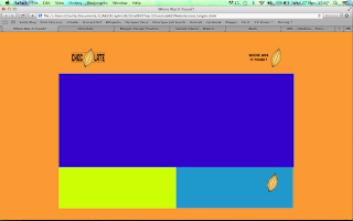
| Button Placements |
After creating the Navigation Bar for the Buttons to go into, I created the coding for the buttons to see whether they had the right amount of spacing on screen. I added a background colour to each of the boxed areas so that it was obvious and clear where each section was and if it had worked. I haven't added in the Images yet as I wanted to get the correct area sizes before adding them to the page.
 |
| Image Sizes for Homepage |
After working on the website coding and finding that the spacing was precise, I went back into Illustrator and created the correct sized files for the Buttons and the Image Title so that they would fit precisely into the website.
 |
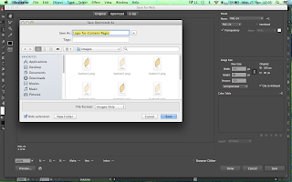
| Saving and Applying Images |
In order to make sure that the images would translate precisely for web and load up quickly, they need to be saved for Web as a PNG file within the images folder of the root folder. Both the Buttons normal and roll-over effect needs to be saved separately. Within Dreamweaver, selecting the image option, you can add a picture to put onto the website so I attached my title image to the title image box. As for my Roll-over Buttons, I have to go to 'Image- Image Objects- Roll Over Objects' and put the 2 separate button images selected into the finder window so that the software knows in what order they go in and that they are connected to each other.
 |
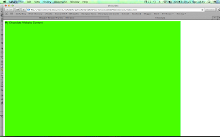
| Homepage |
Having saved the file and looking on my Internet Browser, I could see that my Images were placed in the right area so I got rid of the background colour elements and made the Homepage white so it was all consistent and looked connected.
 |
| Container for the Content Pages |
From the success of my Homepage, I decided to go onto producing the Wire Frame for the Content pages. I created a new file and linked it to the current CSS Style Sheet in order to make a same-sized Container for the Web Page.
 |
| Navigation Bar |
From within the confines of the Container, I created a Navigation Bar along the top of the Container for the Logo and Orientation to go into.
 |
| Content Sizing for Navigation Bar |
From the Navigation Bar, I needed to input the sizes for the content of the Bar (the Logo Home Link and the Orientation Image) so that when the Images are put in later on, they fit precisely.
 |
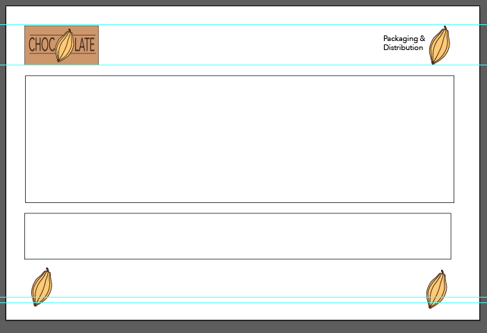
| Content Box |
Following from the Navigation Bar, I put in the box where the Content is going to fit which shows how much room is left at the bottom for the other Page Links to fit into.
 |
| Bottom Navigation Bar |
The remaining Container space is then taken up by a Bottom Navigation Bar.
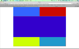 |
| Content Sizing for Bottom Navigation Bar |
The Bottom Navigation bar is then split up in 2 in the same way that the top navigation bar is, creating a consistent visual.
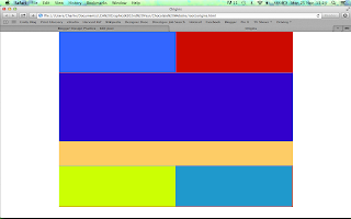 |
| Sizing Content for Content Box |
Within the Content box, I put a Text Box at the bottom for the information to go into so that there is enough room for the information and the illustration to go.
 |
| Logo for Content Corners |
After putting in all of the separate sections for the Web page, I started to re-size the images to the precise size so that they could be placed into the Page. Just like the images for the Homepage, the illustrations had t be saved specifically for Web as a PNG file and saved in the images file of the root folder.
 |
| Link for Home Button |
Like I had for the Homepage Roll-Over Buttons, I had to create a Roll Over Button from the Logo so that it would act as a connection to the Homepage. I saved both sections separately and then using the same as before, saved them together within the HTML sheet in Dreamweaver to create the Roll Over Effect Link on the Web Page.
 |
| Addition of Orientation and Next Page Link |
Using the same principle, I added the orientation of the page to the top corner but as an image rather than as a roll over button. With them having worked and got into the correct place, I removed the background colour which has made it look a lot more connected to the Homepage. At the bottom Navigation bar, I added a link like the ones in the Homepage but this would go to the next page in the series. In order to keep it in place however, I had to input the data for a Previous Button before the Next Page button to make sure that it stays in place.
 |
| Content Page Layout on Dreamweaver |
Following this, I put some text into the Text box using the Loren Ipsum text to see whereabouts it would be placed.
So far on my Website, I am not sure about whether this is going so well in terms of designing for my Intended Audience as the layout and presentation so far is quite sterile and clinical; not at all a website that you would associate with Children. I am going to use the crit as a basis for how I should continue onwards.
We had a Interim Crit based on the work we had been doing (See PPP Blog) and I felt it was important to take on board some of the suggestions that had been given to me, such as considerations of language choice, typeface and colour usage for my audience. I responded to my Crit feedback by improving on the pages I had already done and felt very inspired and invigorated by the Crit. It defiantly gave me the push I needed and made me very enthusiastic to continue on with my Web brief.
 |
| Background Colour |
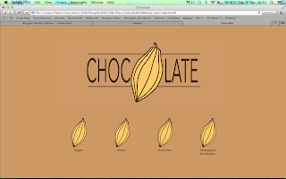
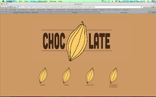
The first thing I did was focus on the need for colour. The page had previously been white and just had the background colour of the logo therefore I decided to make the colour available for the whole container. I liked what I saw but felt it wasn't enough so I decided to flood the entire page with the brown colour which, I felt, automatically improved the aesthetic and made it much more visually appealing to the target audience. The page also felt a lot more spacious and wider so I felt it was ideal to make the logo larger.
In regards to the logo, in the crit, it was suggested to use a typeface which would appeal to the younger audience, perhaps lowercase sans serif, which I felt needed to be applied to the current logo as it appeared quite stiff and business-like.
 |
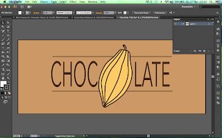
| Logo Development |
I tried tracking the letters, using a scruffy hand-written font (Chalkduster) and a lowercase sans-serif (Brixton) which saw my logo go in the right direction, however, it was the use of the font Cubano which made it seem much more friendly for a younger audience, with the rounded, softer ends which made it appear more appealing to the target audience. I enlarged it to make it fit better on the full screen colour therefore complimenting each other.
Next thing I had to address was the use of language for my target audience.
 |
| Roll-Over Bean Button Effect |
It was rightly pointed out in the Crit that my target audience would not be able to understand some of the longer, more complex or specialist words used, such as 'Production' so I would need to make it simpler like calling it 'Making it'. I felt using a description like that would be a bit too wordy so I changed the words into questions with simpler language so it is like the website is answering the question they are after.
 |
| Roll Over Buttons |
I applied this to all of the Roll-Over Buttons as well as the Cubano font which I think defiantly brings it all together in a more fluid yet personality-filled manner.
I decided to follow this on with the rest of my design, trying to make it more friendly to the target audience.
 |
| Changed Orientation and Home Link |
In order to make the website consistent throughout, I updated the orientation and the home link to the current font and logo so that it was the same. It defiantly gave it a lift in regards to the personality and approach of the website.
 |
| New Wire Frame for Content Pages |
From the Crit, I felt like the way that I was going to present my information was a bit too structured and formal for my target audience and therefore decided to change the content and text boxes for my Wire Frame. I feel like they should be side by side and the illustration being quite large and not confounded by the small width of the image box so I decided to merge the boxes together to make just one large content box.
 |
| Application of New Wire Frame |
From this working out of the dimensions, I applied the new Wire Frame to the content page which instantly created a larger, more spacious frame to work with as well as giving a cleaner, slicker and simpler layout to work with.
Firstly, I planned out and wrote from my research what each illustration would have and the content that would go onto the page.
 |
| Content Plan |
I felt this was important so as to give structure to my website as well as to work out whether what I would be putting was appropriate to the audience.
Then I went onto producing one of the illustrations that would go into the content box to see whether the Wire Frame would be successful.
 |
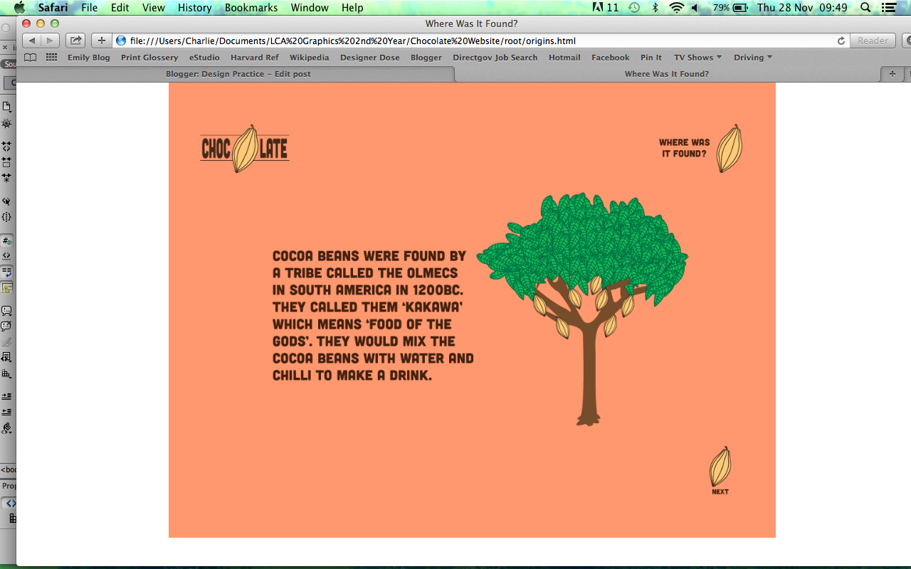
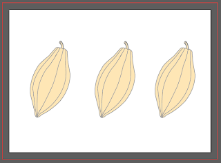
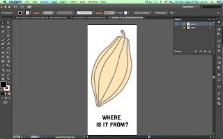
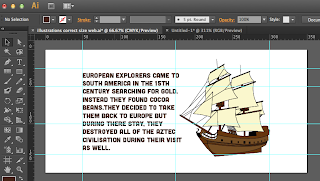
| Illustration for Content Page |
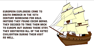
I started by making the illustration as flat as possible but I felt that the tree wasn't very realistic so I decided to add a little detail onto the leaves to make it more realistic without tang away from the illustrative manner. The cocoa beans are the same as the logo and roll over buttons so it keeps some consistancy within the imagery. The language is simple and easy to follow and it is to the side of the image so it keeps in the eye-line of the user so they know the image and text correspond to each other. I decided to use a tangerine colour for the background of this particular content, the origins, in reference to the hot climates and weather that the beans grow in.
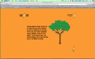 |
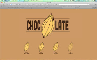
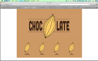
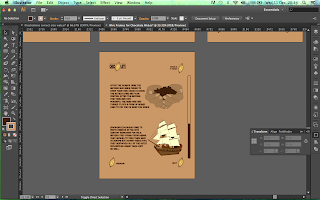
| Origins Page |
I resized the image as it initially only took up a small amount of space on the web page so I made it larger so it was easier to see and positioned it centrally so the eye is immediately drawn to it. I am very happy with the visual effect this has and the fact that the illustration is in keeping with the rest of the website, looking consistent throughout. I very much like the style of the aesthetic design and the website now comes across as a site for children, not like it had done previously.
Following on from this success, I went onto creating the next pages following this change in layout.
 |
| New Documents for 3 Pages |
 |
| Coding for 3 Pages |
As the layout for the pages is following the same Wire Frame as the first page, I just linked the CSS File to the new pages and applied it to them so that the layout is kept the same. I have used different colours for each page so that it helps with the orientation and differentiation between the pages. The only difference between each page is that it has its own orientation and the final page has just one link at the bottom navigation bar as it is the last in the series.
 |
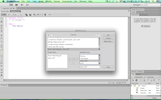
| Linking Pages Together |
After producing the aesthetics for the pages separately, it was time to link the pages together. You do this by putting the name of the page you want to link to after the '<a href= ""> coding putting it in-between the speech marks. You must remember to add .html at the end of the page so the software knows it is one of the pages you have already created. You need to do this for every individual button or link you have produced.
 |
| Linked Pages |
Having gone through all the buttons, save it and open the Internet Browser where you can check that all the buttons work. You should be able to tell by the fact that the pages will open up in just one browser window. I am very happy with the outcome of the website and feel very proud that I have managed to create a website that links together having only had the tutoring of the 3 Web sessions.
The next part of my Website I have to produce are my illustrations and text to produce the content of my Web Site.
 |
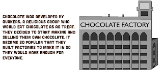
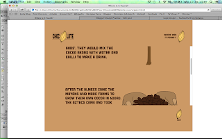
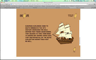
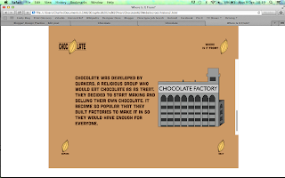
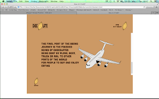
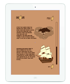
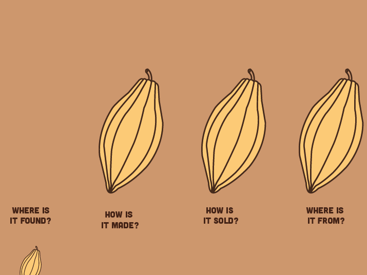
| Where Was It Found? Content |
 |
| Where Is It From? Content |
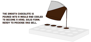 |
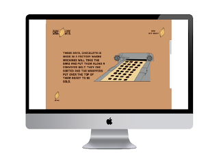
| How Is It Made? Content |
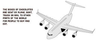 |
| How Is It Sold? Content |
These illustrations took a very long time but I felt it was necessary to spend this time on them as I knew it would be relevant to the target audience and their understanding and would be the main integral point to my Website. I tried to make the illustrations easy to understand and clear through some of the detail whilst also didn't include lots of detail so that it stuck with the rest of the aesthetic of the design. I put my text alongside my illustrations so that the target audience could correspond the image to the writing. I put it in short sentences in a factual manner in a small block so that they can digest the information easily and not be too overwhelmed. I think I have presented this with my target audience in my mind and, to me, it seems relevant.
The next thing I had to do was input all of my content onto my Website. To do this, I was just to add the imagery to the Content box and the idea was for Dreamweaver to automatically start scrolling as the content was bigger than the box it was being put into. As a precaution, I added a scroll bar regardless to make sure that I could add one in.
 |
| Adding Content |
As you can see, the content was added but the Web Page wasn't scrolling so I couldn't add anymore on and half of the content was hanging off the page.
Not knowing what to do, I asked the help of one of my Tutors to find out how to adjust it and I was told that I had gone about doing this in a strange way and that, despite using the teaching that we had gained in the Dreamweaver Software Sessions, I was doing it wrong. So much so that I would have to re-do the entire Website to make it work.
This was quite a big blow for me because I felt like I was really getting somewhere with my Coding and enjoying making my Website. All I could really do was deal with it and start again because otherwise I wouldn't have any content and would be without a working website for the Final crit the next day.
 |
| New CSS Style Sheet |
 |
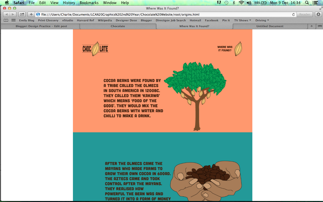
| Where Is It Found? Page |
 |
| Working Scroll Bar |
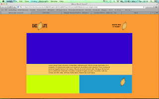
As you can see from the Screenshot, I re-applied everything to a new Stylesheet and applied a Scroll Bar to the Content Box so as to make the content scroll work. From this, I checked it in my Internet Browser to make sure it worked and it did. The scroll bar was an original intention of my site as I wanted it to scroll automatically so I am a little paranoid about the fact that the Scroll Bar takes away from my Website but if it means that my content is going to work then I am very grateful. The only downside is that I would loose my different coloured backgrounds, however, I think it makes it more sophisticated and cohesive as one single colour throughout.
 |
| 4 Newly Coded Pages |
From that, I then had to go through the process of Coding every single page again using the new working page as a template. I also had to re-code the Homepage so that it would link with the new pages I had created.
 |
| Image Re-Sizing |
From this, I had to resize all of my individual illustrations in order to make sure that they fitted within the confines of the Content and Scroll box.
Eventually, I managed to make a working Website with Completed pages using a working Scroll Option with Content:
 |
| Homepage |
 |
| Where Is It Found? |
 |
| Where Is It From? |
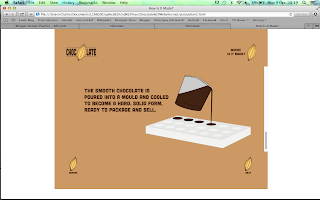 |
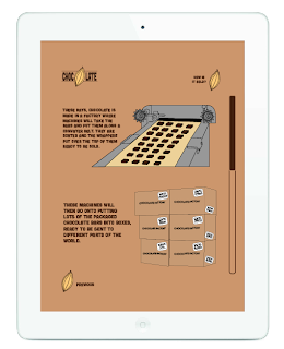
| How Is It Made? |
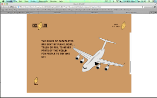 |
| How Is It Sold? |
I have to say I am very glad that my perseverance paid off by re-doing the whole Website as it really did make a difference being able to have my Content in and the Website working. It really does make a great compromise from originally wanting lots of pages to having just 5 that scroll as it gives the impression that there are more pages even though there isn't.
I am very happy with how my website has turned out and feel like, albeit simple, it is appropriate for its intention and this comes across with the aesthetic and my approach to the brief.
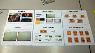
From the development of the website, I needed to produce 5 Design Sheets showing hope we have approached the brief and how it has developed into the Website we have produced.
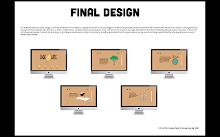 |
| 5 Design Boards |
 |
| 5 Design Boards for Designing for Web |
I produced them in InDesign and printed them on A3 to display alongside the Website for the Crit.
I am very happy with how my Website has turned out and I will use the Crit to see how a fresh pair of eyes sees my work. This will see whether there are any further developments that I need to do for my Website.
We had a Final Crit based on the work we had been doing (See PPP Blog) and I felt it was important to take on board some of the suggestions that had been given to me, such as the presentation of my Design Boards, the content of my narrative and Image/Text Ratio. I responded to my Crit feedback by developing the pages I had already done so as to improve it further.
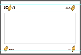
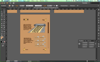
I started by producing a Grid for the Image and Text ratio so that it has an equal amount of spacing. This is something that I had noticed when I had previously added the content to the website so the fact that it has been noticed by others shows that this is something that needed to be changed.
 |
| Gridded Content for Where Is It Found? Page |
I made it so the text and images had an equal amount of spacing as a border and within the grid I made so that the image and text were not too close together. This grid system would make for a more successful placement.
 |
| Gridded and Adjusted Content |
The grid has helped make all of the content the same size and put in the same place so it isn't leaning to the left as much as it was, making the content central. Whilst adjusting all of the content into a grid, I went over some of the text content as I had been suggested through the crit that my narrative could do with being more story like and have some more content. From this, I tried to add some extra points within my content and give it more of a conversational tone so as to give this impression of being story-like.
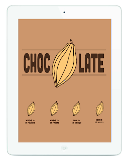
I am very happy with the success of my website and from that success, I went onto developing the layout for if it was to be used as an iPad app as a proposal for broadening the Website and its range of platforms. I decided on having it for the iPad as it is popular amongst my target audience of children to play with as it is very interactive using the touch screen. It would be used as an educational app that the children can scroll down using their fingers to read the content.
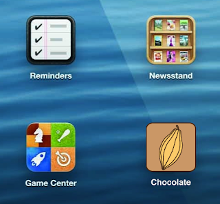 |
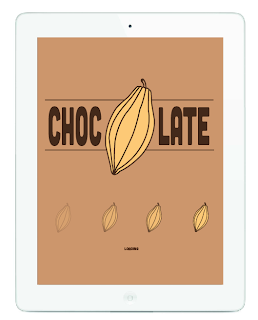
| App Icon |
For the App Icon, I wanted to keep it really simple and felt that it was adequate to use the Cocoa Bean icon that I had used throughout the Website so that it stays consistent and fluid throughout. This would also mean that the user would know automatically that it was to do with the Chocolate Website.
 |
| Loading Page |
When you use an App, you usually have to wait for it to load up when using it so I decided to create a loading page. Using the layout for the Homepage, I turned the Cocoa Bean page links into a Loading bar by having the Beans getting less opaque the more the page had loaded up. This way, this would mean that there isn't a big difference in regards to the visuals so it is still consistent throughout.
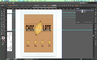 |
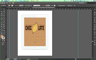
| Homepage |
For the Homepage, I kept it the same as on the Website, however, I had to change the orientation of the site from Landscape to Portrait to show how it would look if being used upright on the iPad.
 |
| How pages would scroll |
Using Grid lines, I created an even amount of spacing for the placement of my links and added the content in the same manner so that it would work on the different portrait orientation. For the first page, I produced a visual of what the top and bottom of the page would look like to show how it would scroll when the target audience would use their finger and scroll down, shown by the position of the Scroll Bar at the side of the page.
 |
| Other Pages |
From this, I developed the rest of the pages to fit these dimensions.
I transposed these illustrations onto an iPad image so that you could clearly see how it would work on the dimensions of an iPad. This would show my Proposal on a much more professional level as you can clearly see how it would work in real life.
 |
| App Icon |
 |
| Loading Page |
 |
| Homepage |
 |
| Scrolling Pages |
 |
| Content Pages |
I believe that the content transposes itself well to the medium of an iPad App. I was slightly worried about the change in placement from Landscape to Portrait but it comes across as well fitting and, if anything, looks like the site would work better with the scrolling option as it allows the target audience to interact with the story element of the site.
From the success of the iPad Proposals and the Website design itself, I ended up producing a proposal for the website I initially proposed at the beginning of the Brief. These are showing how my design would be produced in a digital fashion. I found it very difficult to show how the full website would work but I managed to mock up how I would want the Homepage to work.
 |
| Homepage for Website Proposal |
The Homepage as the logo orientates the user whilst the cocoa bean moves from one page to the other so that the user can follow the bean to the next section. The beans link to either of the four sections so that the user doesn't have to keep scrolling to get to a particular area. The website would be completely linear based on scrolling down but the option to click a ink gives the user more control over their user experience as well as linking wight he want for it to be a narrative journey that the user would follow along with. On the content pages, this motion graphic would continue with each page having the bean somewhere and it going down to the next page.
Lastly, I developed my Design Boards by adding the improvements that were deemed as necessary by the people who Critted me.
For my Design Boards, I have broke the text up by adding spaces between the lines and presenting it in a bullet pointed fashion, having it as quid notes on each area rather than a few lines on everything to make it easier to read. I have also included additional images to my Design Choices Board so it is a lot more visual in presentation. I've also included a Design Board for my iPad App Proposal so show how it would look and work. These are only small changes but if they help get my work across then they are worth doing.
Finished Design:
A Multi-page working website using Dreamweaver based on the research conducted on our Summer Project. Alongside this is 6 Design Boards and an additional iPad App Proposal as to how the website would run on a different platform.
 |
Finished Website Design
|
 |
| iPad App Proposal |
 |
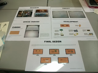
| 6 of the 7 A3 Design Boards |
Overall, I feel as though this Brief has been very successful for me as I have learnt a new skill and put it to the test. I thought I would be very difficult and, in a sense, it was but I really enjoyed it. I'm very happy with the consistency of the web pages and how I have managed to do the coding to make it work. If it was to improve it, I would try and make it more animated perhaps and include more pages, similar to the proposed Website that I started with but this would be depended on having better skills and more time.


