From the 5 Pangrams that we had to produce, we had to put them on the walls and we discusses legibility and readability in regards to the pangrams (see pictures) :
 |
| Pangrams Being Used |
From this, we found;
- Script Fonts- Not designed for body copy or a large scale
- Header font- A Sentence at the most
- Line Length - One sentence on one loine rather than on seperate lines
- Breaks up the sentence and the readability
- Distance & Scale of paper affects the readability
- Roman Fonts - Small scale designed for reading
- Block Fonts - Designed for Headers (illegible at small scale)
ALL GRAPHIC DESIGNERS NEED TO BE ABLE TO DO 2 THINGS: LOOK AND LISTEN
We went on to look at how you interpret signs without the use of type:
Toilet/Airport Signage- making a language that is universally understandable without knowing the
language of the host country
- Use of symbols as interpretations (eg. Genesis Pictorial)
Symbols that we are familiar with
Type- Not as letters but as an image base for a letterform
- Subtley changed
- Using type as visual language adding to the impact of the communication
- How do you make and construct typefaces? - The media you choose?
- Build your own brand and identity
From this, we took the letterforms that we had collected and began to play with the forms of the lettering:
Gothic Lowercase b- Tracing a Regular version and producing the smallest and biggest point size
 |
| Thickest and Thinnest Point Size |
Roman Uppercase A- Tracing a Regular version and producing the thinnest and thickest possible sizes
 |
| Producing the Thinnest Possible and Thickest Possible Outcome |
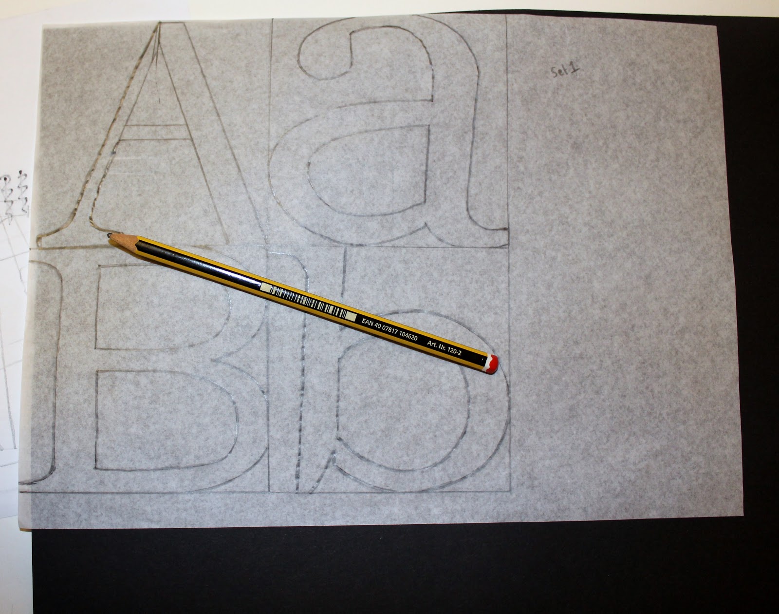
The 2 sets of tracings produced a full set on the tracing paper
 |
| Overall Tracing |
Then tracing the Gothic Uppercase & Lowercase A, B & C
 |
| Gothic Uppercase & Lowercase |
Gothic Upper and Lowercase C- Producing the thickest and thinnest possible outcome
 |
| Boldest Possible and Lightest Possible Outcome |
Gothic Upper and Lowercase B- Stem is thickest and Bowel is thinnest
 |
| Thickest Stem and Thinnest Bowel |
Gothic Upper and Lowercase A- Stem is thinnest and Bowel is Thickest
 |
| Thinnest Stem and Thickest Bowel |
The Uppercase A, however, does not have a bowel as it has a crossbar instead thereby it doesnt have a thick section.
 |
| Overall Tracing |
After producing different versions of the same letterform, we were then encouraged to take the individual letterforms themselves and dissect them into thier individual anatomic pieces, mainly consisting of stems, bowels and crossbars.
Firstly, I carved them out of the paper in thier sets:
 |
| Block Font |
 |
| Gothic Font |
 |
| Roman Font |
 |
| Script Font |
Then separated them into there anatomical pieces (see pictures):
Uppercase A's (2 Stems and a Crossbar)
 |
| Set of Dissected Uppercase A's |
Lowercase a's (A Stem and a Bowel)
 |
| Set of Dissected Lowercase a's |
Uppercase B's (A Stem and 2 Bowels)
 |
| Set of Dissected Uppercase B's |
Lowercase b's (A Stem and a Bowel)
 |
| Set of Dissected Lowercase b's |
From these dissections, we had to seperate the pieces into piles and begin constructing and reconstructing letterforms.
Uppercase A's:
Study Task:
Continuing from this, we then had to persue this production of variations of these Letterforms until we couldn't produce anymore. We had to produce them in a systematic way so that it was a thorough investigation into the anatomy of the letterforms.
 |
| Systematic Combinations of Letterforms Created |
These are just a selection of letterforms that I produced whilst using this systematic approach to creating letterforms.
We then had to chose the 5 most successful and create an Uppercase & Lowercase A, B & C in the same logic for all 5 of them. From all of these Photographs, I felt that these 5 were the most successful:
This was successful as it allows for a variation in different letterform types to work together. I wanted to see if this would work on a larger scale.
This was successful as it managed to keep a traditional aesthetic due to the mixture of Roman and Block type thereby it would be legible and readable on a large scale.
This is unusual in its appearance due to the script stem but for some reason it works. I like how distinctive it is and I think that if it worked as a whole alphabet, it would be unique and individual.
This aesthetic is quite quirky as both styles are very distinctive yet I felt that this was successful as it had visual impact as well as being legible.
This combination of Block and Roman is subtle and makes it appear as though it has more emphasis towards one side.
From these chosen 5, I then had to produce an Uppercase and Lowercase A, B & C for each 5 letterforms using the same logic as when making the originals:
 |
| 5 Chosen Letterforms Uppercase & Lowercase A, B & C |
From these Uppercase and Lowercase A, B & C variations that I have produced from the 5 chosen letterforms, we then had to go onto tracing them:
 |
| Tracing over the chosen Uppercase & Lowercase Letterform A,B & C's |
 |
| All 5 Traced Chosen Letterforms A, B & C's |
From these, we had to then handwrender the Letterforms that we had created. I cut mine out of Black Card:
 |
| Tracing & Card Cutting Letterforms |
 |
| Handwrendered Versions next to Traced Versions |
I felt that my handwrendered letterforms were successful as they showed how the letterforms would look when they are out together rather than when they are arranged as it is much clearer as to which are successful and which arn't.
 |
| 5 Chosen Letterform Sets Handwrendered |
From these, we then had to use the same logic to produce Uppercase & Lowercase X, Y & Z's for these same sets :
Firstly, I cut out the sets of the Uppercase & Lowercase X, Y & Z's in the same fonts as the previous A, B & C's.
 |
| Script Font |
 |
| Roman Font |
 |
| Block Font |
 |
| Gothic Font |
Then I seperated them out into thier letterforms and dissected them in order to produce new letterforms.
 |
| Dissected Uppercase X's |
 |
| Dissected Lowercase x's |
 |
| Dissected Uppercase Y's |
 |
| Dissected Lowercase y's |
 |
| Dissected Uppercase Z's |
 |
| Dissected Lowercase z's |
Then I had to produce Uppercase and Lowercase X, Y & Z's that would match with the previous sets of letterforms I had created.
 |
| Created Letters produced from Dissected pieces |
Once I created the sets of letterforms to match the previous lot, I traced them
 |
| All Traced Uppercase and Lowercase X, Y & Z's |
I went on to hand wrendered these as well in order for it to go with the other handwrendered sets of letterforms.
 |
| Handwrendered Versions next to Traced Versions |
 |
| All Uppercase & Lowercase Letterform Sets Handwrendered |
To prove that they work with the Uppercase and Lowercase A, B & C's, I put the sets together to see that they work together as a set of 12. The final thing I need to do is name my sets of letterforms so I felt it would be better if the letterforms were all together to produce some appropriate font names.
 |
| Full Font Set 1: 'Lop-sided' |
I named this font set 'Lop-sided' as it is thicker at the stems than elsewhere on the alphabet therefore it gives the appearance that the letterform is going to topple over as the weight of the block stem is the main focused element of the alphabet.
 |
| Full Font Set 2: 'Alice In Wonderland' |
I named this font 'Alice in Wonderland' because of the very quirky shapes and body forms of the letterforms themselves which gives the impression of something mystical and crazy due to the script fonts curviture and decorative aesthetic.
 |
| Full Font Set 3: 'Invitation' |
I named this font 'Invitation' as, to me personally, it has the appearance of a font that would be used for a posh dinner and service, particularly due to the format of the Z's. The script and roman combination gives a classy appearance that looks confusing but formal.
 |
| Full Type Set 4: 'Evolution' |
I named this font 'Evolution' as it is a combination of Roman and Gothic fonts which are Sans Serif and Serif combined which I think is where Type could go next- to see if there is a healthy medium between the different legible types.
 |
| Full Font Set 5: 'Identity Crisis' |
I named this font 'Identity Crisis' due to the fact that this font has 3 types of font within it and it looks confusing to determine what is going on with its shape and unity amongst the letterforms. This was probably one of my least successful alphabets due to the messy outcome of the letterforms in the end.