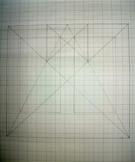
- Also known as the 'Secret Canon'
- A gridded page which adds structure were elements can be organised. This aids maintaining continuity and the flow of information digestion
- It's a historical reconstruction that aids book design to produce pleasing proportions, by dividing the page up in this manner
- It can work for any page height:width ratio
We applied this to the custom page that we had produced in order to see if it would work.
 |
| Van de Graffe Canon |
 |
| Canon with Page Layouts |
Single Page Canon:
- Layout is based on a Reading Book
- Gives Margins based on the Finger Placement
- Optical- Eyes take in large amount of information quicker in this layout
The text area and margin proportions are determined by the starting page proportions
Leading:
- Column width is more than just design or format- it's legibility
- Printed collateral is read by the eye at a distance of 30-35cm so, as an empirical rule, there should be no more than 7 words per line for any text length
- You need to keep the text area light and open so leading is considered, e.g.. the vertical distance from line to line which suits the size of the type
- Overlong and Over short text lines tire the eye- Overlong causes tiredness due to the text being over a long distance. Over short causes the eye to jump from line to line- Ultimately, Wrong Column width leads to wasted time and energy
- The key is ease of reading- text must not impair the rhythm
- This rule cannot be applied to tiles and subtitles. This is because areas like advertising require headings to stand out and be absorbed by the eyes.
 |
| Examples of Spacing between words |
Are Columns and the Application of Columns just for the aesthetics?
Margin Proportions:
- Can have an influence on the overall feel of a page
- Too Small- looks over full
- Too Large- exaggerated
- Well balanced margins on the sides, head and tail can produce an agreeable impression
- Same sized margins never generate an interesting page design and appear wishy-washy, uniform, boring and unconsidered. They generate the impression of indecision and dullness.
- Despite this, having luxurious margins are costly at the printers
How the Rules and Layouts Link:
- The points all join together when done properly. When drawn over the top of each other, they should match up
- Page, Grid and Apply Context (Method of Application)
- You can use the Rules and Grids separately and together
- Qualitative Approach
- Is there an indefinable rule amongst Grids and Layouts
Study Task:
From this, we were to produce thumbnails creating grid layouts, starting with 1 column and working our way to 2, 3 and Double Spread layouts.
From this, we were to produce thumbnails creating grid layouts, starting with 1 column and working our way to 2, 3 and Double Spread layouts.
Using the Thumbnails, we then had to digitise them which I decided to do by drawing them in Illustrator We need to do it to the scale that it was intended for. We need to show the applications of the boxes by showing the skeleton version and then an applied version.
 |
| Grid Lines and Rulers To Produce Scaled Digitised Layouts |
 |
| 10 Digitised Grids Layouts |
 |
| 10 Digitised Versions of the Scaled Grid Layouts |
 |
| InDesign Attempts at Contextualising Grids |
 |
| 10 Digitalised Versions of the Contextualised Grid Layout Skeletons |
Preparatory Task:
I was given the topic of Sport and from that, I was to find some page layouts both from print and the web of Sports articles.
In regards to print, I managed to collect a range of magazines and publications, not just in journalism but in match day programmes as well.
- Liverpool FC- Monthly Liverpool Football Team Magazine Publication
- Power Slam- Independant Wrestling Magazine
- ManC and City- Manchester City Football Team Monthly Magazine Publication
- A range of Rugby/Football Programmes- Publications for Match Days
 |
| Printed Sports Magazines and Programmes |
These layouts in the recent ManC Magazines are considered and artistic in their approach to layout. The placement of text and image as well as type choices and colour have been given a purpose to the article and make it consistent throughout.
This layout in the Liverpool FC Publication is nice in regards to composition and gives a large visual element tot he work, however, the choice of title text takes away from the professionalism in the design and instead, makes it seem quite childish yet this may be so it comes across as child friendly as well as adult friendly to expand the readership.
The page layouts within Power Slam magazine is embarrassing as they are full of type and text, tot he point where it is over-facing and overwhelming to the reader. The image placement is clumsy and sporadic and the choice of typefaces are irritating on the eye.
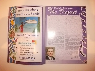
The layouts within one of the Rugby Match Programmes is old fashioned throughout the whole publication with a barrage of information on pages, unclear due to the use of images as backgrounds and other ugly printed advertisements that take away from the articles and sometimes even overlap them.
In regards to web, I wanted to have a look at 2 areas, sports news and specific team websites:
 |
| Sports News Websites |
 |
| Club Teams Websites |


No comments:
Post a Comment