For this brief, we have to make a double page spread within InDesign based on the topic of an animal. The animal that I was randomly given was the Wolf. It must have 500 words minimum and have at least 3 images.
Firstly, I had to research into the animal and find some imagery that would be appropriate (See Design Context Brief)
From the information that I have gained by watching these documentaries and the understanding it has given me, I think I want my double page spread article to be about the challenge that wolves face against humans. The topic of being hunted for the loss of game and the livelihood of hunters is quite topical and I think a serious journalistic approach to an audience of well- educated people would be relevant to the brief.
From this, I felt it would be appropriate to draw out some layouts on a design sheet of possible designs that I could present my information with.
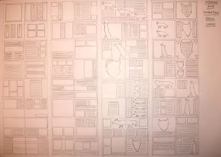 |
| InDesign Double Spread Layouts Design Sheet |
I did both traditional layouts using rectangles and grids as well as some which included the idea of using shapes and imagery amongst the text layouts to try to make it more interesting visually.
InDesign Workshop:
Setting Up:
We went onto setting up the layout of the page that has been set on the brief. It can be set up in 3 different ways.
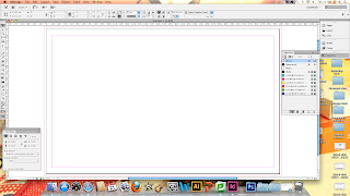 |
| Set Up 1 |
This set up uses the length and width in 1 piece of paper. You could split the page in half and get the double page spread that is needed but this would be an unprofessional way to do it.
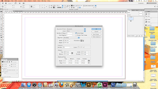 |
| Set Up 2 |
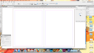 |
| Add an Extra Page for Double Page Spread |
From the second set up, 2 pages had been selected in the number of art boards and facing pages was selected in order for the pages to be able to be positioned next to each other. When producing the set up, we reduced the width of the page in half when setting up to allow for this set up to be produced. Then a new page was added on the second page to make a double page spread of the correct size.
 |
| Set Up 3 |
This final way of Setting Up was used by unchecking Facing Pages. This meant that the 2 pages that were produced were separate from each other.
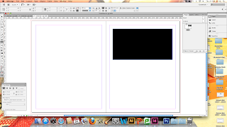 |
| Allow Document Pages to Shuffle |
By using the options available for the layers section, you have the option to allow document pages to shuffle. This allows you to swap the layout and ordering of your pages. As demonstrated by the black rectangle, you can see that by selecting this option and dragging the pages in the layers palette that you can have separate pages laid out next to each other to make a double page spread.
Layout Guides:
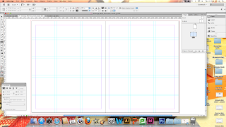 |
| Guides on Double Spread Layout |
By adding the amount of columns and widths that you need, you can add guides to produce grids to the layout of your double page so that it aids the layout of your work.
Work Flow of Finding Internet Images:
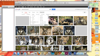 |
| Other Tools, Selecting Larger Than |
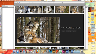 |
| View Original Image |
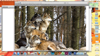 |
| Save Within InDesign Folder |
In order to get images that are of a high standard, you can use a tool on Google than allows you to pick larger images using the Other Tools options. By viewing the original image, you can see the image to its fullest scale beforehand. Then to save any images within a folder of their own along with the InDesign document they are going to be used in.
Images for InDesign:
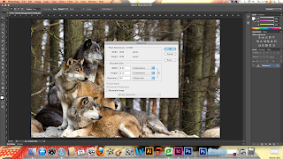 |
| Resample Image to 300dpi Resolution |
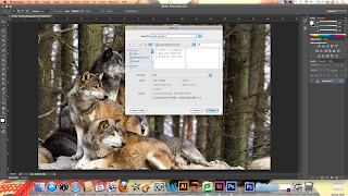 |
| Image Converted to TIFF File |
Images for InDesign need to be put into Photoshop in order to sort out the image size before it is used as it is not good practise to edit photos within InDesign. Place the image into a new Photoshop file and by selecting Image Size, you can use the 'Resample Image' choice to change the image resolution to 300dpi. This means that it will be the right resolution for print. For the image to work in InDesign, you need to save it as either a TIFF file or Photoshop File to work in Print in InDesign. Photoshop files are best to use if you want to preserve any transparency in the image.
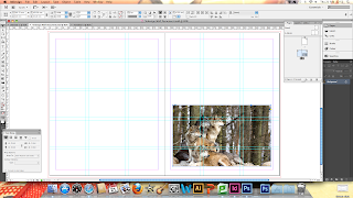 |
| Placement of Image |
Then you just place the image into the document you are using and select the place you want to put it.
Resizing an InDesign Image in Photoshop:
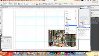 |
| Find the Scale in Links and Edit With Photoshop |
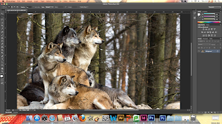 |
| Resizing Image |
You can reduce and enlarge an image for InDesign within Photoshop to the size that you want it for. Resize the image to the size you want in InDesign and, using the links tab, find the scale percentage that it has been enlarged or reduced to. Then right click and edit with Photoshop. Within Photoshop, using Image Size, Re-select 'Resample Image' to get the sizing options back again and change the width and height to the scale percentage you want. It is recommended that you change the Bicubic option as well to the recommended enlargement and reduction options so it aids the quality of the image. When saved, the changes of the image will automatically update in InDesign.
Manipulating Text and Image:
You can manipulate the text boxes with writing in to change the shape of the text box and manipulate the shape that the text is produced in. This way, you can have any image that you want and make it in text.
Not only that but it is possible to put images within text to create a striking effect.
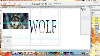 |
| Create Outlines |
You need to choose the font and write the text that you want the image to go in. Select the option to create outlines in order to turn the letterforms into vectors. From this, you can put the image into the text in order to present the text.
If you have a letterform that has accents in them, like an A or a P, you can use Compound Paths to be able to fill them again so that it keeps the legibility of the letterform.
Print Out
 |
| General Print Options |
To print out, select the colour printer with the print spreads option and the range of pages you want selected, in this case 2-3 for the double page spread
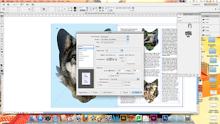 |
| Set Up Printer Options |
Select the paper size you are working from which is A3. Centre the document so it fits on the page and orientate the page to landscape so it prints both pages on the same A3 sheet for the effect of a double page spread.
 |
| Marks and Bleeds Printer Options |
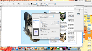
When going through the bleed options, make sure that the crop marks option has been ticked so that when the spread is printed out, you know where the bleed/spread ends and the rest of the paper begins.
Own Development Work on Double Page Spread:
After having the InDesign Workshop, I went onto producing some designs from the techniques that we were shown within the Workshop. I started off with trying out some simple, structured layouts in order to get the feel for using InDesign as a program so I could gain in confidence.
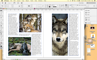 |
| Structured, Traditional Layouts of Wolf Double Spreads |
Many of the layouts were very successful in regards to how they were clean and considered. They came across as having a quite professional aesthetic and I felt quite proud at this achievement. Also, more importantly, I had a lot of fun making the different layouts and enjoyed doing it. One thing I think let down my layouts was the presence of a heading as it didn't seem to fit the presentation of the article- visually, my article layouts looked better without a title.
From the techniques shown in the InDesign workshop, I liked the idea of putting text within an image and images within images. I decided to develop this to create other layouts that would be more experimental and playful.
I created some outlines of Wolf bodies and heads on Illustrator.
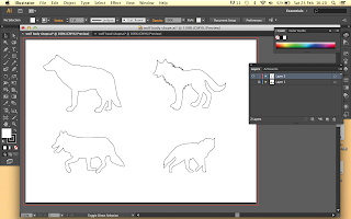 |
| Illustrator Images of Wolf Heads and Bodies |
From this, I wanted to experiment with the outline shapes and add the images and text to see if it would add to the overall look of the layout.
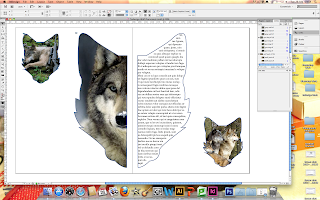 |
| More Experimental Layouts for Wolf |
I felt that many of these experiments into possible Layouts was worthwhile and aided the development of my work as it gave me an insight as to what worked and what doesn't. I like how clean the layouts are despite the mixture between type and image structures.
From this, I decided to include my own 500+ word text within the double spread and compare some typefaces to see which would be suitable to my audience as well as be legible.
|
|
Malayalam Sagnam MG Regular
|
I felt this was quite a legible text font however, it would be an unusual choice. It isn't a commonly used font so it might be difficult for some people to use.
This would suit with the aesthetic associated with Wolves but it would not be legible or readable in a body copy scenario. With this, this font would be more suited to be a header font rather than anything else therefore being unsuccessful.
I like the old, aged aesthetic that has been produced by the typewriter style font but it did effect the legibility of the text when put in a body copy scenario, particularly if put into thin narrow columns for the sake of layout presentation.
I felt that Helvetica was a legible and readable font which, when tested in different font sizes, looked easy to read in small or big point size. From that, I felt it was the most successful font I had tried as it would allow my font to be more accessible to a larger audience range.
From this, I went and added the text from the article that I had written into the page.
To follow on from this, I didn't know whether it would be necessary to the design as to whether I included colour in the text or background. I thought it might be an idea to experiment with it to see how it would effect the outcome of my double spread and see if it was relevant to my target audience as currently, without colour, it looks relevant.
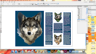 |
| Layouts with Colour |
As shown by the Screen prints, I tried using some colour within my article but it didn't give the same journalistic edge that I am looking for with the audience I am trying to communicate to. This takes away from the actual article making it unsuccessful and illegible.
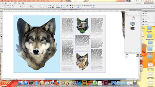 |
| Layouts with Tinted Colour |
This lighter tint looks much better that the darker, bolder colours that were used beforehand. The fact it is a icy cold blue goes well with the theme and habitat of the wolf. The subtle colour doesn't take away from the photos or the type either. Trying with 2 different colours I didn't think worked as well compared to using just 1 colour and stock as I felt it didn't add anything to the article.
I wasn't sure whether it was compulsory to have a heading alongside the article that we were producing. Personally, when producing layouts, it didn't look very aesthetically pleasing when creating the layouts to have a title. It didn't mesh well with the rest of the layout but I decided to try it out anyway.
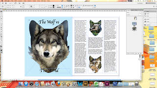 |
| Experimental Title Heading Layouts and Fonts |
They all look dreadful due to the font which looks as though it has been an afterthought rather than something which appears considered. They either look like they have been stuck on or the typeface doesn't fit the mood of the text. Due to these reasons, personally, I don't like the look of the heading on the page.
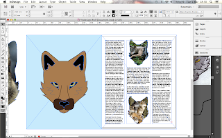
To see if it would be any more successful, I decided to use the Illustrator silhouettes and the photograph of the wolf head I have been using and produce my own wolf head drawings to see if this would aid the aesthetic flow of the layout as so far, it is successful but doesn't seem very fluid.
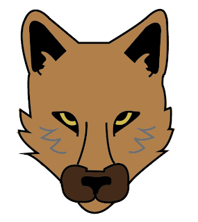 |
| Original Illustration |
 |
| Layout with Illustration |
I like this illustration as it is quite inoffensive and suits the coloured background on the left page therefore allowing more of a flow on the page. I think that it doesn't interfere with the other photographs that have been used and gives a real focal point as it is different to the rest of the layout.
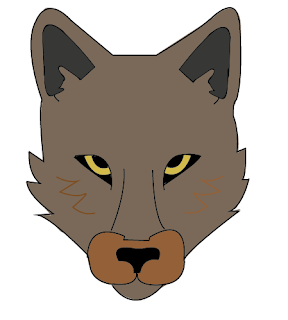 |
| Other Illustrations |
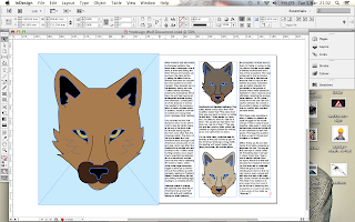 |
| Layout with all Illustrations |
I decided to try it with some more illustration variants to replace the photographs yet I didn't think it was as successful. This is due to the fact that it doesn't give the layout any variation and therefore makes it lack more visual interesting focal points.
Tester Piece:
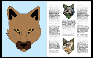
A3 Landscape Double Page Spread based on 3 images and 500+ words on the topic of an animal, the Wolf.
 |
| Tester Design on InDesign |
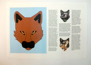 |
| A3 Print Out |
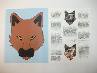 |
| A3 Cut Out Printed Layout |
I'm really happy with how well my layout has gone as it is well balanced and the colour is bright but not overwhelming so it carries the image in a positive way.
From my tester piece, I was given the opportunity to get feedback via a Crit process that we had during Design Principles where we had to show any work we had done based on grids and layouts. (See PPP Blog)
After the Crit, I took all the comments on board and reacted to it. I blocked out the paragraphs that had done so that it made it more of a block set of text.
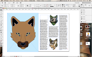 |
| Blocked out Columns |
After this, I found that it made some room at the top of the column at the beginning so I thought that this may help solve the issue of the use of a Heading by using this empty space and producing a small yet simple heading.
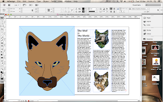 |
| Heading |
I added a Heading into the space using the same font, Helvetica Neue, yet I used the Bold option and had it in 24pt size so that I could put emphasis onto it so that it would draw the viewers eye towards it.
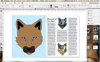 |
| Changed Heading |
I decided that the previous Heading title was a bit off balance and didn't fit very well into the columns but this new Heading works as a saying rather than splitting it up so it makes the title more readable for the eye.
I am very happy how the Heading has come out after all the difficult I had previously when trying to produce a suitable looking Heading. It fits in with the rest of the aesthetic and keeps the balance that I originally had within my layout design whilst adapting to the changes I have made.
Final Design:
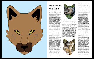 |
| Final Design on InDesign |
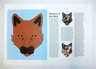 |
| Printed A3 Layout |
For this brief, I feel as though I have done very well in regards to developing my layouts as I have continually developed and experimented with different ideas, layouts and visual variations on what I had produced. I feel as though I covered a lot of the areas of interest as I looked at colour, type and layout as well as managed to deliver the needs of the brief. I feel as though I have managed to make the article, both the text and layout, relevant to the audience that I was aiming for as it looks sophisticated and reads journalistically. Even the fact that it uses an illustration doesn't take away from the overall tone of voice and relevancy to the audience and subject matter.


No comments:
Post a Comment