For Design Principles, we need to produce 10 double page spreads based on the research we did a while ago for the '10 Things..' study task. We need to present this information in a format of 10 double page spreads minimum that we think is relevant to us.
I started by producing a substantial amount of layouts so that I could have a range to fulfil. I want the layout that I use to be one that can be used throughout the book so it has a strong identity and consistency.
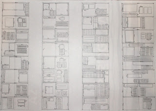 |
| Layout Design Sheet |
After going from this, I decided to produce some layouts that could be done for each of the '10 Things'. I wanted to consider the content and the design of the layouts. I also looked into possible imagery to use for each one by designing some simple images associated with each thing.
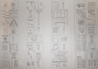 |
| Layout Design Sheets |
Due to the fact that I want it to be consistent throughout, I liked the idea of having a set style of body copy with imagery and text that reflected that of the subject matter of that double page spread.
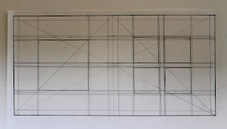
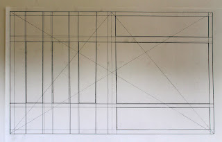
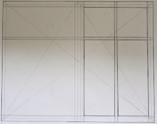
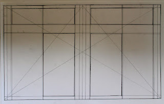
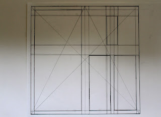
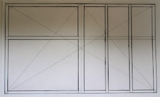
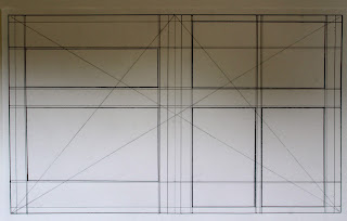
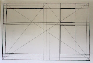
From this, I went onto creating 10 of the layouts to their proper scale to see if they would be successful to produce as a set. I needed to produce traditional mock ups for them, outlining the margin, gutters and layout by using pencil and ruler rather than putting them into the computer to do them.
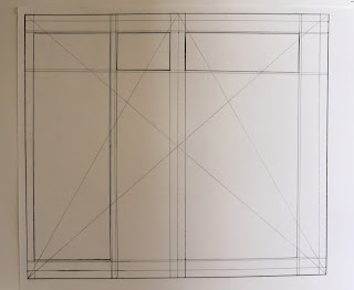 |
| 40cm x 35cm |
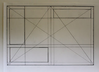 |
| 30cm x 20cm |
 |
| 40cm x 20cm |
 |
| 50cm x 30cm |
 |
| 50cm x 40cm |
 |
| 50cm x 30cm |
 |
| 30cm x 30cm |
 |
| 50cm x 30cm |
 |
| 50cm x 30cm |
 |
| 30cm x 20cm |
I set the margins at 1cm each so that there was an equal amount of space to act as a border as well as allowing for as much space as possible for content. I had the gutters at 2mm each just so that there was a small amount of considered space, however, normally I consider having at least a space of 1cm between columns/ boxes naturally as otherwise it would appear too cluttered and cramped.
From these, I was able to determine what would work the best as a layout in regards to sizes and presentation. The physicality meant that it was much easier to judge this rather than just putting the size straight into InDesign as it doesn't allow you to see the full scale and therefore, not determine the most suitable outcome.
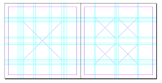
I went onto digitising these in InDesign so that I could see how they would present themselves in a digital format. They need to be both successful as a digital and traditional mock up to see which would be the most functional.
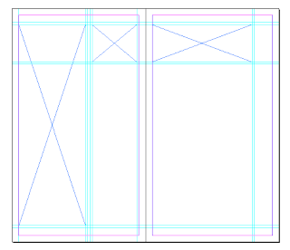 |
| 40cm x 35cm |
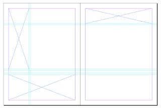 |
| 30cm x 20cm |
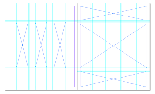 |
| 50cm x 30cm |
 |
| 50cm x 40cm |
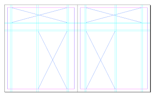 |
| 50cm x 30cm |
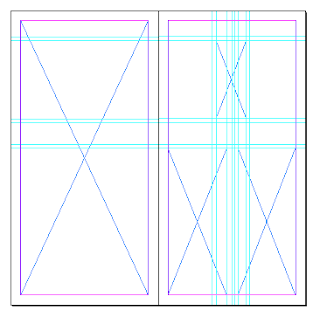 |
| 30cm x 30cm |
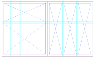 |
| 50cm x 30cm |
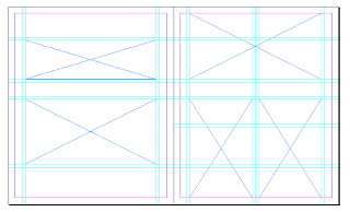 |
| 50cm x 30cm |
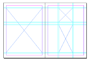 |
| 30cm x 20cm |
 |
| 40cm x 20cm |
By producing them in InDesign, I was able to see which worked the best in regards to proportions and content amounts, which I felt that the ones which were smaller in size were more successful at this.
From these, I couldn't decide out of 2 of them which to use. I liked the size and the scale on one but I preferred the layout on another so I decided to integrate the 2 to make an overall final layout.
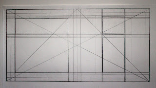 |
| Final Design Layout 40cm x 20cm |
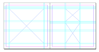 |
| Final Design Layout 40cm x 20cm |
I prefer the layout based on the fact that it uses some negative space and is more columnised without using a large amount of boxes or content. I wanted a layout which can be used consistently throughout the book and I think it would be a layout which would work for all 10 double spreads.
From deciding on the set layout of the double page spreads, I needed to concentrate on the contents of them. I want to include a title, image and some body copy as the set contents so that it is not cluttered but does have contents even if it is minimal in style.
From the design sheets I had produced earlier for the contents, I produced an illustration to visually represent each of the 10 things.
 |
| Book for Type Readability and Legibility |
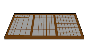 |
| Movable Type Draw for the Invention of the Printing Press |
 |
| Pantone Swatch Booklet for Pantone Colour Matching |
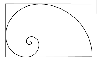 |
| Fibonacci Spiral for The Fibonacci Sequence |
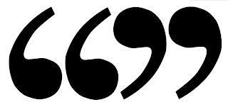 |
| Speech Marks for Tone of Voice |
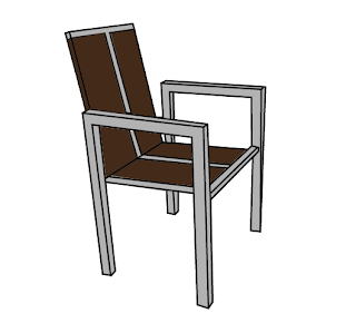 |
| Chair for Form Follows Function |
 |
| Dog and Fox for The Quick Brown Fox Jumps Over The Lazy Dog |
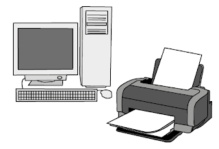 |
| Computer and Printer for Print vs Web |
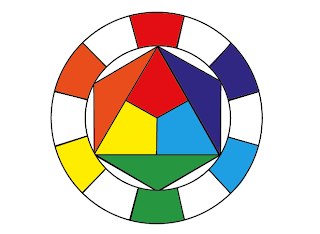 |
| Colour Wheel for Complimentary Colours Don't Compliment Each Other |
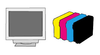 |
| Computer Screen and Ink Cartridges for Print vs Web |
I wanted to have these acts as either little icons or large scale images that would help illustrate each aspect of the double spreads.
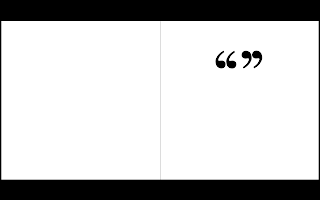 |
| Double Page Spreads with Illustrations |
After including the illustrations, I went onto including the information that I collected from the previous
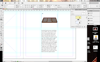
Study Task. I liked the idea of having the image and text columnised. I needed to test out what typeface I was going to include for my design sheets. I wanted the body copy text to be something familiar and legible so it would help with the readability. Also, my layout is quite simple which I wanted to reflect within my font choice.
 |
| Helvetica |
Helvetica looks too wide to fit within the narrow spacing for the font so it doesn't appear to fit with the overall layout.
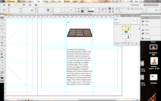 |
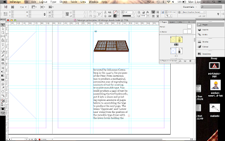
| Ariel Rounded MT Bold |
Ariel is too dark and I don't like how the rounded letters fit on the page. I don't think it suits the narrow layout that I am going for on this page.
 |
| Georgia |
Georgia fits quite well as it is a smaller, more narrow font yet it does appear slightly old- fashioned which may not be in keeping with the overall visual aesthetic.
 |
| Gill Sans |
Normally, Gill Sans is my go-to font but it appears quite scratchy and unconsidered when put on the page alongside the illustration.
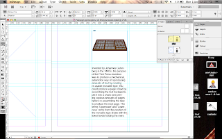 |
| Calibri |
To me, Calibri seems quite thin and narrow whist also having a rounded form so I felt it was quite a good looking font alongside the illustration. I may have to try it bolder to see if it makes any difference.
 |
| Rockwell |
Rockwell seems like a typed font so I don't think it works with the digital illustration that it is to go alongside, particularly if I want them to work together.
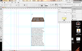 |
| Calibri Bold |
Calibri Bold doesn't suit the layout of the font as much as it did in its regular form. I was worried that the normal version would be too light but compared to the bold option, I feel it is quite fitting.
 |
| Double Page Spreads with Body Copy |
I used Calbri on the rest of the pages with the inclusion of the Body Copy text I was going to include and felt that Calibri worked throughout as a series and alongside the illustrations. It worked with the clean aesthetic that I am going for as well as working in regards to being narrower than other rounded fonts. This meant that it worked with the space that it was given.
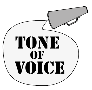
I went onto producing the headings/ titles for the opposite pages so that it would orientate the reader. In a previous double page spread brief, I had found producing a title or heading difficult so I was worried about how this would turn out. I wanted each one to be relevant to the subject matter so it would be instantly communicated to the reader what the spread was about.
 |
| Headings/ Titles for Double Spreads |
Some of the headings I think work really well such as the Fibonacci Sequence and the Form Follows Function which are based purely on the typographic layout and presentation. To say I have never done something like this before, I am quite proud of how those have come out. The RGB vs CMYK heading I like as well as it is quite simple in its image and the typeface, looks quite fitting alongside it. Some others, such as the Print vs Web heading, doesn't seem to suit the same level of wit and cleverness so they seem lacking in quality compared to the others.
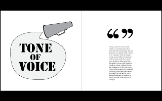
I put them on their corresponding pages to see how they would look when on the spreads, how they interacted with the other page and whether they worked as a unit.
 |
| Layouts with Headings |
I feel that some of the layouts work really well with each other, especially with the amount of space that the headings took up. It really balances out the spreads now that they have something on the opposite page. The layout and style has allowed for the uniformity I wanted amongst the spreads whilst they are still all different in their approach to this.
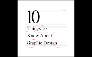
To develop this further, I went onto producing extra that would be produced if this was put together as a book. I decided to include a front page and a contents page to aid reader orientation. I decided to go with a general aspect of Graphic Design to illustrate this so I settled on the concept of type anatomy to present it as it covers a large aspect of the general discipline as well as being something we have covered in Design Principles.
 |
| Title Page Layout |
I decided to go for Times New Roman as I wanted to be able to show different aspects of the font anatomy and I felt it would be easier using a Serif font rather than a Sans Serif, particularly as I had tried it with the font Verdana and it didn't look as good. This way, I get the opportunity to use both types of fonts in my double spreads while having purpose and not causing them to look awful together. I kept the composition simple and used minimal colour as I wanted the front to be in keeping with the overall look of the double spreads.
 |
| Contents Page Layouts |
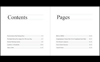
The contents pages I reflected using the front page so that there was some consistency which I felt was fitting of the overall design.I doesn't have the same layout as the content of the double pages yet I think this gives it some differentiation as to the purpose of the pages and the actual content.
From this, I uploaded the finished layout to Issuu to produce a digital version/ mock up of what it would look like as a proper book.
Final Piece:
11 double page spread layouts on the topic of the research we produced for the '10 things...' study task.
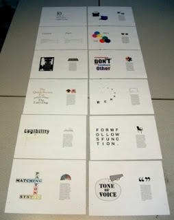 |
| All Finished Printed Double Spreads |
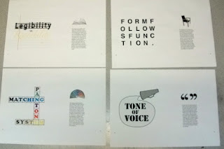 |
| Printed Double Spreads |
Overall, I feel as though my double spreads work together as a collection as they are pretty succinct in regards to layout and presentation. There is a fluidity when going through each double page spread which is aided by the consistency of the pages. If I was to improve it, I would perhaps make the page size smaller so that it is more intimate as I like the space around the layouts, however, due to the size it does seem a little bit overwhelming.


No comments:
Post a Comment