Completed self evaluation sheet for the Responsive Module
Showing posts with label Responsive- Design Process 2. Show all posts
Showing posts with label Responsive- Design Process 2. Show all posts
Sunday, 20 April 2014
Monday, 14 April 2014
Responsive- Design Process 2: Summative Evaluation
At the beginning of the year, the idea of producing work for outside of college and having other people look at my work made this a module that I was scared of. I felt like I was under immense pressure because I do not have the confidence to show my work in a college setting never mind trying to produce professional outcomes for people outside of the institute. The idea of being in control of my own briefs was daunting and the prospect of having to compete against other designers was over-whelming. I just didn't feel ready for it.
Despite this, what I wanted to get out of the module was an opportunity to try as many different types of design areas as possible as another thing I wasn't sure on was what type of design I wanted to go into. I felt that this module would give me the chance to have new experiences and further myself as a designer.
At first, I would shy away from doing any of the briefs but I knew that I would have to do something to try and get over the initial fear of producing work for an outside audience so I did work for a small christmas card competition which I think eased me into the module. This meant that I broke the cycle by facing this head on and made me feel more confident about trying to put my work out there.
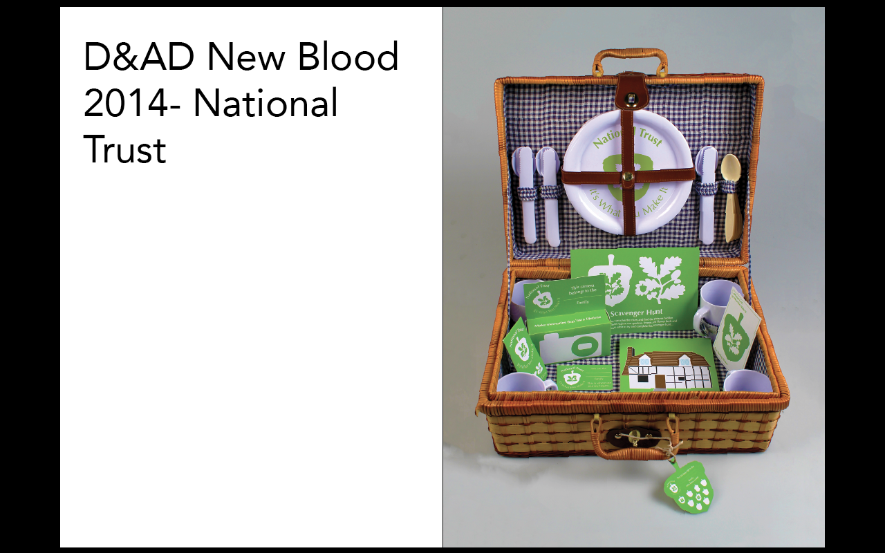
The main element of my responsive module was choosing the individual brief that I would want to do. I wanted to do a D&AD brief because I wanted the experience of having produced work for something that is considered prestigious. I decided that if I was going to have to produce work for the outside world, I was going to pick the body that had a lot of respect within the industry and prove that I could do it. I knew that if I did this, I would have to produce my best work yet.
The reason I selected the National Trust brief was because I could relate to the brief and felt that, from my own experience, I would be able to produce something that would be relevant to the target audience. At the same time, due to the fact that I was familiar with the brand, I knew that this would be a difficult and very challenging ask to change the perceptions. At one point I did question whether I had picked the right thing but I persevered as I didn't want to give up and in the end I produced some of my best work to date. The only downside to it was it took at lot of my time to produce the work for it which meant that I couldn't commit any time to produce some smaller brief responses.
The hardest brief to work with was the collaborative brief as, despite the fact that the brief was incredibly fun and engaging which I would defiantly take part in again, I had a partner who didn't contribute to the partnership as much as there needed to be and the unreliability meant that I was constantly having to ask for contributions so that I could produce my work. Despite this, I was very happy with the result of the work produced and I am actually looking forward to the YCN briefs for next year.
My time management due to the time spent on the large individual brief meant that I didn't have a lot of time to produce lots of small individual briefs. The briefs that I did produce were varied and allowed me to work on a different aspect or area of design thereby allowing me to try them out and broaden my horizons as a designer. I did a range of competitions and live briefs so that I got experience in both areas, with live briefs allowing me to try and work to a client wants whereas competitions allowed me to be more imaginative but I still had to work to submission and format requirements. The one that I enjoyed the most was the Penguin Book Awards as I had free-reign for the design and found a topic that I was interested in. I am looking forward to next year as I intend to take part in both the adult and child awards.
Overall, I have enjoyed the module even though I have found it very difficult to balance this module alongside all of the other modules that are going on. I feel that it has helped me become more professional in the display of my work and has given me more confidence to try and get my work out there. I would have probably enjoyed it more if I was able to focus more of my time on this module. Despite this, I have learned a lot during this module, about what I enjoy designing, what work I want to produce and the way I should present my work.
Despite this, what I wanted to get out of the module was an opportunity to try as many different types of design areas as possible as another thing I wasn't sure on was what type of design I wanted to go into. I felt that this module would give me the chance to have new experiences and further myself as a designer.
At first, I would shy away from doing any of the briefs but I knew that I would have to do something to try and get over the initial fear of producing work for an outside audience so I did work for a small christmas card competition which I think eased me into the module. This meant that I broke the cycle by facing this head on and made me feel more confident about trying to put my work out there.
The main element of my responsive module was choosing the individual brief that I would want to do. I wanted to do a D&AD brief because I wanted the experience of having produced work for something that is considered prestigious. I decided that if I was going to have to produce work for the outside world, I was going to pick the body that had a lot of respect within the industry and prove that I could do it. I knew that if I did this, I would have to produce my best work yet.
The reason I selected the National Trust brief was because I could relate to the brief and felt that, from my own experience, I would be able to produce something that would be relevant to the target audience. At the same time, due to the fact that I was familiar with the brand, I knew that this would be a difficult and very challenging ask to change the perceptions. At one point I did question whether I had picked the right thing but I persevered as I didn't want to give up and in the end I produced some of my best work to date. The only downside to it was it took at lot of my time to produce the work for it which meant that I couldn't commit any time to produce some smaller brief responses.
The hardest brief to work with was the collaborative brief as, despite the fact that the brief was incredibly fun and engaging which I would defiantly take part in again, I had a partner who didn't contribute to the partnership as much as there needed to be and the unreliability meant that I was constantly having to ask for contributions so that I could produce my work. Despite this, I was very happy with the result of the work produced and I am actually looking forward to the YCN briefs for next year.
My time management due to the time spent on the large individual brief meant that I didn't have a lot of time to produce lots of small individual briefs. The briefs that I did produce were varied and allowed me to work on a different aspect or area of design thereby allowing me to try them out and broaden my horizons as a designer. I did a range of competitions and live briefs so that I got experience in both areas, with live briefs allowing me to try and work to a client wants whereas competitions allowed me to be more imaginative but I still had to work to submission and format requirements. The one that I enjoyed the most was the Penguin Book Awards as I had free-reign for the design and found a topic that I was interested in. I am looking forward to next year as I intend to take part in both the adult and child awards.
Overall, I have enjoyed the module even though I have found it very difficult to balance this module alongside all of the other modules that are going on. I feel that it has helped me become more professional in the display of my work and has given me more confidence to try and get my work out there. I would have probably enjoyed it more if I was able to focus more of my time on this module. Despite this, I have learned a lot during this module, about what I enjoy designing, what work I want to produce and the way I should present my work.
Responsive- Design Process 2: Collaborative Brief Submission and Individual Boards
Collaborative Submission Boards
Collaborative Individual Boards
Collaborative Individual Boards
Sunday, 13 April 2014
Responsive- Design Process 2: Project Report
As part of the Responsive Module, we have to show what we have done for the module through the production of a digital Project Report. This would act like a digital diary of the briefs we have done and the work we have produced.
The first thing was I produced the body copy for the Project Report so that I knew what I would have to work with when producing the layouts.
I decided to structure my body copy so that it has a set way of discussing my briefs, starting with the brief information and concept, leading to successful and weaknesses followed by what I had learnt and how this would influence my practise. Despite this, it also gave it a very clinical and robotic way of discussing my briefs and doesn't come across as though I have down them personally.
With that being said, I decided to change how I wrote it, by changing the beginnings of the paragraphs so that the tone of voice was more conversational thereby having a more personal attribute towards the briefs whilst still keeping the structure that I had produced.
I started off with a basic 10x10 grids that I had a basic layout to work with in regards to spacing and format. I decided to produce it in an A4 portrait format as I felt that this would be the most suitable format for the work that I have produced for the module.
Following this, I went onto producing the layout of the front cover of the Project Report because, this way, the format of the book can follow the layout established by the front cover.


I found the layout for the Secret 7' brief very difficult to achieve based on the fact that the shape of the mock up isn't a rectangle but its a square either so I was going to have to work the layout around the image. I experimented with a range of different layouts with just the mock up image but none of them were working. From this, I decided to include the original image alongside the mock up to see if it would effect the aesthetic. By including it, I started to work on placement of the two images and found that the layouts where much more harmonious. Eventually I settled on a landscape layout with each image having one page and 2 columns of content so that they are even and reflectively balanced.


The trouble with the green I had chosen was that it was only a tester colour and I didn't choose it for any reason so I decided to change it to the same green colour that I use for the National Trust brief. This way, there would be a context to the colour scheme and it would work alongside the content. To reflect this aesthetic, I changed the contents page and the orientation of the title of the front cover so that it was much more in keeping with the style of the Introduction Pages.
Final Product:
The first thing was I produced the body copy for the Project Report so that I knew what I would have to work with when producing the layouts.
I decided to structure my body copy so that it has a set way of discussing my briefs, starting with the brief information and concept, leading to successful and weaknesses followed by what I had learnt and how this would influence my practise. Despite this, it also gave it a very clinical and robotic way of discussing my briefs and doesn't come across as though I have down them personally.
With that being said, I decided to change how I wrote it, by changing the beginnings of the paragraphs so that the tone of voice was more conversational thereby having a more personal attribute towards the briefs whilst still keeping the structure that I had produced.
Happy with the content of my Report, I moved onto producing each of the layouts for the different areas of my Project Report.
 |
| Grid System |
Following this, I went onto producing the layout of the front cover of the Project Report because, this way, the format of the book can follow the layout established by the front cover.
 |
| Front Cover Development |
I have never done a layout before which is quite minimalist and decided that this would be an appropriate way to go as the information would be type based. I tried having the information all in one column to the side but I felt that this was quite empty. From that, I decided to try the information along the bottom the cover which instantly lifted the cover as it gave it more of an experimental aesthetic. The large amount of space left on the cover was a challenge for me because I wanted to have some space but it was drowning the title so, instead I started to use the space to my advantage, playing with the placement and font size of the title. Eventually, I found that having the title in the top half was much more effective and, by adding a line across the page separating the information, it gave a definitive aspect of hierarchy and positive space.
 |
| Contents Page Development |
Following the production of the front cover, the contents page reflects the development that the front cover went through before sticking to a similar aesthetic so that they are consistent throughout. I felt that I couldn't have the name of the briefs along the bottom of one page because I felt like I would need some page numbers to contextualise where each brief was for easy access so I spread them out across the bottom of both pages. Also, I included the page numbers at the top of the page so that this wasn't in the way of the numerical values at the bottom.
 |
| Introduction Page Development |
I needed to present each different project within the report but I wasn't sure how I was going to do this because I knew that some of my content would only take up a small amount of space, like a double page spread. I started off by having the title of the project I did with an image accompanying it. Whist this would be suitable for a large project like the National Trust brief, I came to realise that some of my work doesn't have that many visuals to show what I did. From that, I decided to reflect the grid system I had already established with the contents and front cover by having the title at the top and the information at the bottom but it didn't work so I moved the information underneath the title and this gave a much more professional aesthetic.
Main individual Brief:
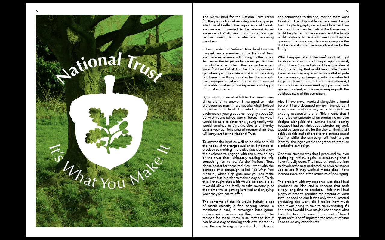
I decided to have the National Trust brief as my first brief as it is the main deliverable brief of my individual practise.
 |
| Initial Layout |
To start with for the National Trust pages, I had just two double spreads and had them showing the kit and the contents of it. However, I felt that this was a little one dimensional to my work as it only showed one aspect of it after talking about the range I had done in the content. What I did like was the use of the landscape photograph which spanned the width of the double page spread as it had a larger impact and made for a bold statement. In regards to the content layout, I justified aligned the information so that was much smoother and I got rid of any hyphenation so that it has a more professional style.
 |
| Image Choice Development |
From the initial layout, I made the landscape image larger and changed the kit image to one of the concept campaign so that it introduces the whole campaign. I expanded the space so that it was across 3 double page spreads so that I could include an image of the app proposal that I produced for the campaign as well. This range of images gives a much more inclusive range of the work I produced for the campaign. The larger scope for the information means that I made the text go across the three pages but that meant that there were gaps left over on the spreads. I included the page numbers at the tops of the pages as well but I didn't like the way that the page numbers were within the images.
 |
| Inclusion of Basket Image |
To get rid of some of the spacing, and because I now haven't got an image of the actual kit, I included an image of the picnic basket which added to the overall section. The trouble with the content is that the content on the double spread was coming across as difficult to read because of the cutting off of the information and starting on different pages.
 |
| Final National Trust Layout |
Based on the difficulty of the readability of the previous double spread layout, I decided to make the second layout solely of the landscape photograph for a much more impactful layout. This in turn allowed me to move the text to get rid of the spacing on the first double page spread. I changed the placement of the page numbers so that they were above the page margin, automatically making it less in the way of the images and giving more of a professional aesthetic. This allowed me to make the picnic basket image bigger so that it was more aligned along the top with the app image.
Smaller Individual Briefs:
After the National Trust boards, the next work I was going to include in my Project Report was the smaller briefs for the individual aspect of the module. In regards to the information order, I decided to include the brief in the order that I did them.
 |
| Tigerprint Double Page Spread |
For the Tigerprint competition, I started off by having all of the 5 designs on one page and having the content on the other page, seeing how much room I could have left over. The space left over at the top, I decided to include the contextualised mock ups I had made. I felt that this would help in the long run with determining the use of the designs. The problem was, when I included them, they didn't fit the overall aesthetic and it seemed to cheapen the aesthetic of the spread. In the end, I decided to not included them within my Project Report and decided to just have the original designs. I thought about having the text and a lot of empty space but I felt that it made much more sense to take the opportunity to space out the designs. Therefore I decided to have 2 designs at the top of the empty space and the rest of the designs on the other page so that it is much clearer and spaced out.
 |
| Secret 7' Development |
 |
| Coffee Crib Layout |
For the Coffee Crib brief, I found that I could fit all of the content into one full column thereby I had quite a lot of space to play with but it was in a rectangular format. Despite that, this seemed to work for me as the logo itself is rectangular and the mock ups underneath are two squares next to each other. It is a very simple layout but it works for the content of the page.
 |
| Outsiders Layout Development |
Due to the fact that the brief submission asked for a cover, I knew that it was important to include the cover design but I wanted to show what the book would look like when published. I liked having both of the images on the same page but I felt that the size of the images were mis-matched. I tried them being reflected on the opposing pages but I felt that this was too similar to the Secret 7' layout. So that the images could be the same size there were better suited to being on opposing pages so I tried them being on diagonals, which seemed to work as it was balanced and seemed to match.
 |
| Riverfront Layout Development |
I knew that the original labels themselves would need a page of their own due to the size and format of them. I wasn't sure whether or not I should include the mocks ups that I made for the brief due to the fact that I felt that the let the brief down a little but I felt that the labels were not contextualised or easy to know their purpose without putting them in a real scenario. Originally the mock up sizes I did were quite small so that they looked out of place and dwarfed by the rest of the content. I changed the size and scale of the mock up sizes so that they fitted with the rest of the content.
Collaborative Brief:
Following from the individual briefs would be the collaborative brief as that was part of an individual section of the module.
 |
| BEAR First double spread development |
I started off by having the characters of the designs as the main image of the first page as it is a way of introducing the concept and idea behind the work. I managed to fit them all onto one page but this just made the double spread look very empty. I thought it would be different if I laid the characters out landscape along the top of the content which instantly looked more full. I decided to see what the characters would look like with a cream border similar to the cereal box background but it didn't suit them as they looked like they had been stuck on. I felt that a plain white background with just he characters was striking without trying too hard.
With the first double spread having the characters introducing the concept, I decided to have the 5 main box backs as the main images for the next spreads, reflecting the National Trust layout by having the second double spread with just images, showing 4 of the backgrounds in context, leaving the last box back for the final page with the rest of the content.
After producing all of the layouts, I didn't know whether to include colour with my Project Report.
 |
| Colour Development |
Due to the fact that the layout worked in white, I decided just to keep the coloured aspects to the front cover, contents and introduction pages and that I would only use one colour. Trying grey and black made it seem quite dark and uninviting but the green was much more striking. Using these colour choices however I had to change the colour of the typeface to white so that it would be readable and legible.
Despite this, I felt that having all of the information at the top of the introduction page didn't reflect the front cover or contents layouts.
 |
| Introduction Page Developments |
I developed the introduction pages by trying them by having the information at the bottom of the pages. I felt that this gives a more experimental style and individual application. Then I had the line breaking up the information shortened so that it was just the line that connected the two piece together. Feeling that this disconnected them too much, I then lengthened it so that there was a slight connection. This design gave the Project Report much more of a personal touch.
 |
| Application of Development |
I applied this new aesthetic to the rest of the introduction pages and this gave the information more of a striking aesthetic.
 |
| Changed Green Colour |
Final Product:
A Project Report showcasing the briefs I have down for the Module in a PDF Format:
I am quite happy with the way that I had demonstrated the different briefs that I have produced. I have always had trouble producing books or working to the format of a book and this is probably the most successful I have produced in regards to layout and presentation. What I liked about producing the Project Report was being able to reflect on all of the different things that I have done this year. I have been struggling with juggling the different modules I have done but, at the same time, I am happy with the progress that I have made from the year and I think this shows through the Project Report. If I was to improve the Project Report, I would make some more mock ups and expand on the current work further so as to have more images to put into the Report.
Subscribe to:
Posts (Atom)