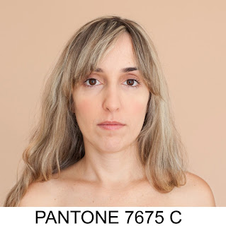
Introduction to Colour Principles:
Colour is largely indefinable- some people will percieve some colours differently to others
Physics of Optics:
- Light travelling in different wavelengths
- Interpretting different frequencies & waves to percieve the colour
- Eyes have 2 receptors: Rods & Cones
- Rods convay Greys
- Cones percieve Colour
- 1st is Red-Orange Sensitive
- 2nd is Green Sensitive
- 3rd is Blue- Violet Sensitive
-When a cone is stimulated, our brain percieves a corresponding colour
Paint:
- Primary Colours- Can't make these colours by mixing other colours
- Yellow, Red & Blue
- Secondary Colours- Made from the mixture of the Primary colours
- Violet, Green & Orange
- Tertiary Colours- Breadth of other colours between the Primary & Secondary colours
- eg. Greeny-Blue, Reddy-Orange...
Graphics Based Colour Modes:
- Primary Colours- Spectrum Colour for Screen and Light
- Red, Green & Blue (RGB) is a screen based reflection of light
- Primary Colours- Physical Colour Pigments
- Cyan, Magenta & Yellow (CMYK- Except without K)
- The eye cannot percieve Spectral Yellow which impacts on our perception of Cyan & Magenta
- The eye can be fooled into seeing a range through the proportionate adjustments of
the colours: Red, Green & Blue
Subjective Colour (Ink-Based)- By mixing the Primary colours together, they loose thier colour value
- The CMYK Primarys make RGB Secondarys
- Making Murky Browns & Greys
Additive Colour (Light Based)- The RGB Primarys make CMYK Secondarys
The invention of the Colour Wheel by Josef Albers produced a systematic manner that determines how colour works
Complimentary Colours- 2 opposite colours on the Colour Wheel that don't work together
- Mixed together they produce a neutral grey
From this, we had to get into groups by Object Colour so I was in the Green Group. We had to organise the colourations of all the individual objects (We had to go from Bluey- Green, Green and Yellowy- Green) in order to make a fluid colour wheel with the rest of the groups in the class.
 |
| In Class Colour Spectrum |
 |
| All The Way Round The Spectrum |
Dimensions of Colour:
CHROMATIVE VALUE = HUE + TONE + SATURATION
Hue- Individual Colour chromatic value, eg. Yellowy- Green, Pale Green
Luminance- How Bright or Dull a Colour is
- Bright colours reflect Light
- Dark colours absorb Light
- Darkening a Colour - Shade
- Reducing a colours Brightness -Tint
Tones- The desaturation of a colour
Saturation- How much of a colours purest form is still left over
Pantone Colour Code:
- Allows you to specify a colour and make sure it's definatly the colour you want
- Entire range of colours that all have a specific colour code to follow
- Essential to compare 1 colour to the next
- Systematic approach to reading colour
 |
| 7 Chosen Green Objects |
- Original Colour Green
- Bluey- Green
- Yellowy- Green
- Lightest Tint
- Darkest Shade
- Brightest Green
- Dullest Green
 |
| Original, Yellow-Green & Bluey Green Objects |
 |
| Darkest Shade & Lightest Tint |
 |
| Brightest & Dullest |
 |
| Original Colour Green- Bottle Top |
- Formula Guide /solid coated
- Pantone 3425 C
- 15pts Pantone Green 83.3
- 1pt Pantone Yellow 5.6
- 2pts Pantone Black 11.1
 |
| Bluey-Green- Hairspray Bottle Top |
- Formula guide /solid coated
- Pantone 3278 C
- 13pts Pantone Pro Blue 81.3
- 3pts Pantone Yellow 18.7
 |
| Yellowy-Green- M & S Carrier Bag |
- Formula Guide /solid coated
- Pantone 389 C
- 13pts Pantone Yellow 93.8
- 1pt Pantone Green 6.2
 |
| Lightest Tint- Zip |
- Formula Guide /solid coated
- Pantone 365 M
- 3/4pt Pantone Yellow 4.7
- 1/4pt Pantone Pro Blue 1.6
- 15pt Pantone Trans.WT. 93.7
 |
| Darkest Shade- Clarks Shoe Box |
- Formula Guide /solid matte
- Pantone 3308 M
- 13pts Pantone pro Blue 61.9
- 3pts Pantone yellow 14.3
- 5pts Pantone Black 23.8
 |
| Brightest- Dog Toy |
- Formula Guide /solid matte
- Pantone 802 M
 |
| Dullest- Jewellery Box |
- Formula Guide /solid uncoated
-Pantone 364 U
- 10pts Pantone Yellow 55.6
- 6pts Pantone Pro Blue 33.3
- 2pts Pantone Black 11.1
Study Task:
We then had to look at some research sources and images in order to strengthen our understanding of colour theory and the language used by designers when explaining it.
http://colormatters.com is a very useful website for this as it has specific areas on the website, with sections that are based on the science of the colours and how they work. It has interesting interpretations of the colours and their meanings. The website has its own blog (http://colormatters.com/color-matters-blog) which has articles discussing the way colour effects our lives and interpretations of products.
These images are from the presentation that we had in our Design Principles session which illustrate the ideals behind colour theory.
 |
| Print Screens from Presentation based on Colour Theory |
From this, I went onto looking at pieces of design that have looked at colour theory and the colour spectrum. There are a lot of design blogs that focus on the aspects of colour, such as http://www.colourlovers.com/blog/category/inspiration?page=1, that take inspiration from how colour effects the way design works and how it communicates in the context of a design piece.
 |
"RGB Colorspace Atlas" (2011) by Tauba Auerbach
Auerbach, T. (2011) "RGB Colorspace Atlas" [Internet] Available from http://taubaauerbach.com/view.php?id=286 (Accessed 28th January 2013)
|
 |
"Novum" (2011) by Paperlux
Paperlux (2011) "Novum" [Internet] Available from http://www.paperlux.com/design-en/novum-en-GB/2011/ (Accessed 28th January 2013)
|
 |
"CMYK Playing Cards"(2013) by Hundred Million
Hundred Million (2013) "CMYK Playing Cards" [Internet] Available from http://hundredmillion.co.uk/HM-cmykcards.html (Accessed 13th April 2013)
|


No comments:
Post a Comment