For this brief, we have been asked to produce a 16 page research book based on the research that we have conducted over our chosen topic. We have to print the book and craft it as well as produce some packaging for the book to be presented in.
My chosen research topic was Zoos which was then focused down onto Chester Zoo (See Design Context Blog).
To start on the brief, I designed to produce a design sheet of initial ideas of what I could do in regards to making a book in a relevant format for a Zoo.
 |
| Research Book Design Sheet |
To start with, I worked on experimenting with different layouts, both digitally and hand drawn, I could do for the book which I did as part of my response to Study Task 2. Alongside this, I produced some nets for the packaging ideas I had come up with (See Design Practise Blog).
Based on what I had done so far, we had a concept crit where we got to discuss what we had done so far and the ideas we had come up with (See PPP Blog). For this I showed what I had done for the packaging mock ups and what I had produced for Study Task 2.
From the Crit, I had decided that I will be focusing on the zoo gate packaging as this was the one that got the most positive feedback. In regards to the Study Task experimentations I did, illustrations and photography combined was seen as the way to go for a family audience as well as to continue experimenting with the ideas of having interactive formats
To start with, I decided to work on the brand identity and visuals of my book.
 |
| Chester Zoo Logo |
 |
| Typeface for Book |
The closest I could find to their typeface is the typeface 'Indy Pimp' which is very much capitalised and handwritten. The downside to it is that it isn't as rounded so there is a little bit of a difference but this was the closest I could find.
 |
| Green Colour |
Alongside this was the fact that I would have not been able to get hold of the exact spot colour that Chester Zoo use without paying a lot for it so I just used the eyedropper tool in Illustrator to get the closest green shade I could get to the original. Alongside this, it uses a white inside to separate from the border.
From this, as I had more of an idea where I was going with my zoo gate packaging rather than my format, I decided to work on that first.
From this, as I had more of an idea where I was going with my zoo gate packaging rather than my format, I decided to work on that first.
 |
| Packaging Mock Up |
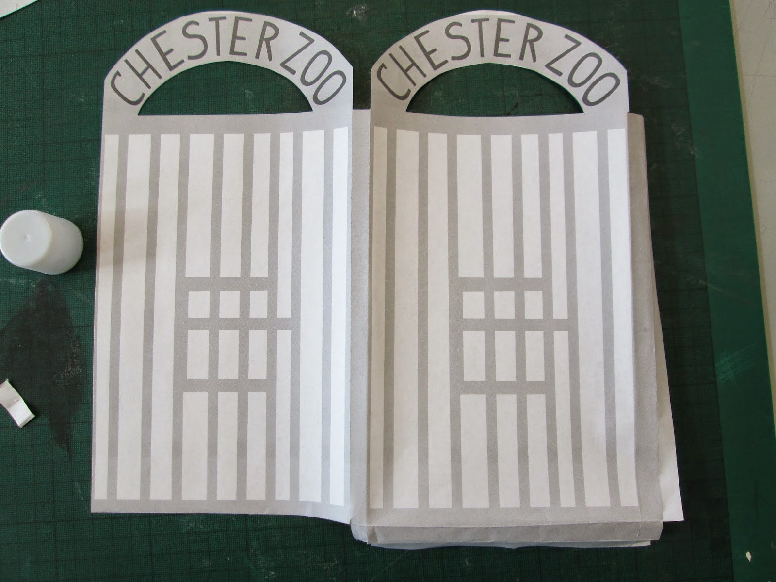
To start with, I planned the visual aesthetic of the packaging. I based the visual on the drawing that I did on the hand-wrendered packaging, having a gate on the front and back of the packaging. I decided to have the word 'Chester Zoo' in the same colour as the brand logo so that it wouldn't all be the same colour as so that the subject matter stood out and I used a light grey for the bars of the gate as I didn't like the idea of having a darker shade of grey for the gates as this would appear quite sinister.
 |
| Digital Nets For Possible Packaging |
 |
| Adding the design to the Net |
 |
| Open gate packaging |
 |
| Structure of the Packaging |
 |
| Mock Up Packaging |
From this, I printed off a copy of the packaging and crafted them to make sure that they worked. I am happy with the way that my mock ups will show visually what I mean about my packaging. It is a shame that I have not been able to do the open style packaging to the scale that it would need to be done at but I want to see which of the two styles that they prefer at the Crit.
The first thing I did in regards to the production of my book was decide on what I was going to have pages on and what was going to be the content of my book.
I made a word document which I based my planning on, including all of the information I wanted to include and split them up into sections. These sections would then make up the pages that I was going to have in the research book.
 |
| Format Mock Up |
From this content which I planned out, I went onto applying this plan to a mock up version of the format of an A5 Flipbook. I planned out how I could lay out the pages and based the possible image placements on the images I collected during my research period.
 |
| Book Layouts for 16 Pages |
From the plan that I made from the mock up alongside the content that I had planned out, I laid out the information that I was going to use, having the text in blocks and having the placement of the images in coloured blocks. This way, I was able to clearly imagine where the images would be placed. I underlined the titles of the pages as well as made the headers larger so that they were more distinctive. I kept the information to one or two columns so that it was simple because of the amount of information that had to go into the book.
 |
| Justified Text |
 |
| Inclusion of Images |
 |
| Inclusion of Logo on Front Cover |
Overall, this is what my book looks like up to this point before I go into my Crit. I think it is good that I have a solid structure and have considered my content and layout but, to me, it is coming across as the bare bones of what it should be. Currently, it is just a load of pages with some words and picture on it and has no redeeming features to it at all.
 |
| Mock Ups for Crit |
From the Crit, I was given a lot of helpful feedback. The group agreed that the book was plain and needed to have some more illustration to give it a more unique aesthetic. The front cover needed inverting for more impact and the packaging which worked the best was the open gate but without a padlock so that it didn't give the wrong impression.
The first thing I needed to address was the front page which I inverted the colours of.
 |
| Inverted Logo Colours |
The next thing I decided to address was the use of illustrations as I wanted to make the book less boring.
 |
| Chester Zoo Brand Identity Illustrations |
 |
| My Interpretation of Illustrations |
To include them within the publication, I decided to draw around them to reproduce them but as I as drawing them realised that the illustrations themselves would have too many smaller details that would be difficult to reproduce on a smaller scale. With that, I made the choice to draw my own interpretation with a much more simple outline and less detail so that, overall, it would be clearer in the publication.
 |
| Inclusion of Monkey |
 |
| Front Cover Development |
I felt that the illustrations were so good, I wanted them throughout my book. Something which hand;t occurred to me yet was the need of page numbers. With the book being so small, I felt it was unnecessary yet others would argue otherwise. With this in mind, I decided that it might be quite different to use the illustrations as the page numbers. I thought about using the animals in the line going along the pages showing how far the reader has got into the book. However, the number of animals is smaller than the page numbers so I decided to have them going in twos, like the animals did in Noah's ark.
 |
| Animals by Two |
The animals in two along the bottom makes for a niche and individual way of showing the progress through the book whilst adding a slice of the character and personality of the Zoo itself. I am very happy with the development I have made since the Crit because the tone of voice of the Zoo seems to be coming across more within the publication.
It was at this point that we had to give a presentation to the whole year on the research book that we had been doing. I kept mine simple and to the point, showing the book itself and what I had done so far, showing visual mock ups of what my work will be like as well as the design decisions that I had undertaken for this brief.
The presentation itself went well in regards to presenting I feel as I had prepared myself for what I was going to say. I barely included any written prompts within the presentation but I had included a small list of written points on some paper so I had to speak for myself whilst having a them to guide me. I spent a lot of the time speaking to the audience and glanced at my presentation when pointing out something visually to the audience.
What I think my book needs after seeing everyone else's presentations on their publications is some personality. I had produced the content, images and layout for the book but my book looked so unfinished and unprofessional that it made me want to scrap the lot.
What I think my book needs after seeing everyone else's presentations on their publications is some personality. I had produced the content, images and layout for the book but my book looked so unfinished and unprofessional that it made me want to scrap the lot.
What I realised was that I needed to apply what I had started doing with the animals and the front cover to the entire book. It needed more character and to stay true to the essence of Chester Zoo rather than being just an information book. I felt that the entire book needed a major overhaul and a complete design development so that it was more sophisticated.
The first thing I wanted to do was improve the quality of the layout of the book.
The first thing I wanted to do was improve the quality of the layout of the book.
 |
| Changed layouts and font size |
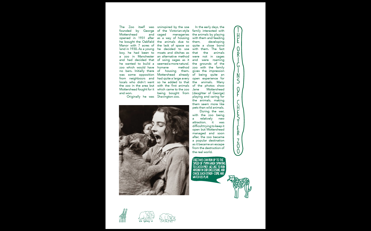
With the fact that I wanted to make my book more professional, I completely overhauled the layout and presentation of the content. I made the columns changed from 2 to 3 in number and made the font size smaller so as to accommodate for the amount of content. I wanted to encourage a more professional looking layout and this is what I was trying to achieve.
 |
| Headers |
One thing I noticed was the fact that the headers for the pages didn't have any emphasis on them compared to the rest of the text. I thought that it might be nice to have the headers so that they were like the logo of the Zoo. I did this by putting a border around the name of the page so that it was like that of the logo which gave the headers a instant boost in personality.
 |
| Headed Layouts |
I applied the headers to the layouts which I felt helped give the book what it needed as it came across as more fun and much more experimental. Saying that, I felt that the borders around the headers didn't fit the words properly and could be made smaller so that there was more space on the page.
 |
| Individual Title Headers |
I made the headers smaller and more condensed so that each individual header fits the page that it is being used for so that it makes more use of the space provided. This made much more sense and allowed for them to fit the pages better.
Adding these more illustrative tones, I felt it would be nice to include some illustrations with the animals involved. I felt that this would help to have more of the zoos personality within the book.
 |
| Illustrations of animals in the zoo |
 |
| Inclusion of Illustrations |
I felt that the illustrations gave a more personal touch to the book and allowed for the animals to put a stamp on the book. The only problem was that they looked like they had been placed there rather than integrated into the overall image.
 |
| Fact Illustration Development |
With the fact that the placement of the illustrations looked like they had been dumped there or put there with no consideration, I wanted to make sure that they had morel of a footing on the page. I took the stroke tool on illustrator and put a brush stroke under each animal so it gave the impression that the animal was standing on a dirt floor. Another way I tried to combat this was to have some of the animals in just showing the upper body so that it was like they were popping out the side of the page.
 |
| Application of Illustration |
I applied these elements to the pages and felt that this gave a much more natural looking aesthetic rather than having the animals just put on the page. I think they may need some juggling around so that they fit better but in regards to the placement and sitting on the page, it is much more fitting.
It was at this point that I realised that I had made a front page but I hadn't considered the fact that I would need a back page.
 |
| Original Back Page |
I felt that, if I was to have this book in the shop or given it, it would make sense to have the contact details and information of the zoo on the back of the book. With this, I put the information centred at the back of the book, however, I felt that this was quit boring and unconsidered which I didn't want to come accords just because it is the back page.
 |
| Book Back Cover Illustration |
I realised that I had done a fact illustration for all of the other animals in the illustrations apart from the meerkats so I decided to use these on the back page as if they are telling the audience about the details. I felt that this was much more in keeping with the rest of the book as it gives a fun and unexpected ending to the book. The back cover is in green to match the front so the illustration is in white, opposite to the rest within the book.
With all of the changes that have been added to the book, I think it has improved for the better but I am not yet convinced in regards to the layouts and the information.
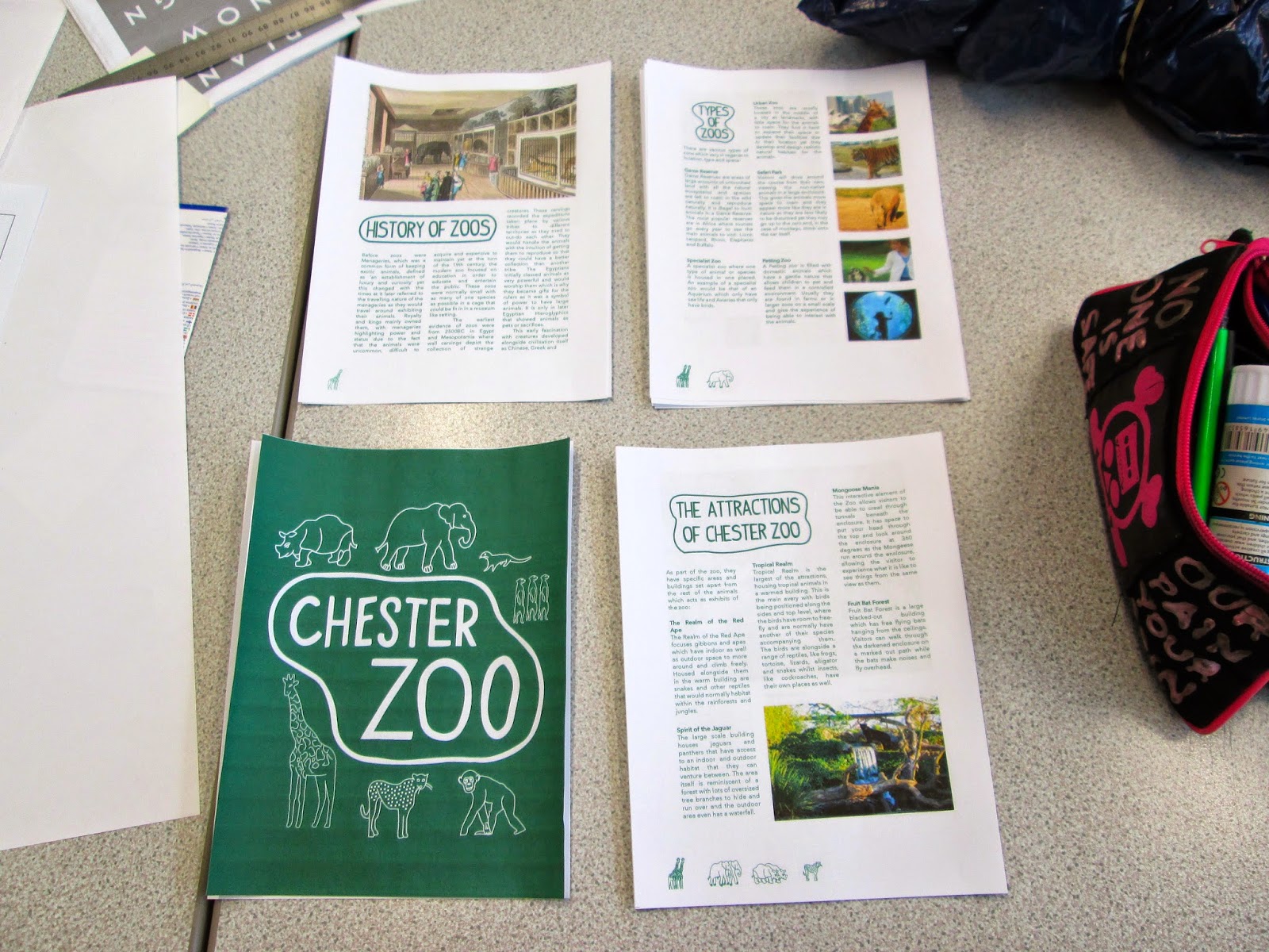
To try and help my position in regards to the success of the book, It is at this point that I printed out a copy of my publication. I decided that it would be best to see the publication in a physical copy by cutting it to shape and binding it together so that I would be able to see any faults with it.
 |
| Pages Cut Down To Size |
 |
| Bound Book First Attempt |
 |
| Preparing for Binding |
 |
| Gluing Pages Together |
 |
| Perfect Bind Attempt |
From that I saw with the book, I decided that I needed to change the format of the book to make it much more narrower.
 |
| Document Set Up |
The shape of the book was very wide when it came to seeing it in a physical form so straight away, I changed the format so that it was thinner and narrower. Another thing I realised from the book was that, by having a front and back page, this would mean that I would actually be a page down from 16 because I had been counting the back page as a page.
 |
| Addition to the Primary Research Pages |
With all of my content on the existing pages, I wasn't sure where I would be able to add this extra page to make the correct number. I realised that it would be really fitting to add an extra page into the primary research section as it hands itself to the extra page without disrupting the rest of the flow of the book. I changed the image sizing and had just a page of my images for the extra page.
With these additional changes, the book was starting to look much better but I was having an issue with however is my content because I am having trouble with the justification of my book. The words within my book are very oddly elongated to fit into the column spacing and I have been trying to change this feature as it doesn't look very professional. I have managed to get rid of any hyphenation which has helped the professionalism of the content but the spacing of the words is spoiling the text. After this, I had a talk with Lorraine about my book because she offered to have a look at my mock up.
 |
| Needed Changed to Layout |
Lorraine commented on the need to change the justification with the spacing and I discussed my problem with her. She suggested changing the words that are used within the content so that I an adjust it according to get rid of the main issues as well as making the column widths bigger. On top of this, she mentioned my need to bring all of my content down so that it had equals spacing at the top so that the content wasn't eaten by the binding. The pages needed to be equally aligned at the sides so they all stop and start at the same point.
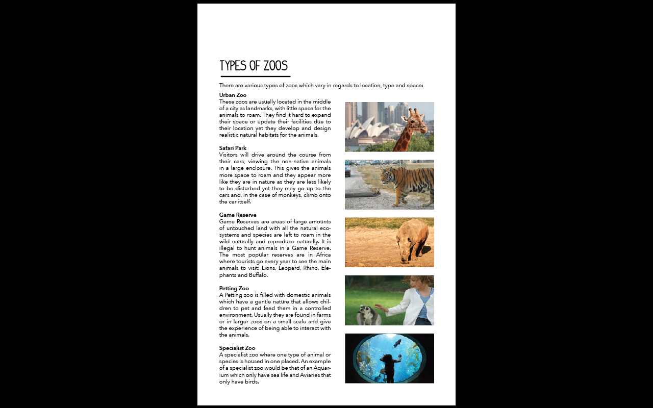
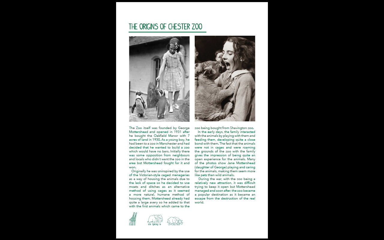
I took what Lorraine said and started working on it straight away. I changed the size of the columns so that they were larger in width. This instantly gave the words much more space to work with and made it even throughout. I got rid of some of the unnecessary wording and added spaces between headers so that it was consistent as well as easier for the words to fit. This eased some of the spacing issues I was having with the justified text. To help with the layout issues, I applied some rectangles on the sides of the publication throughout and used them as markers to put my work to so it was the same throughout. I used this for the top and the spacing in between the images as well.
Using these lines, I was able to align my content properly that it was much more tidy. I did the same with the top so that all of the pages sit better. Not only this but I changed the images that I had so that I could get rid of the pixelation issues that I had. I really did not want to do this because I wanted to use my own images but, however much I tried, I could not improve the quality of the images and, at the end of the day, it was affecting the visual quality of the book. Even I had to admit that the new images looked better than mine but that wasn't the point and I was disappointed by this dilemma.
With this development to the book, I wanted to develop the packaging for the book as well.
 |
| Making the Packaging Bottom Longer |
The problem I was having with the gate opening concept was that the packaging structure was not strong enough to hold the book in place when it was within it. I tried to rectify this with making the bottom side longer to hold it better but I felt that this wouldn't help by much. I decided that I would need to change the structure and the actual packaging to make it work better.
 |
| New Packaging Net |
Instead, I made both of the sides solid so that they wouldn't open so that the packaging would wrap around more like a box where you would get the box by taking it from the top. With that I made the side and the bottom folds quite deep so that they would be securely in place.
 |
| Final Packaging Mock Up |
From this success, I settled on this packaging and printed out the book on recycled stock. It was important for me to use recycled paper because it is integral to the conservation aims of the zoo to protect the environment as much as possible and using recycled paper would help this.
 |
| Printed Recycled Papers |
 |
| Printing and Production of Final Book |
From that, I cut out each of the pages and covers individually using a craft knife as I found that using a guillotine would catch on the pages and affected the quality of the book. I bound them together using the Perfect Binding technique that I had learnt earlier. For the packaging, I wanted to use the recycled card that I had bought and used for the covers but unfortunately the scale of the packaging meant it was ever so slightly larger than A3. This was annoying because it meant that I couldn't use the stock I wanted but I would have had to either completely scale down my book or change my packaging. For the production of the packaging, I had to do the same for the crafting and scored at the edges to make them easier to fold. I used double sided tape to secure it into place.
 |
| Original Photographs |
I photographed my book alongside its packaging on a grey background so that it would contrast nicely against the green of the book itself. The problem with the images was that they were quite blue so I would have to photoshop them to change the colour balance.
 |
| Editing In Photoshop |
I took the images and edited them in Photoshop, getting rid of some of the blemishes using the Content Aware option and enhancing the image using Auto Tone. Then, using the Levels, Colour Balance, Brightness and Vibrancy options, I edited the image more specifically. I did this for all of the images to see which would come out the best.
Final Piece:
16 page publication of researched topic with packaging.
 |
| Edited Final Images of Final Piece |
I think the edited images show my publication in a much better light, particularly against the grey background which suits the green of the book. It also highlights the little details within my book which give it its personality without showing the content/layout which I'm not happy with.
The final thing I had to do was produce 5 design boards for the brief, showing what I had done with both the book and the packaging.
I started off with setting up the layout and the written information. This is the hardest bit of a design board for me and this is normally the reason why it takes me so long to produce one but I find it difficult to lay it out. I settled on a three column page with short paragraphs on aspects of the production of the book.
It was at this point that my laptop broke before the deadline, as I was doing these boards alongside the boards for the other Studio Task. This meant that I nearly lost what I had worked on. Fortunately I managed to get my work back but I had limited time to work on my images for the boards.
The layout for the design boards is professional and structured which I think make them the most successful boards I have produced all year. I was considerate in regards to the information I put on them and took extra care in regards to placement and space. Even the images which I didn't have much time to perfect seem to work alongside each other.
Overall, I have found this brief perhaps the hardest I have ever found a brief for this year. I have struggled constantly trying to make it work and I couldn't get it to, with the extra time I spent on it affecting the time I had on other work and other briefs. What was good about this brief was how much I learnt about binding which I enjoyed and I liked the physical production of the book but the actual designing of the book was overwhelming in the end. I think what I would like to do is to take from this experience and learn from it, maybe by even trying to make another book next year so that I can have another go and try to improve on my own skills because this has really brought my confidence down.








No comments:
Post a Comment