For the typography session, we have been encouraged to try and break the rules of type by acting as a research group. We were given little tasks to do to try and work out how to do things for ourselves.
Kerning:
The first thing we were to look at was Kerning. Kerning is the area between the letters in a word. The rule of Kerning is that you never look to reduce the space but you take the largest white space out of the whole word and make the rest of the letter spacings match up to that.
 |
| Kerning Name |
Breaking a Sentence:
The next task we were asked to overcome is how would we break up a sentence into two parts correctly.
 |
| Breaking the Sentence |
While we were doing this, we were asked to think about how we would read it. By saying it out loud, we can identify where would pause during speech. This way, where you would put the pause when speaking is where you would break the sentence typographically.
Hierarchy:
Hierarchy:
The next thing we had to determine is how to show hierarchy on a page. We were given the words one, two, three and four and we had to put them in order backwards, with the intention of getting the reader to read the words in the original order.
 |
| Attempt at Hierarchy |
I attempted to show this by changing the point sizes of the words and changing the weights of the words so that there was more physical emphasis on the starting words to the last word. Placement and page positioning can affect this as well. What was trying to be emphases was that what we look at and what we read are two very different things.
The next thing we had to do was the same exercise but we were to create a hierarchy using single weights and point sizes.
 |
| Layout Hierarchy |
Body Copy:
The final thing we looked at was body copy, where we had to look at readability and legibility of type based on how they are presented.
 |
| Making Body Copy Readable |
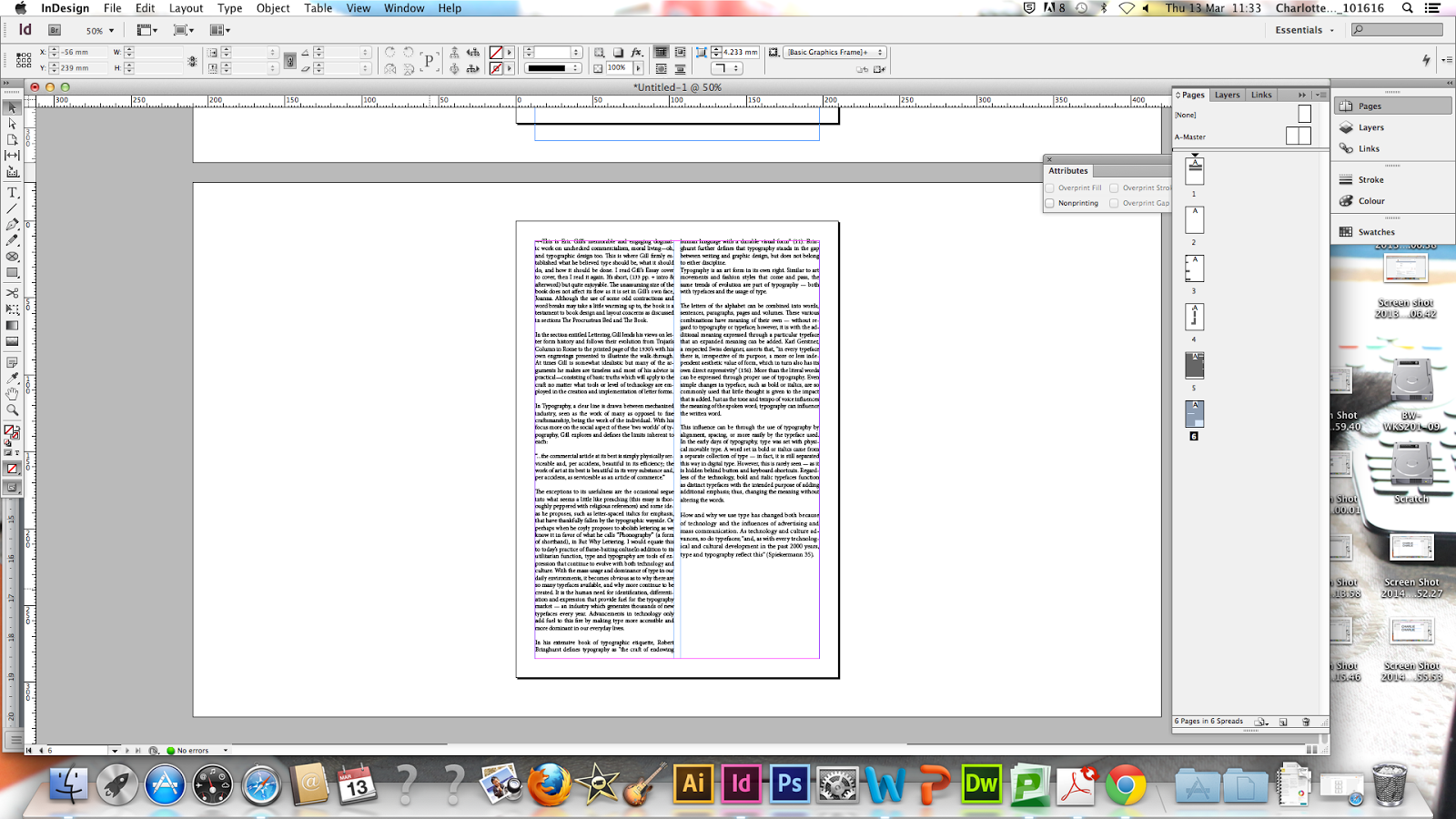
From a large amount of body copy, we had to try and find the next line comfortably but we found that our eyes would jump from line to line not comfortably reading the text. By changing the line spacing and the point size, it helps the readability but the main thing which makes a difference is by putting the text into two columns, which breaks the text up to easily readable chunks.
 |
| Different Alignments |
We tried putting the large amounts of text into different types of alignment to see how they would affect the readability. Centring and Right Aligning the text made it difficult to read because your eye would continually be trying to find the beginning of the next line as it would never be in the same place. Justifying the text would allow for same line pavement but this does create a larger line spacing between the different words so it can be more broken-up when reading.
 |
| Additional Columns |
We then added additional columns to see how this would come across when reading. 2 columns was seen as intelligent writing as it would have the correct number of words (10-12) per line whereas 1 or 4 columns seemed the least intelligent type of writing because they had the maximum and minimum (4-6) words per line which all impact on the readability of text.
 |
| Readable Text |
In order to make the text readable and be able to get rid of the large amount of spacing at the bottom, you could make the gutter and margins bigger, adapt the line spacing and change the type size. Changing the type size could be patronising to the reader so you can make the line spacing bigger so it is easier to read. Also, you could indent your information at the beginnings of paragraphs by 3-4 spaces so that there was a clear beginning to the information.


No comments:
Post a Comment