For our brief, we have been asked to produce a typeface using the computer program 'Illustrator' by taking the letterforms we had created for the 'Alphabet Soup- Visual Thinking' Brief and basing the entire alphabet on one of them.
Before we attempted to produce the alphabet, we first had some Induction Classes into the program of Illustrator and how it works in order to be able to learn different processes so that we could answer and fulfil the brief.
Induction 1:
We were introduced into the program of Illustrator by becoming acquainted with the 'Pen' tool, learning how to produce straight lines and 'Beziair' curves as well as the fundamentals of the program, such as the settings of producing a new document, print and digital settings and the use of layers within an Illustrator document.
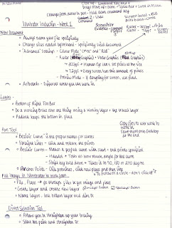 |
| Illustrator Induction Notes |
To start with, we did an exercise sheet where we had to use what we had learnt about the pen tool to complete the drawing exercises (see pictures)
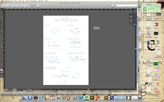 |
| Pen Tool Exercises Sheet- Trace Layer |
On the sheet were different lines where we had to follow along, navigating the commands in order to produce the wanted line.
 |
| Pen Tool Exercises Sheet- Working Layers Complete |
I took several attempts to produce some of the lines but in the end, I think I managed pretty well. I think I will get better with practice at it will come a lot more naturally with repetition.
From this exercise, I learnt what anchor points are and how to produce layers in order to be able to trace off your work in order to be able to go from print to digital.
To reinforce that idea, we had to produce a letter 'g' that had been hand-drawn and use the pen tool to digitize it. This would be like how we would approach doing our first letter from the Alphabet Soup.
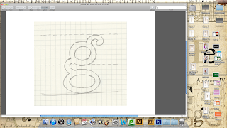 |
| Hand-drawn Letter 'g' |
We had to produce a layer to put the image on, re-name it and then dim the images so that it would be easier to see the image we were producing from the trace.
 |
| Linework on Letter 'g' using the Pen Tool |
Using the pen tool, we had to produce straight and curved lines to get round the outline of the letter 'g' using a second created layer over the top of the trace layer.
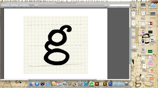 |
| Colour Fill Tool used for Letter 'g' |
The colour was then filled in within the 'g' to make the letterform look more like a proper letter. The Direct Selection Tool was used to produce anchor points and allow the ability to straighten ad edit the lines we had produced to make them appear smoother.
 |
| Letter 'g' drawn layer |
By hiding the original trace layer, the 'g' appears as though it has been created without the help of a previous image.
 |
| Making duplicates of Letter 'g' |
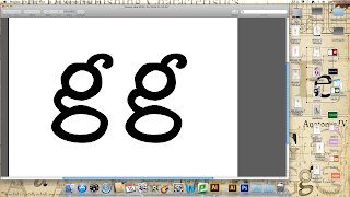
Hold down the 'alt' key and dragging with the mouse, I was able to produce a duplicate of the letter 'g'
Induction 2:
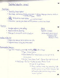
For the second induction, we progressed onto using some of the basic function on Illustrator, talking through how they work, there use and the effects that they can produce on your work. These areas include Pathfinder, Variable Width Tool, Blend, Strokes and Create Outlines to manipulate existing Typefaces. Also, we were introduced to Font Book.
 |
| Illustrator Induction Notes |
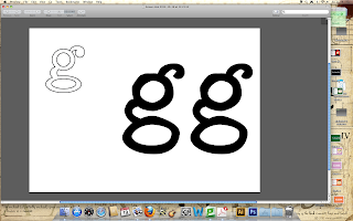
We learnt how to use shapes to produce letterforms, combining them with the Pathfinder Tool.
 |
| Pathfinder Tool |
Firstly, using the 'Minus Front' tool to cut out of 2 combined shapes to make other shapes and then using the 'Unite' tool to bring them all together.
 |
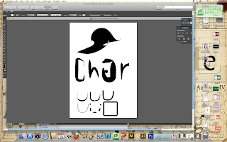
| Create Outlines Tool to Manipulate Typefaces |
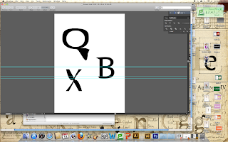
We went on to using existing letterforms and manipulating them to produce new variations on the typefaces. Using the 'Create Outlines' tool, we changed the letterform to a shape and then used the Direct Selection Tool to manipulate the anchor points, such as adding serifs, making straight lines curved and elongating stems.
 |
| Variable Width Tool & Strokes Tool Options |
Other tools that can be used is the Variable Width Tool (which widens and thickens a created line) or the various different Strokes tools that can manipulate and change the line that you have created, with effects such as dotted, charcoal, calligraphic strokes and changing the ends of letters.
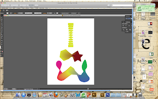 |
| Blend Tool |
The final tool that was show to us was the Blend Tool, allowing for duplication and fusing together shapes, either the same shapes or different shapes. Also, it applies to colour used as well, blending one colour into another for a strong visual effect.
Typeface Illustrator Alphabet:
As part of the mandatory requirements, I had to scan in my 10 x 10 Shatter Letterforms to digitise them (see pictures).
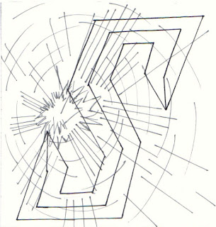 |
| 10 x 10 Shatter Alpabet Digitised |
I selected one of my 10 x 10 Shatter Letterforms and I decided to base my Shatter Illustrator Alphabet on this one letterform (see picture)
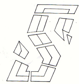 |
| Chosen Shatter Letterform |
Firstly, I sketched out the whole alphabet as to how I wanted it to look. This way I had something to work from so that I had some direction (see picture).
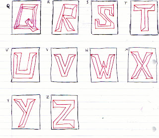 |
| Initial Planning for Full Shatter Alphabet Sketches |
After producing the whole form and shapes that are to be used for the alphabet, I then went over these to produce the detail that I would need to go into to be able to produce the letterform in a successful way thta would communicate the action of 'Shatter'.
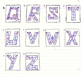 |
| Planning Detail Added to Shatter Alphabet Sketches |
From what I had learnt about scanning and putting images into Illustrator, I scanned in my 10x10 shatter letter and, by using the 'Pen' tool, traced on a different layer to produce the letter.
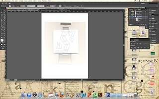 |
| Scanned 10x10 Letterform |
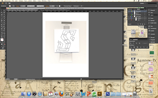 |
| Traced onto 2nd Layer |
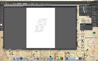 |
| Produced S Letterform |
From this, I based my alphabet layout on this letter by tracing round this letter and creating other letters from this.
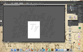 |
| Original Letterforms without the Detail |
I created the letter themselves before using another layer to work over-the-top in order to put the detail in (see Alphabet PrintScreens below).
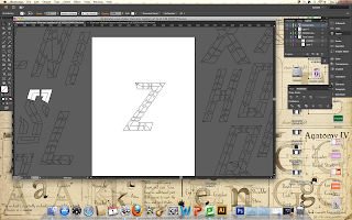 |
| A-Z of Shatter Alphabet Letterforms |
I think my letterforms are successful in regards to the communication that they need to put accross (they reflect the Shatter elements of my original letterform) and the fact that they follow the requirements of the brief as they have been produced on Illustrator. I primarily used the pen tool to produce the letterforms and went between layers to organise the creation and trace the linework neccessary. I decided not to fill them in with colour as I didn't think it would be beneficial to the effect that I am intending to produce and because the original image was very stark and minimal. Not just that but I don't think the bold colouration of CMYK would suit the idea of my Shatter imagery. I think they need improving, however, as they are still very distinctly raw in there aesthetic and therefore I would maybe try and improve my designs by refining the quality of the imagery.
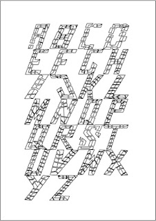 |
| First Full Shatter Alphabet on Illustrator |
From this initial final design, I decided to refine the design so that it would be better in regards to presentation and image quality. To refine it, I decided to improve the grid system I was using so that the letterforms are more spaced out so that it has more clarity and space to breathe. I would investigate with a bit of colour to see whether it would be successful in the visual quality to the image and bulk out the alphabet with a bit of substance. Also, I will go through my alphabet and see what letterforms need changing or developing so that it works a lot more like a unit.
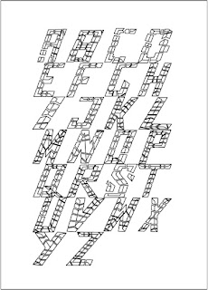 |
| Second Shatter Illustrator Alphabet |
Firstly, I changed the form of the letters J and X so that they slanted to the same degree as the rest of the letters in the alphabet. This made a difference to the overall alphabet already as it has allowed for my alphabet to be consistant throughout and makes it flow better as an overall typeface.
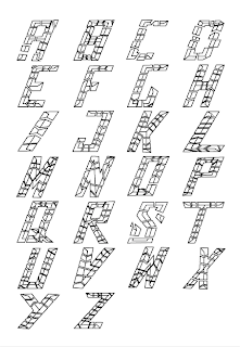 |
| Third Shatter Illustrator Alphabet |
I changed the layout of the grid so that it had less of a border and more space between the columnised letterforms in order to present a more professional and formal layout. It is alot more successful as it allows the letterforms to breathe and means there is less negative space dominating the page, instead just surrounding the letters in a healthy way. It allows the flow of the alphabet to continue to improve from the re-adjusted letters thereby making the letters more succinct.
From producing an overall alphabet, I wanted to see what it would be like to have any CMYK colour put onto the alphabet in order to see what the impact of it would be and whether it would be successful (see pictures).
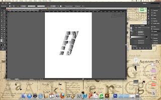 |
| Black Gradient Colouration |
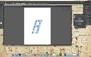 |
| Blue Gradient Colouration |
I have only considered using Blue or Black from CMYK as I do not think that any of the other colours would be appropriate to the subject matter of 'Shatter'. I decided to use a gradation/ tonal blend to the alphabet as the term 'Shatter' usually connotes something that is fragile or delicate and i thought the light opacities and tonal values would reflect on this really effectively.
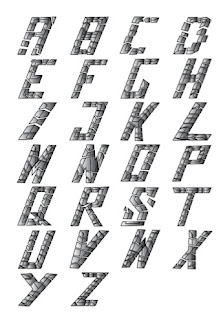 |
| Black Full Shatter Alphabet |
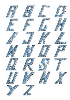 |
| Blue Full Shatter Alphabet |
I did a version of the alphabet in both the Black and the Blue gradient colouration in order to compare and contrast the visual quality of each one so I could see which was the most successful in communicating the visual 'Shatter'. I felt that the black/grey tones gave a lot more of a cold and chilling feel yet the blue shade added to the fragility. The blue shade I feel is more communicative of the different aspects of 'Shatter' yet I think that the black works a lot more on a visual level as it simplifies the intention behind the imagery.
Final Piece:
In order to fulfil the brief, I needed to present it printed out in CMYK in a grid format in size A1 (see pictures).
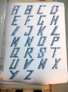 |
| Full Scale A1 Print of Illustrator 'Shatter' Alphabet |
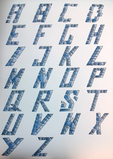 |
| Close Up of A1 Illustrator 'Shatter' Print |
What was successful about this brief was the fact that it reinforced the basic principles that we were taught in the Illustrator induction and gave me a platform to put the skills into practise. I learned all about using layers which is something I had never managed before and I didn't know how to trace either so the brief has been successful in regards to my own personal growth. The brief was also successful in the fact that I managed to produce the criteria neccessary for the brief and that the alphabet came out very well in a print format as well as look good digitally. I chose the blue colouration due to the fact that I feel that the communication of the letterform was the main important aspect of the alphabet, however, I still think it looks aesthetically pleasing in the blue tonal shading.


No comments:
Post a Comment