We have been given the task of producing an Info-Pack which is to be about things to know, consider or remember on the topic of Print.
I started by doing some research into areas of Print which may been considered as useful things to know. (See Design Context Blog)
From this, Anna, Emily and myself took part in a group brainstorming session in order to come up with some starting points and considerations for the brief:
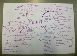 |
| Group Brainstorm |
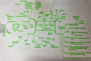
Following this, we developed this further as we discussed in detail the contents that should be covered within the pack:
 |
| Group Brainstorm 2 |
This was to give ourselves more focus in regards to what we should be researching and what we should include within our info-pack.
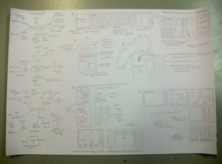
From this, I went onto coming up with some ideas and concepts that I would be able to produce a info-kit from.
 |
| Initial Ideas and Concepts Design Sheet |
I brainstormed the concept of an info-kit and considerations to be included as well as possible tones of voice/ approaches to the design. I came up with some initial ideas but felt that some of them didn't answer the brief very well or were very obvious ways of answering it. When thinking of tones of voice, I thought about how I could persuade people to take up Print which then made me think of a campaign in the style of a Political Party where it uses bias language and methods of persuasion to get people to support them. I felt that this would be a great concept to go along with as I would be able to produce a response/answer to the brief whilst having a context which focuses it.
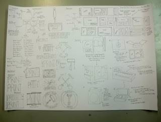
I went onto making a Design Sheet where I developed it further, looking at possible names, logos, layouts for my publication element and packaging concepts.
 |
| Campaign/ Party/ Club Design Idea Development |
I've decided to produce a New Members pack for my Print Party Campaign which will include the necessary detail for the brief within a publication/book as well as have some fold-out A2 posters. These will be packaged in a box/folded file which can be given out or posted to new members. The publication will include a lot of information and may be quite bulky so I think I will design and print it digitally whereas my posters and packaging I would like to produce printed using physical, handmade methods as it will have more of a personal quality. After coming up with several names, I settled on the name 'Project Print' as it sounded more like a campaign and less like a Political Party- it sounds more of a determined mission statement.
Working from my ideas on the Development Design Sheet, I started off with experimenting with a Typeface choice.
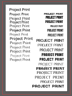 |
| Chosen Typeface Development |
I wanted to have a sans serif font which is quite bold, capitalised to go along with the punchy, statement-style name.
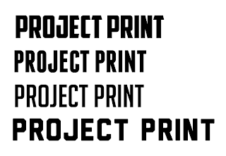 |
| Either American Captain, Franchise Bold, Big Noodle Titling or Liberator |
I was torn between 4 different fonts yet I eventually settled on the font 'Big Noodle Titling' as it was bold but not overbearing, like Liberator or American Captain. The problem is that it doesn't have a lowercase version so I had to find a font that it would work alongside.
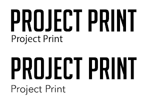 |
| Either Myriad Pro or Avenir |
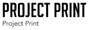 |
| Chosen Typefaces- Big Noodle Titling (Header) and Avenir (Body Copy) |
Putting a few fonts next to each other, I found that Myriad Pro and Avenir were suitable matches to Big Noodle Titling but at the same time, they appealed due to the fact that they are fonts which can be found on most computers so it would help when printing it. I felt that Avenir was more appropriate for Big Noodle Titling as it was slightly lighter in weight and therefore had a slight contrast with the Headliner font.
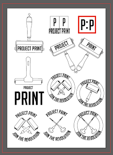
I went onto producing some Digital Logos from the font choices.
 |
| Logo Development |
I tried out some typographic-based logos at first before developing it into a type and image logo. When you think of a propaganda campaign, you think of a stamp logo which can be stuck anywhere so that was what influenced me in regards to my design. I included utensils such as rollers or etching/carving tools to encourage people to have a go as well as allowing them to recognise the tools for when they do it themselves.
 |
| Chosen Logo |
I chose this Logo out of all the designs because I liked the shape of the Logo and felt that it gave the impression of being stamped on.
 |
| Development of Chosen Logo |
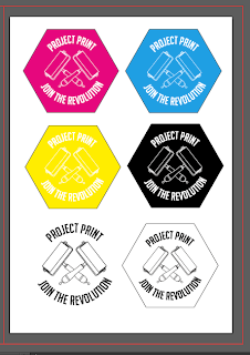
I played with the idea of colour and perhaps having the book in the print colours of CMYK but I felt that this was too common and expected, would give the campaign no identity of its own and didn't go with the logo itself. Having the logo in a shape as well didn't seem to suit it apart from the Hexagonal shape which seemed ok so I continued to play with it but overall, it just wasn't working so I have decided to leave it like this.
I felt like the next step would be to establish the brand further so I decided to come up with some poster designs.
 |
| Poster Designs |
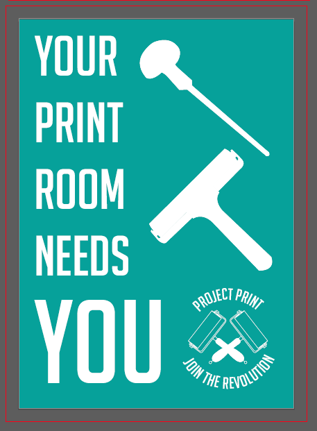
I illustrated some poster designs which I tried to make more typographic-based as it came across more statement and propaganda like. Eventually, I managed to produce a simple layout and design which makes a point and makes the target audience think. The trouble is, based not the fact that I haven't found a colour scheme which has stick with the ideal of the campaign, I have used the blue colour just to show where the colour would be.
From this, I knew I would be going onto producing the content of the book so I decided to make a Design Sheet on the layout and pages that were going to be included in the book as well as producing a Design Sheet on some grids that I could apply to the book layout (I forgot to photograph these before hand in). I knew that by having these, I would have some structure to the way that I was going to layout and structure the content of my book.
After this point, I had my Interim Crit where I gained a lot of valuable feedback based on what I had done so far (See PPP Blog)
I had a pretty bad crit and afterwards, went back to the initial concept and core of the idea of my campaign, coming up with a new way to approach the brief. I decided to produce a newspaper rather than a book as I felt that it would be a more DIY approach to the campaign and would have more hand-made print credibility.
Based on the fact that I had to re-think the whole concept, it meant that I lost a bit of my production time and any confidence that I had built up was shot but I felt very strongly that my new approach to the brief would answer all of the intended questions and I ran with it.
Due to the fact that the campaign is the most integral part of the newspaper production and the way that it would be produced in real life, I felt that it had to be biased and come across more like a propaganda piece. It needed to be more DIY and independent so I decided to make this statement by using red within the colour scheme of the campaign.
 |
| Logo Development |
Red reminds me personally of the uprising with the Russian Revolution that we had talked about last year in Context of Practise lectures and I felt that this would communicate the spirit of the campaign to the audience.
 |
| Revised Poster Design |
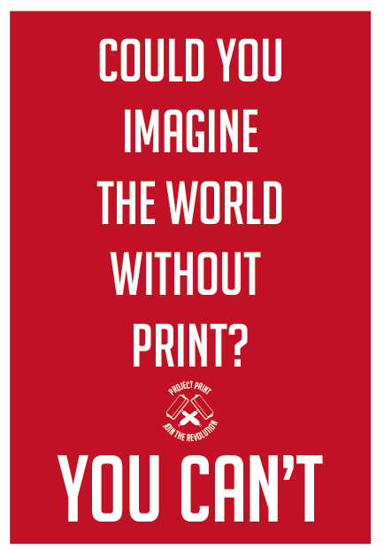
I applied the use of the colour red to the posters which I had produced. Instantly there is more of an impact with the use of the colour red rather than using blue.
Another piece of feedback I got from the Crit was to go and do some primary research based on the information that I would be doing. I took it upon myself to learn all about Screen-printing, Laser-cutting, Embossing and Photo Etching, Book-binding, Foiling, Flocking and Spot Varnishing (See Design for Print Primary Research Blog Post).
Afterwards, I went back to the need for content and, using the contextual research alongside the experience from the primary research I had undertaken, I managed to produce all of the content that was going to be within my publication. I knew that, with it being a newspaper, it would be very heavily text-based and would have to get the information across to the viewer in a different manner than if it was just an information book I was producing. It took a long time but I wanted to get all of the necessary information inside whilst still maintaining a sense of direction towards the audience.
Using the grids that I had developed for the book idea, I used them as a basis for my design development for my newspaper design and went onto starting to develop a front cover.
 |
| Initial Front Page Design |
I started off by having the logo as the main image on the front page but to me this seemed very plain and lazy. This didn't come across as being professional-style newspaper editorial work by just having that on the front.
 |
| Addition to Text |
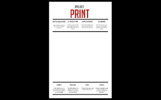
I decided to develop the front page by adding some text to the front of the pages so that it orientates the viewer and catches the interest of the reader. I used the way that I had split up the content into articles and made up title names and a sub-heading to drum up interest and I have presented the title of the campaign at the top centre of the newspaper, split between the red and black ink to make more of a bold impact. I produced these in columns to go with the traditional newspaper aesthetic. Again I added the logo onto the froth cover to see if this was any better but I still felt that it was lacking. I decided that I needed to produce a bold front cover image.
 |
| Front Cover |
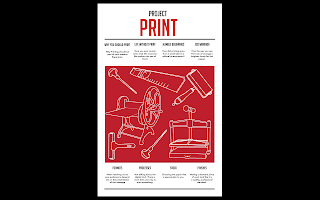
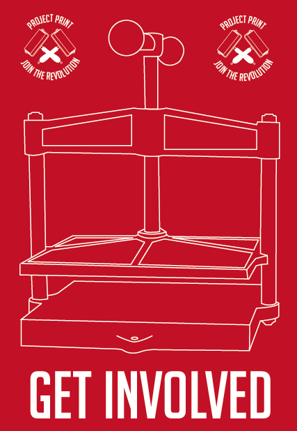
I developed an illustration in the same style as the posters showing different methods of printing. I developed and experimented with the way it was presented, whether that be through solely line work, a mixture of red and white or block colour with line work. I preferred the block colour with line work as it gave the impression that it has been stamped onto the front cover, which makes a statement which is eye-catching and bold.
 |
| Backpage Development |
From the illustration that I made for the front page, I decided to expand this so that it would have the same illustration on the back page so that it would flow more through the design of the paper, however, when I applied it to the paper, it looked very overwhelming and out of place. I ended up getting rid of this all together and decided to keep it simple by having just the campaign logo at the back. This would reinforce the campaign to the reader after they have read the paper as well as promoting the campaign if the newspaper has been folded up and placed face down.
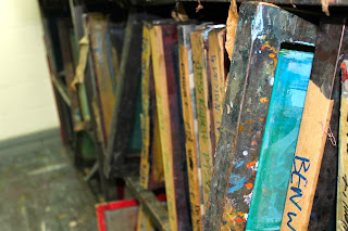
The next thing I wanted to concentrate on from the front and back page was the content of the paper and, in order to produce content for my newspaper, I knew that I would need to go and take some of my own stock photography of the print rooms to make the newspaper relevant to the college itself.
 |
| Stock Photography for Print Newspaper |
I took photos of a wide range of different print processes and materials so that there will be an engaging and different visual element to each double page spread. It will highlight to the viewers the different elements of the printing process.
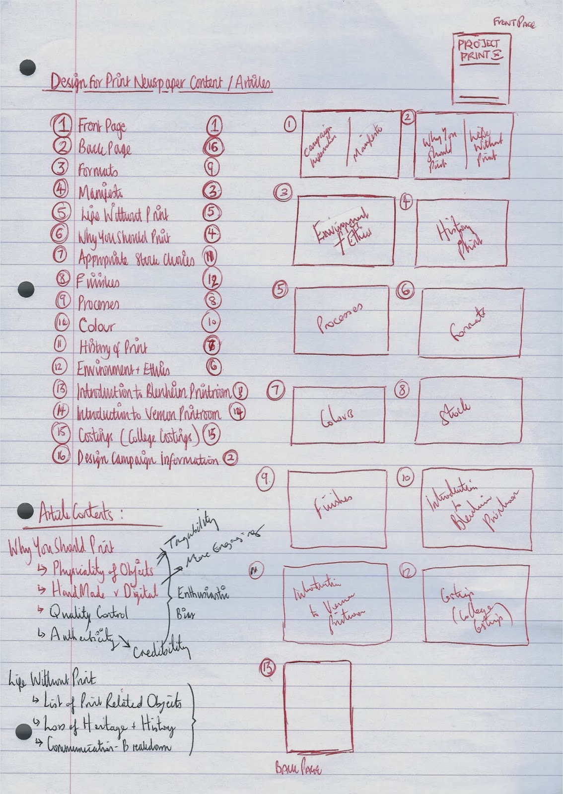 |
| Organising Content Order |
Before making the layouts, I had to determine what order I was going to put the content in. I wanted to make it so that the information flowed throughout so I considered this when determining what order I was going to put the information in.
Based on the fact that I now had images and content, I had to come up with the layout of the newspaper double spreads.
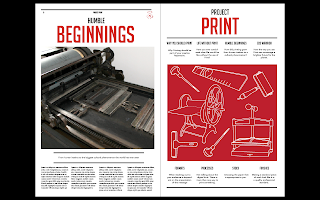 |
| Developing the Double Spread |
I started by creating a layout for the newspaper just by what I would think would look good, having the logo in the bottom corner but it seemed quite squashed in and lacking in fluidity with the front page aesthetic. I designed to deal with this by putting the front cover on one side and producing a single page so that I could use it as a reference. From this, I started by putting information at the top of the page and making more space for the content of the page. I put the heading of the article in the same style as the heading of the front page and I framed the sub-header with lines like in the page.
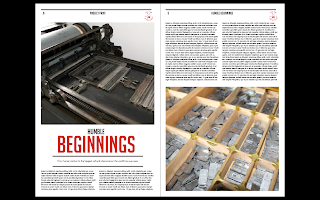 |
| Development of History Double Spread |
From that, I worked from the single layout to expand into a double page spread layout, reflecting the image placement on the opposing page and deciding to work from 2 columns to make for an easier readable content as, I felt, that having 4 columns was a bit more difficult to read.
Then I applied this same aesthetic to the other layouts, however, I experimented with different presentations of the layout, such as image placement and size and column placement and size whilst still keeping the fundamental information and layout the same for consistency.
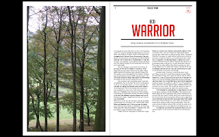 |
| Environmental Double Spread |
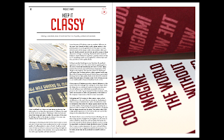
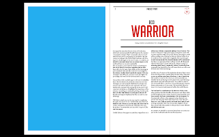
For the Environment Spread, I decided to go for a large single page image for the content as it is mainly a vertical image which wold mean that it would be more effect in the same format. Due to the large amount of content, I decided to put my content in wider columns centre red in the middle of the opposite page so that it balanced out the large volume of imagery on the other side.
 |
| Finishing Double Spread |
For the Finishings Double Spread, I knew that I wanted to include the imagery of the close-up shots of the flocking and foiling as I wanted to display the way that the finish is produced. In the same way that I had done for the Environment spread, I used one of the images for a single page to show the detail within the finish itself but I used the other image on one of the columns without it being a full column to stick with the idea of using two columns.
After this point, I had my Final Crit where I gained a lot of valuable feedback based on what I had done so far (See PPP Blog)
I was given a few things to change and consider but the main thing I found was that I was to keep going with the production of the newspaper. It was mentioned that it would be an idea to try and make the newspaper seem valuable seen as it is something that is seen as a throw-away object but I think that if I can make the design, stock and print of the newspaper seem quite high end then it would be kept. I want my layouts to seem high-end editorial which I have never done before so I will keep this into consideration when producing my layouts.
 |
| Layout of Information |
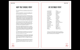
I was really struggling with the layout and presentation of the Campaign Manifesto as I hadn't considered how I was going to show a large amount of writing with no form of illustration. I tried to lay out the content which seemed fine in the left side but the right hand side was very minimal and seemed like it was struggling.
 |
| Campaign Manifesto Double Spread |
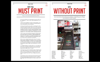
I decided to include an image within my Manifesto page to illustrate the point I am trying to make about the need for print by showing print in a real life everyday situation. I included the heading and played with the format to get a layout which would show the list in a more considered light. These double pages go against the rest of the layouts however I want this to be read as a mission statement where the content is right in front of them. The tone of language is quite persuasive and biased with emphasis on the points I am making to try and encourage them to read on.
 |
| Processes Double Spread |
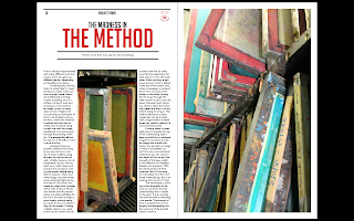
I knew that the photographs that I had taken of the cleaned screens were very colourful and intriguing so I knew that I wanted to make them a main aspect of the layout to try and interest the reader add to what they are so they are influenced into going out and finding out for themselves. I trued to make the content as informative as possible whilst sticking with 2 columns maximum so this meant that it was a bit more of a general overview rather than a detailed account but, just to introduce this to the readership, this would have been sufficient. What I would do is, if I was to produce more newspapers as part of the campaign, I would produce more detailed accounts of individual processes in successive editions so that those who are interested can learn about them in greater detail.
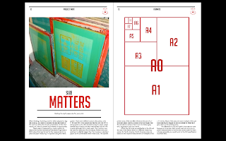 |
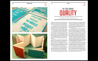
| Format Double Spread |
I knew that I would be talking about different sizes and scale but I wasn't sure how I was going to show this. I had been using photography to illustrate my articles but I wasn't sure how I was going to be able to show different sizes without having to resort to photographing different sizes of papers. I felt it might be an idea to produce an illustration of the different pages sizes in the same visual style as the illustration I made for the front cover and played with the way that I would present it. I didn't have as much content for this page as others because it is quite concise so I made up for this by focusing the article on the diagram.
 |
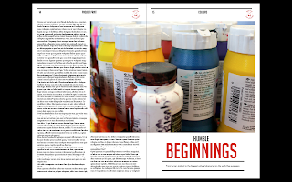
| Stock Double Spread |
The thing that I found most difficult for the Stock double spread was the images that I was going to use. I had taken some photographs during my book-binding induction of the paper I had used, however, the quality of the images was poor and unclear. I felt that by using them despite their relevancy, it would damage the quality of the actual newspaper. It took me a while to find a combination of images I liked that were good quality and relevant to the topic whilst being presented in a attractive manner that fitted with the aesthetic of the campaign.
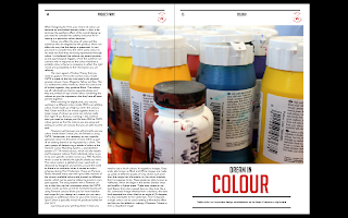
For the colour double spread, I wanted the brightly coloured image of the different available inks to take up a lot of the space in the publication. I hadn't had an image which encompassed both page sod the spread yet and I felt that this was an image which I could do that with based on the detail and the scale of the image. There was a lot of content for this particular article so I felt the need to have wide columns and a general overview with some detail on the more complicated aspects of colour science.
 |
| Costings Double Page Spread |
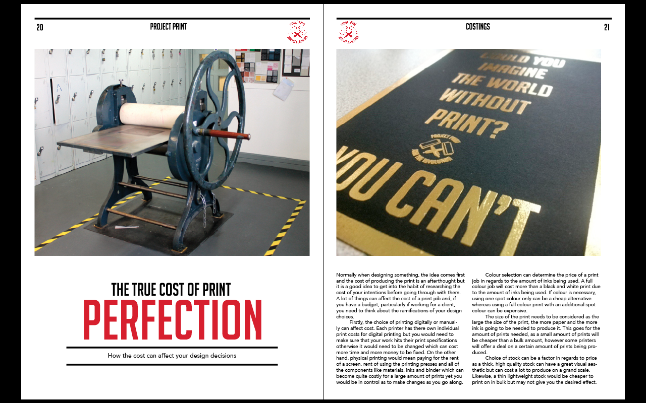
I didn't know how I was going to be able to physically show the cost of printing without taking a picture of some price listings. I had to take a different approach to costings so I decided to show elements which would have to be consider when thinking of costings, like the quality of the stock and finishings and the price of renting for equipment access. In regards to costings, I didn't know how I could interpret the intention for the content as I thought i had to include actual prices in the article but prices are different everywhere so I thought I'd interpret it differently by just highlighting considerations to think about when considering costs. this way I was answering the brief whilst using my own interpretation of the topic.
 |
| Print Room Double Spread |
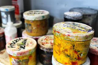
I wanted to show aspects of the print room without directly taking a photo of the room itself. I took some photos of the more mundane aspects of the Print room so that it wouldn't seem as intimidating to the target audience. Not just this but it would make the room more familiar to them so that they were more inclined to visit. The content itself is quite small but thats because it is more of a reassurance and encouraging paragraph to try and get people to get in the room and I feel that by making the print room seem less intimidating through the images that it makes more of an impact.
 |
| Campaign Information Double Page Spread |
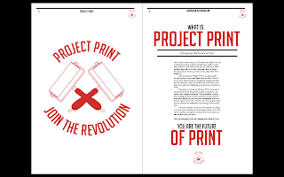
Following the layout that I used for the Campaign Manifesto and, based on the fact that it is covering the same topic, I decided to make the presentation for the content very similar to show a correlation between the 2 double spreads. I used the logo of the campaign as a large image on the inside of the page so that it hits the readers line of vision straight away. I made the information quite emotive and powerful so as to make the point come across very strongly
Overall, I am quite happy with the way that I have presented the content for my newspaper as it is consistent, clean and clear. I have to admit, this was a difficult method of presenting information on the topic of print but I am glad that I have risen to the challenge. I wanted to show that I could bounce back from the bad crit I and and show what I could do and I think the newspaper really showed that.
Even though I had produced the content of the newspaper, I had been to the Digital Print room and discussed the prospect of what stock I would have to use if I wanted my newspaper printing. I would only be able to print on Bulky Newsprint of a minimum of 90gsm. I felt that this would be too bulky and wouldn't be as convincing for the newspaper. From the crit, I was recommended a printing company called Newspaper Club who would be able to print a Newspaper on 55gsm stock. As part of my research, I order some free samples to determine the size and stock and whether it would be appropriate for my newspaper. I was very impressed by the samples and decided to produce my newspaper through them.
 |
| Costings |
To produce them, I needed to have a look at costings to see what it would cost to produce it on a large scale. I wanted to produce more than just one for the campaign but at the same time, for a 24 page newspaper, it would cost £48 for just 5 copies. Rather than buying lots or just one, I decided to go for 5 because that way I would be able to test it out and see what it was like. In a real life situation, I would use these 5 prints to get feedback from them and try them out as a sample and then, based on demand and the success of the publications feedback, I would be able to invest more.
 |
| Working to a Printers Specifications |
In order to be able to produce the newspaper, I have to make sure that all of my newspaper works to the specifications of the printers. I have never worked with a printers before and I feel like this would make for a good experience for me because then I have the experience of having to work to specific specifications and know what it would be like in a real world situation.
In order to produce the print, I needed to have my pages in a multiple of 4, with 150-300 dpi resolution images, CMYK colour modes and specific dimensions of 289 x 380mm. The only thing I hadn't done already from the given specifications was the size of the newspaper as I had been producing mine at the traditional tabloid size. From this, I had to resize all of my pages and their content to be able to get it sent off to print which was a task in itself but I didn't know that I was going to have to produce my newspaper in this manner when I started.
 |
| Resizing Images and Saving on Photoshop |
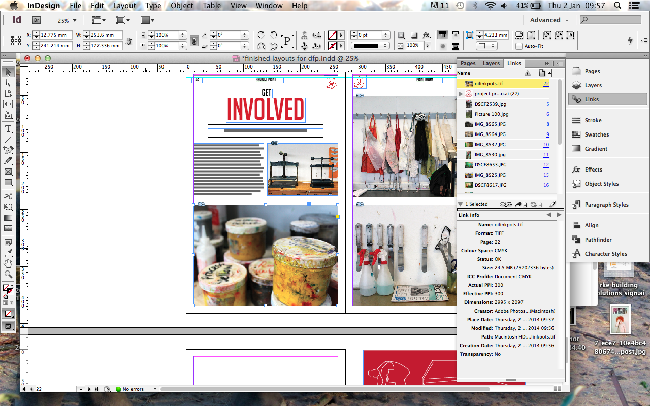
When re-sizing the pages to the specifications, I had to re-size the images as well to fit the desired space on the documents. To do this, I had to select the image space, press copy and open up a new Photoshop file to get the correct dimensions. I had to make sure it was a CMYK file as well to make sure the images were appropriate for printing. I then resized the image and saved it as a TIFF file before placing it back into the InDesign file. I did this for every image to make sure it was correct. It took a very long time because I don't have a lot of experience but the fact that I am switching between software programmes to make the Newspaper properly shows how much I have improved from last year as, admittedly, I have never done this for any of my other tasks last year.
 |
| Saving as a PDF |
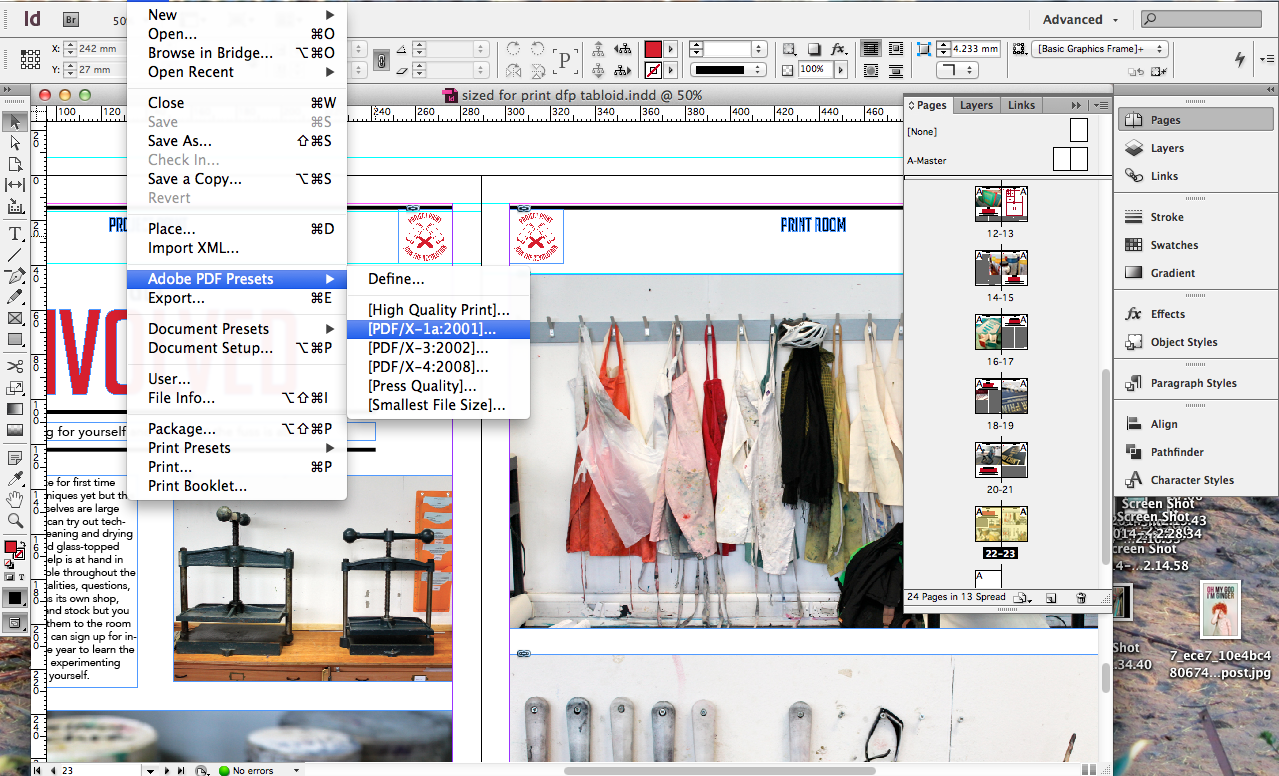
For the file to be uploaded to the Printers, I had to send it as a PDF so that all of the images, photos and typefaces would be saved appropriately so that they wouldn't be changed at the printers.
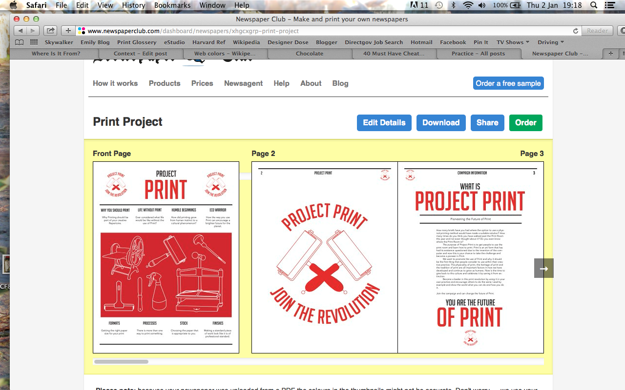 |
| Ordering Newspaper |
I felt quite apprehensive when sending for the newspaper to get printed off because I have never sent my work to be printed and have always been present when it has been so it would be out of my hands.
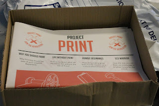 |
| Received Newspaper Print |
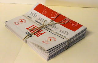
I was very excited by the prospect of receiving my Newspaper as I was quite anxious about how it had been printed and if it had turned out in good quality. I was pleasantly surprised by this outcome as I expected the worst due to the fact that the control is out of your hands yet it also shows that sometimes you have to be able to trust people to produce quality standard work. It truly meant that the apprehension was unnecessary and was defiantly worth waiting for.
Final Piece:
24-page Digital Tabloid Propaganda-style Newspaper on the subject of Print, printed on 55gsm Newsprint, packaged and presented in a traditional string tie.
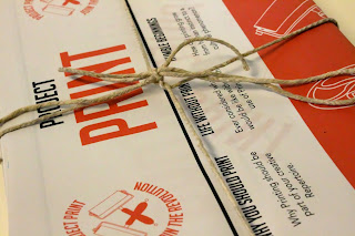 |
| Final Piece |
I am very happy with the way that my newspaper has come out as it is a great size and has transferred really well from screen to print. I love the physicality of the newspaper and the fact that the stock is lightweight and traditional. I never thought that I would be able to produce something that looks so professional done so I am very pleased with it as it has boosted my confidence a little bit. I would defiantly consider producing something in this way again, particularly as this editorial style allowed for me to do my own written content which I enjoyed contributing to the work which meant that I took a lot more ownership of the entire product.
Proposals:
As part of the brief, I wanted to be able to expand the kit to become a proper campaign, however, I ended up running out of time. From this, I decided that it shouldn't stop me from proposing this aspects.
I took some stock photographs around the college area so that I would be able to apply there posters. I wanted to be able to take my own images of the college rather than use images of a random school from someone else's stock images because I want to be able to show how I would be able to apply this in the real-life situation/ context.
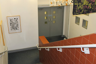 |
| Stock Images around College |
I wanted to take images of the surrounding area around the print room and of the corridors leading to the print room so that I could use the posters as a directional accompaniment to the way-finding system. A lot of the images I didn't feel were as appropriate as they didn't give me enough space to be able to apply a poster or the image wasn't take at a great angle so it would be difficult to use. Despite this, I felt like I got a good couple of images that I could use to be able to illustrate my proposals from.
 |
| Campaign Posters |
Using the posters I developed at the beginning of the project alongside the logo of the campaign, I will apply them to the images.
 |
| Photomanipulation of Stock Photos |
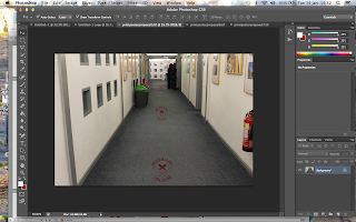
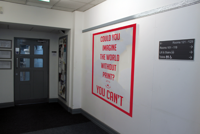
I put some of the better photos into Photoshop and, using the skills that I learnt in the Print and Web brief in regards to superimposing, I applied the posters and logo onto the photos by using Content-Aware by clearing the background area and resized them before using the distort option to place them against the wall on the photo so it looks like it has been put there.
 |
| Proposals |
I think I managed a mixed range of successful and not as successful proposals. Some of the wall poster images come across as quite good as I feel like I have managed to angle them appropriately but the way-finding idea of using the floor I don't think is as successful as it doesn't look convincing. It would have probably worked better if I had applied it to walls as well but then I thought that it would be too cluttered within my proposals if I had everything on the walls. I had wanted it to be more considered then that.
Design Boards:
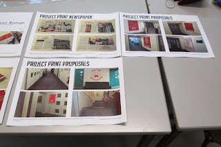
From producing the Newspaper and Proposals for the campaign expansion, I went onto putting this information and displaying it on some Design Boards so that I could show my work in a more professional context. I used a minimal amount of writing keeping it brief and concise, using lots of images to allow the work to visually stand up by itself.
 |
| 7 Printed A3 Boards |
The way that my boards present the information in a concise and specific manner at the bottom of the page in one or two sentences allows for the rest of the board to be taken up by high impact images. This means that I can visually show my intentions and development throughout the brief by letting the work do the talking.
Overall, I feel as though this brief has been quite difficult for me, especially when I had to go away and re-develop my idea based on the crit that I had which knocked at my self-confidence. Despite this, I am very happy with the outcome of my newspaper in regards to the quality of the print, physicality of the product and the way that I have presented the content. If I was to improve it, I would produce the posters and way-finding system which I proposed for the campaign, perhaps even taking it further, into an actual event or group so that the newspaper can run alongside this.












No comments:
Post a Comment