 |
| Group 5 List of "What Is Design For Print?" |
- Physical Products (Printed on Stock)- Books, Packaging, ect
- Interactivity with the Audience/ Consumer
- Processes- Screen Print, Letterpress, ect.
- CMYK, Ink, Consider Changes from On Screen
- Layout/ Composition- Font Size, Legibility
- Promotion/ Distribution/ Inform/ Advertise
- Scale
- Quantity/ Cost
- Medium
- What is it For? (Purpose/ Audience)
- Resolution
- Image (and/or) Type
"Design For Print is a range of design processes and considerations that lead to a physical printed product/ outcome on stock"
From this, we then had to identify and list as many different processes for Design for Print as we could think of.
 |
| Group 5 List of Print Processes |
- Foiling
- Screen Printing
- Vinyl Cut
- Engraving
- Monoprint
- Lino Cut
- Thermography (Raised Printing)
- Letterpress
- Embossing
- Spot Varnish
- Intaglio
- Woodblock
- Digital Print
- Laser Cutting
- Reprographics
- 3D Printing
- Heat Transfer
- Lithography
From the list we have made, we have to select 3 processes that we would like to try this year:
- Screen Printing- I've only had an induction for screen printing and I would like to build on this. I like the different colours that can be produced so that they are unique and I think it would give more of an organic aesthetic to my designs.
- Embossing- I liked to try embossing this year as the texture and shadow that this can give to a piece of work as it has been pressed into the stock, either by raising the image or by sinking the image, would give my work more definition.
- Spot Varnish- I'd like to try a spot varnish alongside the other 2 processes as I think it would enhance the overall visual quality of my work. The fact that there is several types of varnish that you can use would allow for me to do some experimentation with my work and develop my skills by seeing the effects of different varnish on my work.
- Format
- Colour
- Production
- Process
- Finishing
- Stock
Format
Format alludes to the way a design is physically arranged or planned but it can also reference the way information is shown, arranged and stored. Format can also reference the format of information stored on the computer, e.g.. pdf.
1. Business Cards
 |
"Business Cards"
Graphics and Print (2013) "Business Card" [Internet] Available from http://www.graphicsandprint.com/design/business-cards (Accessed 2nd October 2013)
|
 |
"Experimental Business Cards" (2012) by Gabe Ferreira
Ferriera, G. (2012) "Experiemental Business Cards" [Internet] Available from http://www.behance.net/gallery/Experimental-Business-Cards/5515071 (Accessed 4th October 2013)
|
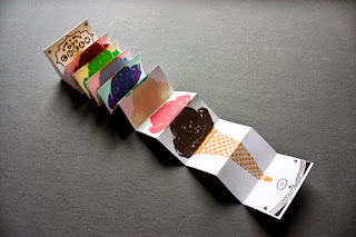
The laser-cut design for the business cards creates a whole new dimension as it manipulates the traditional format of the business card and makes it individual for the user. The format combines the medium and context within the design so it reflects the information necessary for the audience.
2. Leaflet
 |
"Leaflets"
Graphics and Print (2013) "A4 Folding Leaflet Printing" [Internet] Available from http://www.graphicsandprint.com/blog-post/a4-folded-leaflet-printing-the-advantages-of-folding (Accessed 2nd October 2013)
|
 |
"I Love Ice Cream" (2013) by Simon Laliberte
Laliberte, S. (2013) "I Love Ice Cream" [Weblog] The Behance Network 4th September Available from http://www.behance.net/gallery/I-Love-Ice-Cream/9484901 (Accessed 4th October 2013)
|
Colour
In regards to print, the colour format that is used is CMYK whether that be for digital printing or some physical printing methods.
1. Four/Full Colour Printing
 |
"15/115- 15 Years, 15 Projects Book" (2013) by Mash Creative
Mash Creative (2013) "15/115- 15 Years, 15 Projects Book" [Weblog] The Behance Network 31st May Available from http://www.behance.net/gallery/15115-15-Years-115-Projects-Book/9043067 (Accessed 3rd October 2013)
|
This book has been printed using a full colour throughout, producing a consistent and fluid aesthetic which then enhances the quality of the book.
2. Spot Colour Printing
 |
"Mixing Inks"
Bann, D. (2006) "The All New Print Production Handbook", 1st ed., Switzerland: Rotovision, p138
|
 |
"Design Variety" (2013) by Amber Asay
Asay, A (2013) "Design Variety" [Internet] Available from http://cargocollective.com/amberasay/Design-Variety (Accessed 3rd October 2013)
|
Production
Production is the amount of something that is produced by a process as well as the amount of processes that happen in regards to producing the design. This can be on a small scale (Limited Edition/One Off) or large scale (Mass Produced).
1. Mass Production
 |
"Paper Feeding Through a Web-Fed Press"
Bann, D. (2006) "The All New Print Production Handbook", 1st ed., Switzerland: Rotovision, p86-87
|
 |
"McCoy's Man Crisps" (2013) by BTL Brands
The Dieline (2013) "Before & After: McCoy's Man Crisps" [Weblog] The Dieline 23rd September Available from http://www.thedieline.com/blog/2013/9/23/before-after-mccoys-man-chips.html (Accessed 5th October 2013)
|
2. Limited Edition
 |
"Prints" (2013) by Mikaela Lilhops
Lilhops, M (2013) "Prints" [Weblog] The Behance Network 10th September Available from http://www.behance.net/gallery/Prints/10840739 (Accessed 6th October 2013)
|
 |
"2012 Monster Calendar" (2012) by Ross Moody
Moody, R. (2012) "2012 Monster Calendar"[Weblog] The Behance Network 1st January Available from http://www.behance.net/gallery/2012-Monster-Calendar/2775197 (Accessed 6th October 2013)
|
Process
Process is the way or method that something is printed in order to achieve the design
1. Screenprinting
"Printing Processes: Screenprinting"
artsmia (2008) "Printing Processes: Screenprinting" [Youtube] 24th June Available from http://www.youtube.com/watch?v=wogKeYH2wEE (Accessed 4th October 2013)
Screenprinting is a popular printing process where a stencil of a design is put onto a screen and ink is pulled across a screen using a squeegee in order to transfer an image onto the necessary medium. This can be done one or more times and through this process you can create full colour prints using CMYK or mix own choice colours to produce a specific colour palette.
 |
| "Harry Potter Screenprints" (2013) by Stephanie ShaferShafer, S. (2013) "Harry Potter Screenprints" [Weblog] The Behance Network 3rd February Available from http://www.behance.net/gallery/Harry-Potter-Screenprints/6982571 (Accessed 4th October 2013) |
2. Relief Printing
"Printing Processes: Relief"
artsmia (2008) "Printing Processes: Relief" [Youtube] 24th June Available from http://www.youtube.com/watch?v=O0skLwaFpn0 (Accessed 4th October 2013)
Relief printing is by carving or cutting out an image onto a block of material, leaving some areas raised so that they create an outline whilst having carved out the blank, empty space. Ink is then applied to the roller and pressed onto the raised areas of the material so that when it is printed, only the raised areas with ink on are left visible. It can be hand printed or print pressed and the block itself can be reused and manipulated to change the design of the image, however, more can only be taken away and not added to.
 |
"Team Zissou Linocut" (2012) by John C. Thurbin
Thurbin, J. C. (2012) "Team Zissou Linocut" [Weblog] The Behance Network 4th July Available from http://www.behance.net/gallery/Team-Zissou-Linocut/4427731 (Accessed 4th October 2013)
|
These are usually actions undertaken after printing. Finishing is when you have produced the design and wish to affect the outcome of the print by adding an effect to the design to enhance it in some way, whether that be aesthetically or practically, such as by adding varnishes or considering binding options.
1. Embossing
 |
"Embossing"
Graphics and Print (2013) "Embossing" [Internet] Available from http://www.graphicsandprint.com/printing/embossing (Accessed 2nd October 2013)
|
 |
"Crocodile 60th Anniversary A/W Catalog" (2012) by Ken Lo
Lo, K. (2012) "Crocodile 60th Anniversary A/W Catalog" [Weblog] The Behance Network 27th October Available from http://www.behance.net/gallery/Crocodile-60th-Anniversary-AW-Catalog/5689257 (Accessed 2nd October 2013)
|
2. Perfect Binding
 |
"Perfect Binding"
Graphics and Print (2013) "Perfect Binding" [Internet] Available from http://www.graphicsandprint.com/printing/perfect-binding (Accessed 2nd October 2013)
|
 |
"Daily Planners and Notebooks" (2012) by Julia Kostreva
Kostreva, J (2012) "Daily Planners And Notebooks" [Internet] Available from http://www.juliakostreva.com/pages/portfolio (Accessed 2nd October 2013)
|
Stock
Stock is the selection and consideration of the media or material that the design is going to be printed onto.
1. Paper
 |
| "Newsprint" Bann, D. (2006) "The All New Print Production Handbook", 1st ed., Switzerland: Rotovision, p128 |
 |
"Obsessive Compulsive Disorder Newsprint" (2013) by Matthew Moran
Moran, M (2013) "Obsessive Compulsive Disorder Newsprint"[Weblog] The Behance Network 27th June Available from http://www.behance.net/gallery/Obsessive-Compulsive-Disorder-Newsprint/9547225 (Accessed 3rd October 2013)
|
The choice of newsprint for this design is appropriate to the needed aesthetic and intention of the design. This produces an off-white, light weight printed product which encompasses the need to produce information quickly yet is strong enough to be able to withstand constant reading from the public.
2. Material Stock
 |
| BDA London (2013) "Hands On In Berlin" [Internet] Available from http://www.bdalondon.com/hands-on-in-berlin/ (Accessed 3rd October 2013) |
 |
"Flower Apple Mini Tote" (2011) by Jane Foster
Foster, J. (2011) "New Flower Apple Mini Tote Bags" [Weblog] Available from http://janefosterblog.blogspot.co.uk/2011/02/new-mini-apple-flower-tote-goody-bags.html (Accessed 3rd October 2013)
|
Preparatory Task:
For the next session, we need to collect 5 different physical objects/ different examples of printed things.
 |
| 5 Examples of Printed Things |
- Tote Bag
- Editorial/ Publication
- 7" Vinyl Covers
- Chocolate Packaging
- Business Cards/ Loyalty Cards
Following this, for our next Studio session, we had to discuss as a group the 6 categories that were mentioned at the end of the last session, drawing on the research that we had learned and passing it onto the rest of the group.
 |
| Group Discussion List |
As a group, we bullet-pointed the points that we discussed. The list reads:
- Format- Size, Shape and Form. Arrangement of Information. Layout and Interactivity.
- Colour- CMYK/ Full Colour, Monocolour, Spot Colour
- Production- From Start to Finish the collection of Processes, Action Plan to produce Final Resolution
- Process- Way or Method something is produced in order to achieve the design, e.g.. Linoprint, Relief, Debossing, Laser cut, Screenprint
- Finishing- Affecting the design by adding to it to enhance the outcome, e.g.. binding options, varnishes and glosses, packaging
- Stock- Print choice of material and media for the resolution to be printed on, e.g.. different papers and printed objects
Then, as a year group, we went onto discussing what each group had and coming up with and forming our own definitions for the categories.
What is:
- Format- Scale, Size and Working within that
- Colour- Colour Modes, Hues, Function, ext.
- Production- The Actual Making of it
- Process- The Method
- Finishing- Production and Process
- Stock- Substrates for Printing Considerations (Cost)
What we noticed is that all the categories are interlinked together as you can't have one without another due to them overlapping.
Using the 5 different physical objects of printed things that we had each found, the group had to organise and separate the objects into the different categories:
 |
| Formats |
We split them in this way as we felt it was clearer to see by using the purposes of the formats due to the varying sizes and shapes. This way it is easier to see the differences between objects of the same purpose.
 |
| Colour |
We decided to split them in this way due to the fact that most of the colour choices were either full colour or 1 colour plus stock. We did have a debate within the group on whether something is 2 colour printed based on the ink colour and stock colour combined but then we decided that it would be just one as only one ink is used.
 |
| Production |
Production is split into: Mass Produced, Bespoke and Short Run
We split them in this way as those are the different areas of print production in regards to the amount and the scale of the operation, whether that be a small amount of prints or a large amount of prints.
 |
| Process |
We split them based on the print process that had been used and comparing them with the other objects.
 |
| Cost |
We split them based on the amount of colour inks that had been used (the cheaper being just one colour), the stock choice (thinner stock being cheaper) and whether it had been mass produced or bespoke (mass produced being cheaper). We noticed that the higher quality stuff was more expensive to produce.
 |
| Subjects/Areas |
From what we had learnt from the last 2 exercises, we had to think of some things that we didn't know and would like to find out about aspects of print:
- How are Receipts Printed?
- Can using a Typewriter be classed as a Method of Printing?
- Can you print onto 3D objects?
- What is the History behind Printing?
- Different Paper Stocks Available to Print on?
We had to go onto researching the questions that we don't know the answers to in order to expand our understanding.
How are Receipts Printed?
 |
"How To Print on Thermal Paper"
Ouyang, J. (2013) "How To Print on Thermal Paper" [Internet] Available from http://www.thermalpaper4u.com/how-to-print-on-thermal-paper/ (Accessed 11th October 2013)
|
By using a narrow, thin thermal paper that has a colour changing chemical as the stock for the receipt, the information can be burnt on by heating up the paper in a pin-point location on the paper and by turning the infused ink chemical black. By using a pin-point heat source, this allows for clarity of characters and letterforms.
Can using a Typewriter be classed as a Method of Printing?
 |
| "Typewriter" Bedi, R. (2013) "Indian High Commission returns to Typewriters" [Weblog] The Telegraph 27th September Available from http://www.telegraph.co.uk/news/worldnews/asia/india/10339111/Indian-High-Commission-returns-to-typewriters.html (Accessed 11th October 2013) |
Altogether yes, a Typewriter is a method of printing.
Can you print onto 3D objects?
 |
"Pad Printing" by Coatings Applications
Coating Applications (2009) "Silkscreen and Pad Printing" [Internet] Available from http://coatingsapp.com/process-silkandpad.html (Accessed 11th October 2013)
|
"Pad Printing- How It's Done" (2010) by TGAA
TGAA (2010) "Pad Printing-n How It's Done" [Youtube] 10th February Available from http://www.youtube.com/watch?v=nS4-X_KBd7A (Accessed 11th October 2013)
I felt that this video showed that you didn't have to be stuck using just one colour process and how the machines can be set up to produce a wide range of colour ranges.
What is the History behind Printing?
 |
"Brief History of Printing Infographic" (2012) by Solopress
Haynes, R. (2012) "Brief History of Printing Infographic"[Internet] Available from http://blog.solopress.com/printing/brief-history-of-printing-infographic/ (Accessed 17th October 2013)
|
The first major breakthrough in printing was the invention of the Printing Press in 1440 by Johann Guttenberg which allowed for mass printing of publications, which at the time was mainly the Bible. Before this, Priests, Monks and Scribes would hand write the contents of the books for every page.
In the last few years, from the development of Computers and Digital means, the development of the Inkjet Printer, Laser Printer and Digital Printer has influenced how fast printing can be done as well as allowing for printing to be available to everybody.
 |
"Brief History of Printing Infographic" (2012) by Solopress
Haynes, R. (2012) "Brief History of Printing Infographic"[Internet] Available from http://blog.solopress.com/printing/brief-history-of-printing-infographic/ (Accessed 17th October 2013)
|
Different Paper Stocks Available to Print on?
 |
"Do- Si- Do Diary" (2013) by Penny
Penny (2013) "Do- Si- Do Diary" [Weblog] Rats As Big As Cats May Available from http://ratsasbigascats.blogspot.co.uk/2013/05/do-si-diary.html (Accessed 17th October 2013)
|
In regards to what paper type should be used for what, it is considered that:
- 90-100gsm: Stationary, Text for Magazine and Booklets, Flyers and Brochures
- 120-170gsm: Text for Magazine and Booklets, Flyers and Brochures
- 200-250gsm: Magazine and Book Covers
- 280-420gsm: Cards, Books and Booklet Covers
In regards to the Types of Finishes available for Paper Stock:
- Cast Coated: High Gloss Surface
- Glossy: Has gone through a Glazing Process- can be Coated or Uncoated
- Machined Finished: Smooth on both sides
- Lightweight: Thin, coated paper than can be as lightweight as 40gsm
- Matt: Roughness of the surface gives off no light- can be Coated or Uncoated
- Machine Coated: Paper that has coating applied whilst being printed on
- Silk/ Silk Matt: Same qualities as Matt paper- High readability with high image quality
Information from:
- Paper Online (2013) "Types of Finish" [Internet] Available from http://www.paperonline.org/paper-making/paper-production/paper-finishing/types-of-finish (Accessed 17th October 2013)
- Design Pink (2013) "Popular Paper Types and Paper Stocks" [Internet] Available from http://designpink.com.au/paper-types-and-paper-stocks/ (Accessed 17th October 2013)


No comments:
Post a Comment