 |
| Chosen ISTD Briefs |
To start with, we needed to take the 3 briefs printed out to the studio session and, whilst going through them, highlight each key word which I think is important.
 |
| Highlighted Briefs |
- Connects
- Metaphorical Journey
- Broadest
- Fascinating
- Phoney
- Interesting
- Mojo
- Innovative Thinking
What made these words so bad is that they give no metric value for what they mean. You can't have a specific amount of fascinating, can you? The words are unclear, not telling us what the problem is and have been used because the judges don't know what they are looking for. In briefs, we need to try and get rid of these words which can usually be found in more broad briefs.
 |
| First 2 Questions |
- Who is the Target Audience?- Allows me to select my own area of focus in regards to restaurant theme/concept
- Restaurant Concept- What will be the unique selling point? Keeps it open int egads to applying it throughout the identity
- Application of solid typographic brand- Specific which allows for consistency within the brand yet can allow for experimentation
- Language Choices- Theme/ Concept of Restaurant will determine lexis and possible use of international language/word usage
- Will the design choices inform the food on offer or choosing the food on offer first inform the design?
- Typographically-themed
- Designing a Restaurant Brand
- Consider proposals for the interiors and exteriors
- No clearly specified type of restaurant
- You need to promote the restaurant
 |
| Next 2 Questions |
- They are people who eat
- They are people who enjoy eating
- They go to Restaurants
- They have a disposable Income
- Local people who live in the area
- Promotion of good Food and good Times
- The Theme of the Restaurant
- The Quality of the Food the Restaurant is producing
- How this Restaurant is a better place to eat than anywhere else
- Why people should be eating here (eg. Good Value for Money)
Things you do not know about this Brief?
- The Audience
- Restaurant theme (Type of Food)
- Location
- The type of Restaurant it is (e.g.. Fine Dining, Fast Food, ext.)
- Bespoke and Singular or a Chain of Restaurants
- Is it a type-themed Restaurant or is it a Restaurant using type to define its identity
Study Task:
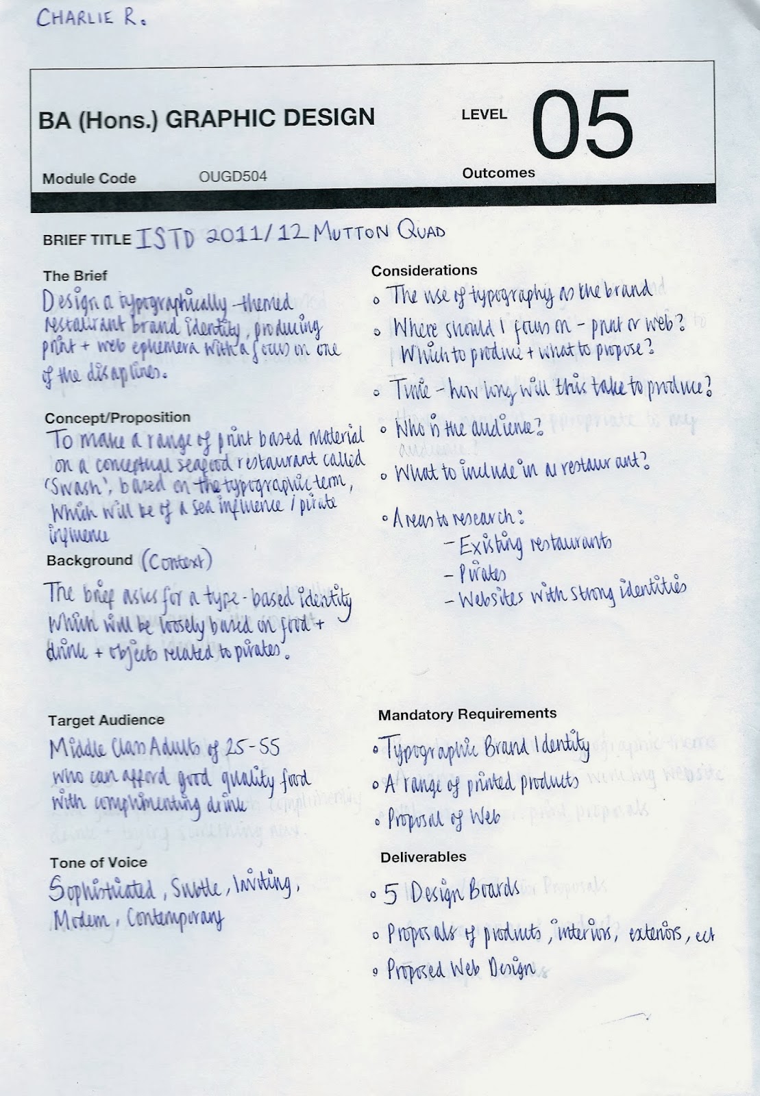
From this, we have to re-write the brief making it as specific as possible for the next session.
 |
| Brainstorm for Brief |
I did some research into different typography terminology and found an interesting term. The term 'Swash' means a flourish which is put at the beginning of a word. This made me think of pirates and the sea so I have decided to come up with a seafood restaurant.
 |
| "Swash" Typography Deconstructed (2010) "Swash" [Internet] Available from http://www.typographydeconstructed.com/swash/ (Accessed 27th November 2013) |
 |
| Re-Written Brief |


No comments:
Post a Comment