Workshop 3- InDesign
Using the DuoTone and Spot Colour Images from the last session, we are going to produce colour swatches in InDesign. Everything that we do in this session can be equally applied to Illustrator. This session will also act as a refresher as to how InDesign operates.
Create New Document:
InDesign is useful as it gives you the ability to easily choose multiple pages for one document. In regards to page sizes, you would normally type the size in rather than use one of the default sizes. The Columns and Margins options are associated with the grids and layout of the Document, however, you can change them later on to suit you.
In the Hidden Options is Bleeds and Slugs. The Slug defines an outside area of printed page which is used for Registration marks and information like Page Numbers. The Bleed option is to do with Trimming with the standard Bleed size being 3mm, however it is best to check this with the Printers you are using as they may have their own specifications, e.g.. BLURB, an online printing company, have their own specifications. In Commercial Printing, discuss Colour Options and Spot Colours, Finishes, Costings and Bleeds.
Other options include; Facing Pages which presents your Double Page spreads together, Primary Text Frame which automatically adds a text frame that fits in your margin which is good for text-heavy files and the option to choose your Starting Page No. so that it can be any page on your file and not the default first page.
Applying Colour:
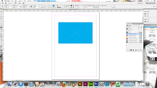 |
| Applying Colour to Vector Shape |
Applying colour in InDesign is the same as in Illustrator as you can apply it to a Vector shape using the Fill or Stroke options.
Colour Swatches:
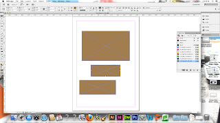 |
| Application of Colour Swatch |
Using a Swatches palette gives you consistency throughout your work in regards to colour application. Despite this, it is presented differently to that in Illustrator: Illustrator has lots of different swatch colours with little information whereas InDesign has just 7 Colours which makes it more practical to work with. They are named by the Colour Ink Mixtures showing how the colours are considered as Inks. Making a New Colour Swatch bring ups a Swatch Dialogue Bow where you can make a new mixture.
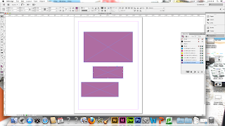 |
| Application of Global Swatch Colours |
These colours are Global Colour Swatches, shown by the Grey Square next to the colour name, which means that if you select the 100% version of the original colour and edit it, you can edit all of the other shapes with the same colour in at the same time.
Tint Colour Swatches:
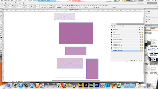 |
| Application of Tint Swatch |
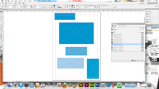
You can set up a Tint of a Colour by selecting the colour you want and then selecting 'New Tint Swatch' from the drop down menu. You can create different tint swatches for different ink percentages so it creates a large amount of variation. When the Dialogue Box comes up for Tints, you can only change the Tint percentage and nothing else.
 |
| Editing Tint Colours |
Just like the Global Colours, If you select the 100% version of the tint colour and edit it, you can edit all of the other shapes with the same colour in at the same time.
Spot Colours
 |
| Spot Colours in InDesign |
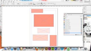
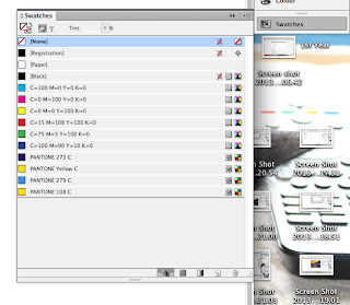
You can access Spot Colours by selecting a new Colour Swatch and selected a different colour mode to the default. Through this, you can find the different Colour libraries, like the Pantone books, and find the precise colour you need for the stock you are using. Again, changing the original colour of the original shape will edit the rest.
Working with Images:
 |
| Transfer of Photoshop DuoTone Image Spot Colours |
 |
| Transfer of Photoshop Spot Colour Image Spot Colours |
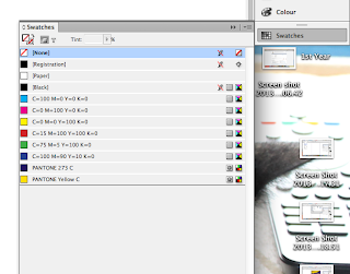
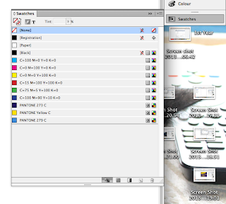
Creating a New Document, Open an Image with File and Place. To show this, we are using the images from last session to demonstrate. To tell whether your images were successful saved in Photoshop, you should be able to see the Spot Colours for the image exported into your InDesign Colour Swatch. This will work during the Printing Process and will show that the image has transferred properly.
|
 |
| Transfer of Illustrator Vector Image Spot Colours |
The transfer of Spot Colours can be done from Illustrator Vector Files as well.
Considerations for Preparing Images for Photoshop to Print in InDesign:
- 300 DPI Resolution- Less Res. means Less Quality, More Res. means the file is unnecessarily Large
- Prepared to Actual Size- Improves Print Quality. Needs to be resized in Photoshop if you re-size it in InDesign. Large File Sizes in Printing causes Errors in Exporting Document
- CMYK or Spot Colours- If working with RGB, it needs to be in the Colour Gamut and then converted to CMYK
- Save as a TIFF or PSD- If working with Transparency, make the file a PSD
Considerations for Preparing Images for Illustrator to Print in InDesign:
- Colours must be CMYK or Spot Colours
- Save files as .ai or Copy and Paste the image into InDesign
Separating Colours:
Illustrator and InDesign software have the ability of separating the colours during the Print Process.
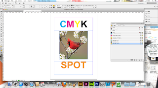 |
| Open the File for Colour Seperation |
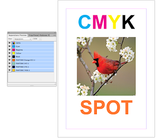 |
| Setting Up Separations |
The Image thats been selected for this demonstration has 5 colours, the 4 Process Colours and a Spot Colour. By selecting from the top bar, 'Windows- Output- Separation Preview', it allows you to see how the Programs will use these Inks. The Separation Preview Window will come up and by selecting the option to 'View-Seperations', you can make the Inks active, shown by an improvement in the Quality of the Image it corresponds to.
 |
| How The Ink Will Be Applied |
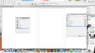
By clicking onto Individual Inks, you can see a visual representation of how the Ink Colours will be applied. This mirrors the Channels in Photoshop and also is the way that Screen-printing Positives can be produced, by printing them onto separate transparent papers and exposing them. If there are colours which are available but they are not in use, delete them from the Swatch Palette as they could be accidentally used and this would incur extra printing costs.
 |
| Creating Positives for Screen Printing |
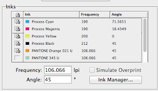
You can create Positives from the Print Dialogue Box by going to 'File- Print- Output'. Go to Colour and Separations to make the Inks active and then select/de-select the Inks you want to use.
Frequency and Angle applies to the Halftone Screen applied to the Separations:
- The smaller the dot, the more the illusion of a light tint
- 150 Lines per Inch of Dots get to produce a High Quality Print
- For Screen Printing, do 40-65 Lines
- For CMYK, its printed over the top sop they are angled so they don't clash
The Separation process only works on Laser Printers and not on InkJet Printers. This is done by Printers during the Commercial Printing Process.
Overprinting and Knocking Out:
 |
| Knocking Out |
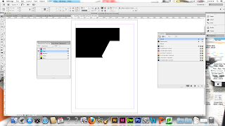
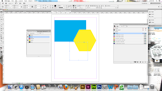
Apply 2 Spot Colours to Overlapping Shapes. From there, go to View Separations in the Separating Preview.When there is 1 colour and no other, the colour is Knocked Out and therefore InDesign removes it. When Colours overlap, they are knocked out by Default.
 |
| Over-Printing |
By adding a Black Shape and selecting the Separation View, the Black will default to being Over-Printed.
 |
| Attributes Palette |
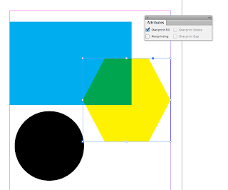
You can find the Attributes Palette by 'Windows- Output- Attributes'. It is Object Specific so something must be selected when trying to apply it. By applying it to an image that is overlapped, it will knock the other Colour out and the inks will mix during the Printing Process. However, you can only see the result of this in the Overprint Preview.
 |
| Ink Limit |
By Selecting the option to see the Ink Limit, your images will turn Grey and will have a coloured area to show where there is going to be too much Ink.
Applying a Spot Varnish:
 |
| Spot Varnish |
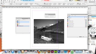
We created some text over an image and added a spot colour to it. By selecting the Attributes and putting a Overprint Fill on it, the colour will not be knocked out in the Printing Process.
 |
| Overprinting With Spot Colours |
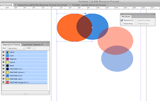
InDesign allows you to apply Swatches with 2 Spot Colours that can be over-printed. There would be no increase in cost as it would just be using the same 2 inks.
 |
| Mixed Ink Swatch |
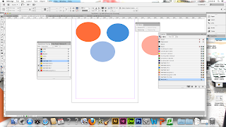
Mixed Ink Swatches are only applied to Spot and Process Colours and can only be made in InDesign. The Mixed Ink Palette allows you to see the colour you would get if the Colours you had were over-printed by creating a new swatch and matching the ink percentages of tints to the original colours.


No comments:
Post a Comment